
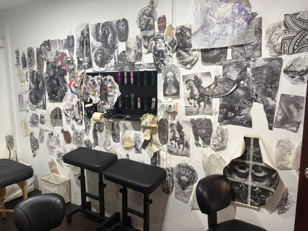
To combine tattoo references well, give each image one job: one for the subject, one for crop, one for contrast, one for body flow, and one for exclusions. Then tell the artist which image is primary and which parts should not be copied. That turns a folder of screenshots into a custom tattoo design brief.
The goal is not to build a collage for the artist to trace. The goal is to explain what you want kept, what can change, and what must be avoided. In Singapore, this also matters because online images and finished tattoos may be protected by copyright. Use references to communicate, not to demand a replica.
Start with the subject before the style
The subject is the main thing the tattoo must be about. It may be a face, tiger, koi, peony, guardian figure, pet, script line, building, or abstract shape. Name it before you talk about mood. “A tiger head, three-quarter angle, mouth closed” is more useful than “powerful and elegant.”
Choose one subject reference and make it the anchor. If you send five different tigers, all with different head shapes, stripes, expressions, and lighting, the artist has to guess which tiger is the real one. If you want a family member, pet, or specific object, the subject image should be the accurate source. The other images can help with finish, crop, or placement, but they should not fight the main source.
When the subject is not a literal object, explain the hierarchy. For a Japanese-inspired sleeve, the main subject might be a dragon, with waves, wind bars, and flowers as support. For a black-and-grey composition, the subject may be a portrait with architectural shadows behind it. In both cases, the artist needs to know what should be read first from a few steps away.
Before you brief Yuyi, browse the portfolio and choose references that sit near the kind of work already shown. If you want a large grey portrait, a reference set full of tiny colour icons will not help. If you want a Japanese composition, send images that show subject and movement, not only isolated motifs.
Use one image to show crop
Crop decides what stays inside the frame. It affects whether a tattoo feels calm, crowded, cinematic, or unfinished. A good crop reference shows how close the subject should be, what is cut off, and how much empty space should remain.
For a portrait, crop may decide whether the tattoo includes the whole head, collar, shoulders, hands, or background. For an animal, crop may decide whether the body is full length, a head study, or a close detail of eyes and claws. For flowers, crop may decide whether the stem and leaves are part of the design or whether the bloom alone matters.
Tell the artist what you like about the crop. Do not write, “Use this.” Write, “I like the tight face crop in image 2, but the face should be my grandfather from image 1.” That gives the artist a problem to solve instead of a picture to copy.
Crop also protects the tattoo from becoming too small. A reference that looks strong as a large poster may collapse if every background element is kept on a small forearm. Ask what can be removed while keeping the subject recognisable. A good crop makes the tattoo clearer, not emptier.
Use one image to show contrast and finish
Contrast is how light and dark carry the design. Finish is the visual language: smooth black-and-grey, high contrast realism, bold graphic lines, soft wash, dense background, or open skin. These are often easier to show than to name.
Choose one contrast reference. If you want black-and-grey realism, point to the kind of darks and soft transitions you like. If you want a Japanese or Asian-inspired piece, point to how the background separates from the main subject. If you want strong readability from a distance, say that you prefer clear dark shapes over tiny tonal details.
This does not mean the artist will copy the image. It means the artist knows whether your eye likes a soft grey finish or a sharper one. The difference matters on skin. A soft reference can look beautiful on a phone but may need stronger darks in a tattoo to stay readable after healing. A very dark reference may need more open skin so it does not become heavy.
For examples of tonal work, see black-and-grey tattoo work and look at how contrast separates face, fabric, hair, background, and negative space. Then write one sentence: “I like the dark-to-light contrast in image 3, not the subject.” That prevents the contrast reference from taking over the brief.
Use one image to show flow on the body
Flow is how the design moves across the body. It matters most for sleeves, shoulders, ribs, backs, calves, and any tattoo that wraps or crosses a curve. A flat drawing can look strong on paper and still feel wrong on an arm if the movement fights the anatomy.
A flow reference does not need the same subject. A koi sleeve can teach flow for a dragon. A back-piece composition can teach balance for a guardian figure. A flower arrangement can show how a design should travel from shoulder to elbow. The point is to show direction and rhythm.
When you send a flow reference, name the body area. “I like how image 4 travels from shoulder cap to outer forearm” is clear. “I like the vibe” is not. If the tattoo should face a certain direction, say whether the head, flower, or main movement should point toward the hand, shoulder, chest, or back.
For Japanese and Asian-inspired work, Japanese and Asian-inspired tattoo work can help you see how a main figure, background, and negative space move together. Do not treat motifs as stickers. A dragon, hannya mask, wave, and peony need a layout, not just a list.
Use one image for exclusions
An exclusion image shows what you do not want. It is often more useful than another inspiration image. Send one only if it prevents a real misunderstanding.
Examples:
- “No cartoon eyes like image 5.”
- “No dense black background like image 5.”
- “No symmetrical mandala frame.”
- “No red ink.”
- “No text or clock added.”
- “No open mouth on the tiger.”
Keep exclusions short. Too many negatives make the brief anxious and hard to draw from. Five inspiration images plus ten hard nos can corner the artist into a narrow imitation of your screenshots. If a detail is essential, say it. If it is only a mild preference, leave room for the artist to solve the design.
Exclusions are also useful for avoiding copied tattoos. If you send another artist’s finished work because the composition is close, add: “Please do not copy the tattoo. I only like the shoulder-to-elbow flow and the amount of open skin.” That sentence gives ethical and practical direction at the same time.
References show direction; they do not automatically grant permission
A reference can explain subject, crop, mood or contrast without becoming a request to reproduce someone else’s protected work. IPOS notes that copyright can cover photographs and other artistic works, and finding an image online does not by itself grant permission for every use.
For a personal portrait, distinguish the file you hold, the person shown and the copyright in the photograph. Use a photo you took yourself or one the photographer or right holder has allowed where possible. For a commercial character, professional portrait, brand mark or artwork that matters legally or commercially, ask the right holder or a qualified adviser before making it central to the design.
A reference set that actually helps
Send three to five images, labelled like this:
- Subject: the person, animal, object, or motif that must stay accurate.
- Crop: how close the final design should feel.
- Contrast: darks, softness, detail level, or black-and-grey finish.
- Flow: how the tattoo should travel on the body.
- Exclusion: one hard no, if needed.
Then add placement, approximate size, and timing. Without those, the reference set floats in the air. A chest piece, upper arm piece, and calf piece may all use the same subject but need different movement.
Do not merge the images into a single collage unless the artist asks for it. Collages hide resolution and make it hard to see which detail belongs to which image. Send the originals and label each one in the message.
A simple message format
You can copy this structure:
Hi Yuyi, I would like to discuss a custom tattoo idea.
Subject: [main subject, accurate source, must-keep details]
Placement and size: [body area, side, rough height x width]
Image 1: subject source.
Image 2: crop I like.
Image 3: contrast or finish I like.
Image 4: flow on the body.
Image 5: hard no, if needed.
Please do not copy another finished tattoo directly. I want these references used to build a new design.
When the set is ready, contact Yuyi Tattoo and attach the labelled images. Yuyi Tattoo is in Geylang, Singapore. WhatsApp: +65 9128 0501.
Sources and review date
- IPOS — Introduction to Copyright — reviewed 24 August 2026.
- IPOS AskGov — Using images from Google Images or portals — reviewed 24 August 2026.
- Ministry of Law — Commencement of the Copyright Act — reviewed 24 August 2026.
- National Gallery Singapore — Our Collections image requests — reviewed 24 August 2026.
Frequently asked questions
How many tattoo reference images should I send?
Three to five is enough for most custom briefs. One image should show the subject, one crop, one contrast, one body flow, and one hard exclusion if needed. More images only help when each adds a different fact. Ten similar screenshots usually slow the consultation.
Can I use another tattoo as a reference?
Yes, if you use it to explain direction rather than to request a copy. Tell the artist exactly what you like: placement, flow, contrast, or empty space. Do not ask for the same linework, layout, or unique composition from another tattooist’s finished work.
What if my references are in different styles?
Choose which image controls the final finish. One image can show the subject, another can show contrast, but they cannot all control the design equally. Write which reference wins if there is a conflict. If you cannot choose, ask the artist which direction suits the placement better.
Should I combine the images into one collage?
Usually no. Send the original images separately so the artist can zoom in and assess detail. A collage can be useful only as a quick overview, not as the only file. Label each image in the message so the roles remain clear.
Is credit enough when using an online image?
Credit is not the same as permission. IPOS says terms of use and copyright-owner consent matter unless an exception applies. For a tattoo brief, the safer route is to use online images for direction and make the final design different, or to obtain permission where the image itself is central.

