
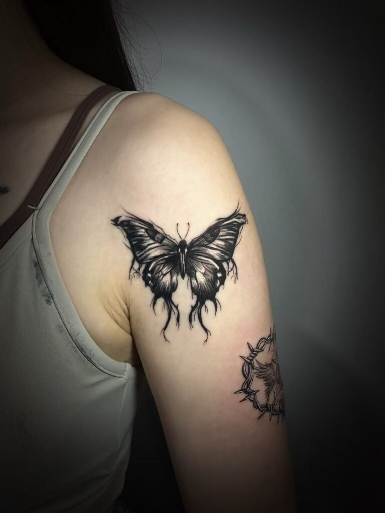
Tattoo design readability matters because a tattoo is seen on a moving body, from real viewing distances, under changing light. Tiny detail can be beautiful, but it only helps when the main shape, contrast and composition are already clear. If the design only works as a zoomed-in phone image, it may not work as a tattoo.
A readable tattoo does not have to be simple, bold or plain. It needs hierarchy: a clear subject first, supporting detail second, and enough open skin or tonal separation for the eye to understand the image. This guide explains how observation distance, scale, contrast and negative space help detail survive without promising how any tattoo will age.
What readability means in tattoo design
Readability is the ability to recognise the image before you study it. In a portrait, that might mean the head shape and expression read before the eyelashes. In a Japanese-inspired sleeve, it might mean the dragon, koi or guardian figure reads before the wave texture. In a black-and-grey realism piece, it might mean the dark mass and light path read before the small pores, hair strands or fabric grain.
The order matters. A tattoo that starts with detail can feel impressive in a cropped studio photo but confusing on skin. A tattoo that starts with readable composition can still reward close viewing. The closer viewer sees small marks; the ordinary viewer sees the subject.
This is why artists often push back on requests such as “can we include every part of this reference” or “can we make it smaller but keep all the detail”. The issue is not effort. The issue is whether the design has enough physical room for the viewer to separate one mark from another.
Observation distance: the phone view is not the body view
Most tattoo references are chosen on a phone. That creates a problem: the image is flat, bright and close to your eyes. A tattoo is matte, curved, partly filtered through skin, and usually seen from farther away. A design that looks detailed on a screen can become a grey patch when it moves to the forearm, calf or shoulder.
A useful test is to step back from the design. If the subject disappears when the drawing is seen at arm’s length, the tattoo may be depending too much on small marks. If the subject still reads at a social distance, the detail is supporting the composition instead of carrying it alone.
Visual contrast plays a role here. Eye-testing research separates visual acuity from contrast sensitivity: a person may detect high-contrast fine detail more easily than low-contrast detail of the same size. Tattoo design follows the same practical idea. A thin dark edge against open skin reads faster than several soft grey marks sitting close together.
Scale decides how much information skin can hold
Scale is not just “big or small”. It is the relationship between the size of the tattoo and the number of important things inside it. A single flower can be readable at a smaller size than a flower, animal, background, text and date all packed into the same space. A face needs more room than a silhouette because people recognise faces through small relationships between the eyes, nose, mouth and jaw.
When a client wants more detail, the cleanest solution is often more scale. The second-best solution is simplification. The weakest solution is shrinking every mark until the reference appears complete in a stencil but loses separation on skin.
Think of scale as a budget. Every design spends that budget on subject, shading, texture, background and empty space. If the subject is realistic, it spends a large part of the budget on form and value. If the piece is ornamental, it may spend more on rhythm and silhouette. If the budget is small, not every element can stay.
Contrast gives the eye a path
Tattoo contrast is not only black versus pale skin. It is the planned distance between values: dark, mid-tone, light and untouched skin. A readable tattoo usually has a clear dark area, a clear light area and a controlled middle. When everything sits in the same soft grey range, the tattoo may look subtle close up but disappear from a few steps away.
In black-and-grey tattoo work, contrast has to do the work colour would otherwise help with. A dark cheek shadow, bright skin break or heavy background can separate a face from the body. Without that separation, hair, background and shadow can merge into one field.
In Japanese and Asian-inspired tattoo work, contrast also controls movement. Waves, wind bars, flowers and figures need a hierarchy so the viewer knows what to read first. Dense background can be powerful, but only when it frames the subject rather than competing with it.
Negative space is not empty design
Negative space is open skin, lighter value or breathing room around an important form. Many clients see it as “blank space” and want to fill it. Artists see it as one of the things that keeps a tattoo readable.
Open skin can separate a jawline from a collar. It can stop two petals from becoming a single blob. It can give a sleeve a rhythm instead of turning every inch into equal noise. It can also help a tattoo suit the body, because skin moving around an image needs some visual rest.
Negative space is especially important when a design includes several textures. Fur, hair, smoke, scales and fabric all use repeated marks. If every texture receives the same density, none of them read. Leaving breaks between textures helps the eye tell them apart.
Detail should have a job
Tiny detail is strongest when each mark has a purpose. It can point to a focal area, describe texture, sharpen an expression or create rhythm. It becomes a problem when it is added only because the reference contains it.
Before approving detail, ask what it does. Does the hair texture help the face read, or does it pull attention away from the eyes? Does the background pattern support the subject, or does it split the focal point? Does a line of text improve the piece, or does it make the composition smaller than the body area deserves?
A detail that cannot be seen at the intended viewing distance is not necessarily worthless, but it should not be structurally essential. If the design collapses when the tiny marks soften or are seen from farther away, the composition is too dependent on them.
| Design choice | Helps readability | Can hurt readability |
|---|---|---|
| Subject hierarchy | One clear focal point | Several equal focal points |
| Scale | Enough room for important forms | Too many forms in a small area |
| Contrast | Clear darks, lights and skin breaks | Everything in close mid-grey |
| Negative space | Separation and rhythm | Every gap filled with texture |
| Detail | Supports expression or texture | Added because the reference has it |
Readability and aging: plan margin, not promises
Every tattoo changes as skin changes, sun exposure accumulates and pigment settles. That does not mean a readable tattoo is guaranteed to age a certain way. It means good design gives the tattoo more margin. Wider value separation, clearer shapes and less overcrowding can remain understandable even when the sharpest edges soften.
This is also why fresh photos should not be the only standard. A fresh tattoo is sharp because the skin is newly worked and the pigment appears high in contrast. The healed view is softer. The long-term view is shaped by placement, friction, UV exposure, skin changes and care. No article or artist can promise the exact result.
The practical point is simple: design for the body, not for the first close-up photograph. If a composition needs perfect sharpness to make sense, it may be too fragile. If it reads because the big shapes are right, the small details can settle without carrying the whole piece.
How to review a design before you say yes
Use this checklist before committing to a stencil or final drawing.
- Squint at it. If the subject disappears, the value structure may be weak.
- Step back. If it only works at phone distance, scale or contrast may need adjustment.
- Name the focal point. If you cannot name it quickly, the design may have too many equal parts.
- Look for open skin. If every gap is filled, the tattoo may have no breathing room.
- Compare size to detail. If the design includes face, text, texture and background, ask whether the placement has enough space.
- Ask what can be simplified. Removing one secondary element often makes the remaining design stronger.
You can view Yuyi Tattoo’s works to compare how larger pieces use dark mass, skin breaks and focal points. You can also meet Yuyi as a Singapore tattoo artist if you want to understand the fine-art background behind his composition decisions.
Sources and review date
- American Academy of Dermatology — Caring for tattooed skin — reviewed 24 August 2026.
- NCBI Bookshelf — Contrast Sensitivity — reviewed 24 August 2026.
- PubMed Central — Unveiling skin macrophage dynamics explains both tattoo persistence and strenuous removal — reviewed 24 August 2026.
Frequently asked questions
Does a readable tattoo have to be large?
Not always. A simple subject with strong contrast can read at a modest size. A realistic face, animal portrait, dense sleeve or multi-symbol memorial needs more room because the design contains more information. The artist should confirm whether the detail and placement are compatible.
Is tiny detail always a bad idea?
No. Tiny detail can be beautiful when it supports a larger shape. It becomes risky when the entire tattoo depends on small low-contrast marks. A better approach is to make the main image readable first, then decide which fine details are worth keeping.
Why does my artist want more negative space?
Negative space separates forms. It keeps a face from merging into hair, a flower from merging into background, or a sleeve from becoming one dense texture. Open skin is a design tool, not wasted area.
Can contrast guarantee better aging?
No. Contrast can give a tattoo more visual margin, but it cannot guarantee a fixed long-term result. Aging depends on skin, placement, friction, UV exposure, ink, application and care. The goal is a design with sensible margin, not a promise.
Should I choose black and grey if I want maximum readability?
Black and grey can be very readable when the values are planned well, but colour and Japanese-inspired work can also read strongly. The deciding factor is not the category alone; it is the relationship between subject, scale, contrast and body placement.
Planning a readable tattoo with Yuyi Tattoo
If you are deciding between detail and clarity, send Yuyi your subject, reference, placement and approximate size on WhatsApp: message +65 9128 0501. The studio address is Geylang, Singapore; message first so availability is confirmed before you visit.
For help planning your own tattoo, contact Yuyi Tattoo.

