
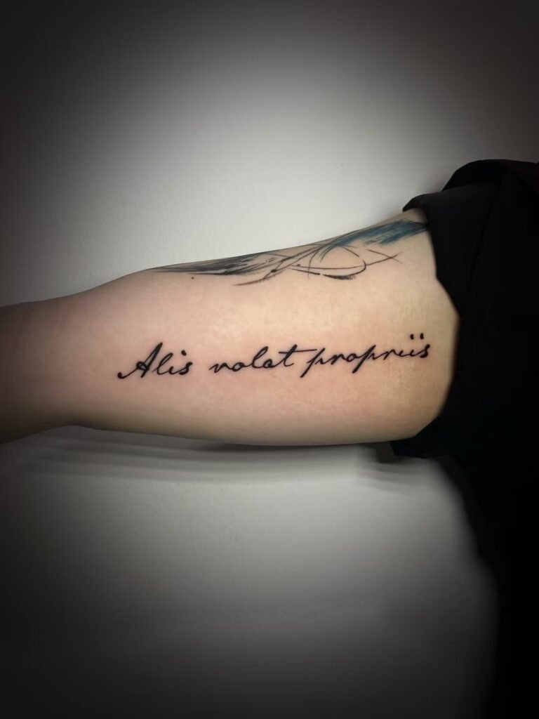
To turn a handwritten note or signature into a tattoo reference, start with the clearest possible scan or straight-on photograph, then provide a typed transcription of the exact words. Tell the artist who wrote it, whether you have permission to use it, which quirks must remain, and your intended size and placement. The source may still need selective cleanup or stronger spacing before it can work on skin.
If you are planning a handwriting tattoo in Singapore, do not send only a cropped screenshot and ask for an exact copy. Send the unedited source as well as the chosen excerpt. A tattoo artist needs to separate pen strokes from shadows, folds, stains and compression noise, then assess whether the thinnest marks and tightest gaps are workable at the requested size. A source can be deeply personal without being tattoo-ready.
Keep the words and the visual form as two separate references
Handwriting carries two kinds of information. One is the text: the name, phrase, date, initials or signature. The other is its form: slant, baseline, loops, spacing, pressure changes and the way one stroke joins the next.
Provide both. Type the wording exactly, including capitalisation, accents, punctuation and line breaks, even when it seems obvious in the photograph. Then attach the image that shows how the writer formed it. This gives the artist a way to check an ambiguous letter without quietly changing the look of the writing.
The distinction matters even more outside English. The Unicode Standard separates abstract characters from the glyphs that display them: the same character can have different visual forms, while similar-looking marks can represent different characters. A typed transcription confirms content; the original image confirms personal shape. Neither should substitute for a native-speaker or suitably qualified language review when the wording is not in a language you read confidently.
Capture the original before editing anything
A flatbed scan is usually the cleanest option for a loose sheet that can be handled safely. Scan the whole relevant area in colour, even if the ink appears black. Faded ink, paper tone, erasures and pressure changes can contain useful separation that an automatic black-and-white mode removes. Keep the first scan untouched and make any crops or contrast adjustments on a copy.
The US National Archives advises keeping originals after digitisation and placing flat papers fully on the scanner surface without forcing material that does not fit. Its guidance also warns against automatic feeders for fragile or valuable papers. Federal digitisation guidance treats handwritten, stained, faded and low-contrast documents differently from clean printed text, which is a useful reminder not to flatten every source into hard black and white.
If a scanner is not available, a careful phone photograph can still be useful:
- Lay the paper flat in bright, even light, with no flash glare or phone shadow.
- Hold the camera parallel to the page rather than shooting from an angle.
- Include the full note in one image, followed by a closer image of the chosen words.
- Tap to focus on the ink and check the result at full size before sending it.
- Turn off portrait mode, beauty filters, document cleanup and aggressive sharpening.
- Send the original file rather than a screenshot from a social platform or chat preview.
Do not press a fragile letter flat, remove it from an album roughly or unfold a damaged crease just to improve the photograph. A less perfect image is preferable to damaging the only original.
Choose the sample for character, not just neatness
The neatest signature is not always the most recognisable one. Look for the version that feels characteristic of the writer: the familiar capital letter, uneven baseline, long crossing stroke or unusual spacing you would recognise without seeing the name.
When possible, send two or three samples from the same period. Signatures change across years and may look different when written quickly, formally or under physical strain. Mark one sample as the primary reference and explain what the others clarify. Do not ask the artist to average them into a supposedly definitive signature unless that is genuinely what you want.
A harder case is a phrase the person never wrote in one piece. Separate letter samples may help explain individual forms, but joining them creates a new composition. It should not be described as an untouched line written by that person. Decide whether authenticity means preserving an existing fragment or building a handwriting-led design from several genuine samples. Those are different requests.
Record permission and source context
Write one plain sentence about the source: “This is my own handwriting,” “the writer has agreed to this use,” “this came from a family letter,” or “I am still checking who may authorise it.” Do not leave the artist to infer consent from possession of the file.
Permission can involve more than the writer. A photographed letter, commissioned scan or image taken from a book, archive, social account or another person’s post may contain third-party material. The Intellectual Property Office of Singapore advises obtaining the copyright owner’s permission before using a third party’s protected work and checking website terms before copying online material. For a fuller source check, use the tattoo reference image permission guide.
Consent and copyright are not the same question. A family member may be comfortable with the words but not with the full letter being shared. A living writer may agree to the tattoo but not to publication of the sample. A full legal signature may also reveal more identity information than a short handwritten word. State whether the source and finished tattoo may be photographed or displayed; do not assume tattoo permission includes portfolio permission.
Decide which imperfections are personal
“Clean it up” is too vague for handwriting. It can mean removing a paper shadow, closing a broken pen stroke, straightening the baseline, correcting spelling or replacing difficult letters. Those changes do not have the same effect.
Before design work, sort visible irregularities into three groups:
- marks that belong to the writer, such as a wobble, unusual loop, pressure break or off-centre dot;
- marks that belong to the paper or capture, such as a fold, stain, shadow, JPEG block or torn edge;
- marks you cannot identify with confidence.
The first group may carry the personality you want. The second can often be excluded from the tattoo reference. The third needs a decision, not a guess. Keep an annotated copy showing what you believe is ink, but always retain the unmarked source beside it.
There is no universal “correct” amount of cleanup. One person wants the hesitation in a parent’s line left visible; another wants the word made easier to read while keeping its overall rhythm. State the priority in concrete terms: preserve the capital and long tail, remove the paper crease, keep the uneven baseline, or do not correct the original spelling.
This article does not promise exact handwriting reproduction. Yuyi would need to review the actual sample, requested size and placement before confirming what can be retained, strengthened or simplified. A digital trace can follow pixels closely and still fail as a tattoo plan if those pixels include blur or if the resulting spaces are too tight.
Line weight and spacing set the workable size
Signatures often contain hairline upstrokes, overlapping loops and narrow closed spaces. On paper, those differences are part of the charm. At a small tattoo size, however, several separate marks may sit too close together to read as intended. Simply shrinking the scan does not solve that problem.
The artist may need to discuss selective strengthening, slightly more space around a loop, a simplified overlap or a larger overall size. The aim is not to turn personal writing into a generic font. It is to protect the features that make the sample recognisable while giving each important stroke enough room. The tattoo design readability guide explains the wider relationship between scale, contrast, open skin and viewing distance.
Ask for a size assessment rather than choosing a fixed width from a phone preview. Include the approximate height and width you prefer, but identify which limit is flexible. If the signature contains a large capital followed by much smaller letters, measure the entire shape, including long ascenders, descenders and finishing strokes.
Plan script tattoo placement as part of the reference
Writing has a reading direction and a baseline, so placement changes more than location. A straight phrase may sit differently on a flat inner forearm than on a curved shoulder, rib area or ankle. A long signature can wrap out of the main viewing angle, while a compact word may leave more flexibility.
Send a relaxed, unfiltered photograph of the body area and state the side in words. Explain who should read the writing upright: you looking down at it, or a person facing you. Mark the approximate top and bottom boundaries, note nearby tattoos, and say whether visibility under ordinary clothing matters. The final orientation and scale still need to be checked on the body before tattooing.
For very small placements, ask what has to change rather than asking whether every pen movement can be compressed. A short excerpt may preserve more personality than a full sentence squeezed into a narrow strip of skin.
Memorial handwriting is one use, not the whole topic
A memorial handwriting tattoo may use a note, card, recipe, envelope, schoolbook or signature. The capture and cleanup questions are the same as for living family members, partners, children or your own writing. What changes is the emotional and family context, not the technical need for a clear source.
Choose the exact fragment before adding dates, flowers, portraits or other symbols. If the broader task is deciding what the tattoo should say about a person, the memorial tattoo planning guide covers that decision. This guide stays with the narrower job of turning existing writing into usable reference material.
What to send for a useful first review
Prepare one compact message with:
- the untouched full-page scan or photograph;
- a close crop of the exact writing you want considered;
- a typed transcription, checked for spelling, accents and punctuation;
- the writer’s relationship to you and the permission context;
- the marks you want preserved and the capture artefacts you want excluded;
- your preferred size range, body side, placement and reading direction;
- a clear placement photograph taken in a relaxed posture;
- whether the source or tattoo should remain private.
Name files plainly so the full source, selected crop and annotated copy cannot be confused. Keep the original paper and the untouched digital file even after sending the brief.
When those materials are ready, use Yuyi Tattoo’s contact page to send the writing sample, desired size, placement and permission context. The review should begin with what the source actually supports, not with an assumption that every visible mark can or should become part of the tattoo.
Sources and review date
- US National Archives — Digitizing Family Papers and Photographs — reviewed 24 August 2026.
- Federal Agencies Digital Guidelines Initiative — Technical Guidelines for Digitizing Cultural Heritage Materials — reviewed 24 August 2026.
- Intellectual Property Office of Singapore — Ownership and Commercialisation — reviewed 24 August 2026.
- The Unicode Consortium — The Unicode Standard, Version 17.0, Chapter 2 — reviewed 24 August 2026.
Frequently asked questions
Is a scan better than a phone photo for a handwriting tattoo reference?
A scan is usually easier to assess because the page stays flat and the lighting is even. A careful, high-resolution phone photo can still work if the camera is parallel to the page, the ink is in focus and there are no shadows or filters. Send the full source as well as a close crop.
Can a signature tattoo be copied exactly?
Do not assume exact reproduction before the source, size and placement have been reviewed. The artist must distinguish genuine pen strokes from blur and paper damage, then assess whether very thin lines, overlaps and tight spaces are workable. State which features matter most instead of relying on the word “exact.”
Should shaky lines or spelling mistakes be corrected?
Only after you decide what authenticity means for this tattoo. A shaky line may be the personal feature you value, while a shadow or scan break is merely capture noise. Spelling correction changes the original text, so provide both the exact transcription and a clear written instruction about any requested change.
How small can a family handwriting tattoo be?
There is no useful universal minimum. The workable size depends on letter height, line weight, gaps, overlaps, total word length and placement. Ask the artist to assess the actual sample. Enlarging the piece or choosing a shorter fragment may preserve more of the writer’s character.
Can letters from different notes be combined into a new phrase?
They can be supplied as source material for discussion, but the result would be a new composition rather than one continuous line the person actually wrote. Label each sample clearly, provide the intended typed phrase and decide whether preserving an existing fragment would feel more authentic.
Do I need permission to use someone’s handwriting or signature?
Explain who wrote it and how you obtained the source. For a living writer, ask about the tattoo use and any sharing of the sample. If the writing or image comes from a third-party work, archive, professional scan or online source, check the relevant right holder and terms instead of treating possession of a copy as permission.

