
“Asian skin” is not a colour swatch. A useful colour discussion starts with your skin in ordinary light and the way the proposed design separates dark, middle and light areas.
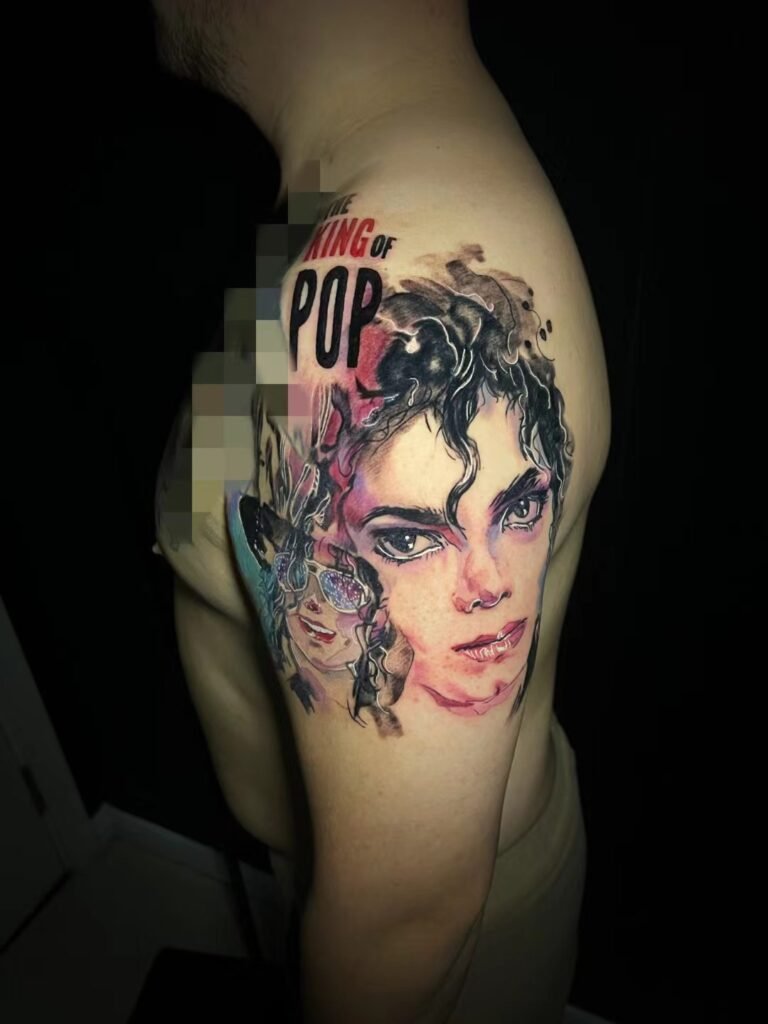
Make the comparison fair
- Look for images with neutral lighting rather than a strong warm filter.
- Ask whether the photograph shows fresh work or a later stage.
- Compare the whole design, not a tightly cropped patch of bright pigment.
- Notice whether the main shape remains clear when the image is viewed small.
Test the palette as a design
Ask for a limited-palette option as well as a full-colour version. A dark outline, a deeper background or more open skin may help distinguish forms; no single colour is guaranteed to look identical on every person.
A screen mock-up can explain the relationship between colours, but it is not a prediction of how pigment will appear in your skin. If your skin is currently sunburned or irritated, discuss rescheduling rather than using the temporary appearance as the colour baseline.
Make a small, labelled reference set
Keep one image for palette, one for contrast and one for the subject’s shape. A brightly lit colour portrait may show the palette you like without being a useful example of how a tattoo appears on skin similar to yours.
When a photograph is being used as evidence, ask what is known about lighting and timing. Do not treat an edited mock-up as a healed example or use a person’s broad ethnic label as a substitute for seeing their actual skin appearance. You can still express a preference clearly: “I want a strong dark frame and one warm accent” gives the artist more to work with than “Which colours suit Asian skin?”
Bring your colour references to Yuyi Tattoo with a clear placement photograph and the visual effect you want.

