
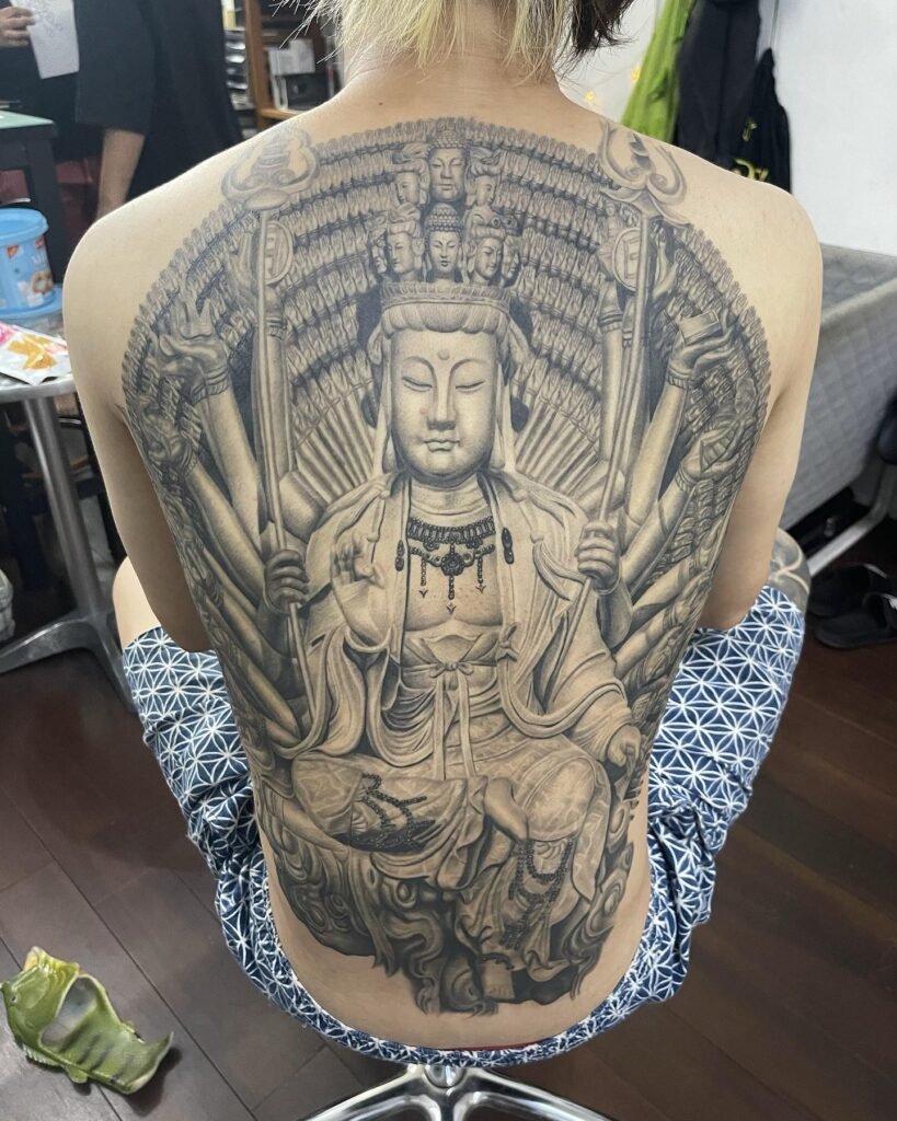
Light grey shading is chosen for subtlety. That also means the design has less visual contrast to spare. No artist can responsibly promise that a pale shadow will look identical on every person or remain unchanged for a fixed number of years.
Start with the drawing
A light background can work when the main subject has a stronger edge or darker focal point. A design that depends entirely on extremely faint marks is harder to judge from a bright screen. View the proposal at actual size and ask what remains readable if its lightest passages become less distinct.
Compare photographs carefully
- Ask whether the picture shows a fresh tattoo or a later result.
- Compare ordinary lighting, not just high-contrast edits.
- Look for comparable placement and skin appearance without assuming an exact match.
- Separate the artist’s documented examples from a digital mockup.
Long-term visibility is a design and maintenance discussion, not something a dilution percentage settles. If a faint effect is the whole attraction, discuss that trade-off before committing.
Use the Yuyi black-and-grey gallery to identify the balance of softness and contrast you prefer.

