
A shadow can make lettering appear raised, but it also adds another layer of visual information. The words should still be readable before anyone notices the effect.
Choose lettering that can support a second shape
Very fine script already contains tight loops and overlapping strokes. Adding a dark offset may close those gaps visually. A shorter word, simpler script or more open letter spacing may give the shadow room to work.
Block lettering offers a different option: larger surfaces can suggest dimension, but heavy outlines plus heavy shadows can look crowded. Compare a version without the shadow before deciding that it improves the text.
A practical wording trade-off
If a long quotation only fits when the letters and their shadows overlap, there are several honest choices: shorten the text, enlarge the layout, remove the effect or choose a different placement. Compressing every word into the original space is not the only option. Decide whether the words or the dimensional illusion matter more.
Check the whole line
- Confirm spelling, punctuation and any translation independently.
- Keep the shadow direction consistent across every letter.
- View the design at actual size, not only enlarged on a phone.
- Check how the text reads when the chosen body area turns.
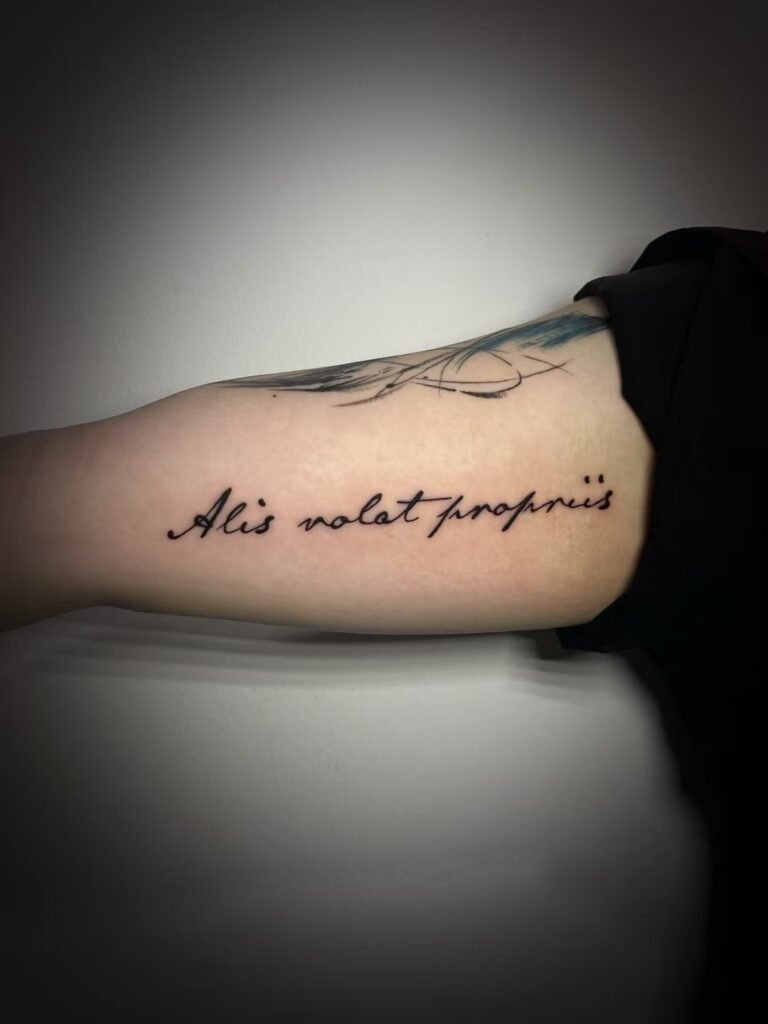
The accompanying Yuyi image shows cursive lettering on an inner upper arm, not drop-shadow text. Use it to discuss placement and word flow, then ask about a custom dimensional lettering design with the exact words you intend to use.

