
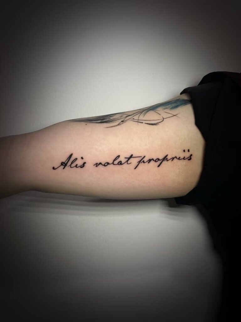
For readable quote tattoo placement, begin with the exact approved wording, then keep only the words that must remain. Break the excerpt at complete phrases or natural pauses, choose who should read it most easily, and compare layouts at actual size on a photograph of the relaxed body area. If letters or lines crowd one another, shorten the text, enlarge it, simplify the lettering or choose a placement with more usable space.
A moving body does not behave like a fixed page. A line can turn out of view around a forearm, a block can change shape when a shoulder rolls, and a narrow gap can close visually when the torso bends. The strongest plan gives the text a clear main view, enough space between letters and lines, and a reading order that still makes sense in ordinary posture.
Freeze the wording before arranging it
Create one plain-text master before discussing type style or body position. It should contain the exact spelling, capitalisation, punctuation, accents and line order you have approved. Record the language, author and source as well. A screenshot is useful as provenance, but it should not be the only master because decorative type can hide a wrong character or missing mark.
If the text is translated, finish the language review first. The tattoo text translation check separates source wording, literal meaning, intended meaning and final stencil review. Placement planning starts after those questions are settled. Changing a word to balance two lines can also change the meaning, so a visual edit must return to the approved language reviewer when another language is involved.
Poems and lyrics also require a rights check. The Intellectual Property Office of Singapore lists both as literary works that may be protected and warns against assuming online material is free to copy. Use your own writing, confirm that the intended use is permitted or obtain permission. A quotation graphic is not proof that its words are available for reproduction.
Shorten by meaning, not by character count
A complete poem may be emotionally important while still containing more text than the chosen body area can support. Start by identifying the smallest unit that carries the reason you selected it. That may be one sentence, one clause, one stanza or a short sequence whose meaning depends on its order.
Make three lists:
- words that must remain exactly as written;
- lines that add context but are optional in the tattoo;
- attribution, dates or decorative marks that could sit elsewhere or be omitted.
This separates meaning from visual weight. A long excerpt plus a large author name may function as two designs. If attribution matters, decide whether it belongs with the main text or as a quieter secondary element.
Avoid rewriting a protected or culturally specific passage merely to make the shape convenient. Removing a repeated line may alter emphasis. Dropping punctuation may join two thoughts that were separate. Cutting the opening or ending may change who appears to be speaking. When shortening is allowed, read the candidate excerpt without the missing context and confirm that it still says what you intend.
There is no universal maximum number of words for a tattoo. Ten short, open words can use less space than six words with wide capitals, long descenders or dense script. The decision has to be made from the exact letterforms, physical dimensions and body surface.
Treat line breaks as part of the sentence
Text tattoo line breaks control both reading and shape. A good break gives the eye a clear place to move to the next line without making the sentence feel accidental. A weak break may strand a preposition, separate a name from its modifier or make two lines appear to be independent statements.
Begin with a plain version and mark possible breaks at these points:
- the end of a sentence or clause;
- a natural pause supported by punctuation;
- the boundary between two balanced ideas;
- an original line ending that is important to the poem’s form.
Compare at least two arrangements. One may preserve the original lineation; another may use fewer, longer lines. Keep the wording identical so the comparison tests layout alone.
Look beyond the number of letters. A line ending in a wide word may extend farther than a longer line of narrow letters. Capitals, italics, flourishes and punctuation all change the silhouette. Centre alignment can make short and long lines form a stable block, while left alignment makes the beginning of each line easy to find. Neither is automatically better. The chosen edge needs to remain visible on the body.
Do not force a geometric rectangle by stretching spaces between words. W3C accessibility guidance concerns web text rather than tattoos, but it demonstrates a useful principle: readers can lose content when spacing is too tight, overlaps or is clipped. Tattoo spacing has no WCAG formula. The practical lesson is to protect open counters, distinct words and separate baselines at the intended physical scale.
Choose a text-block shape that suits the area
Long-form wording usually takes one of four shapes:
| Text shape | Useful when | Main risk to test |
|---|---|---|
| One long line | the phrase is short and the placement offers a clear path | one end turns away or the letters become too small |
| Compact block | several balanced lines fit a broad main view | line spacing closes and the block feels dense |
| Narrow stack | width is limited but there is enough height | too many line returns slow the sentence or create a tall strip |
| Lead line with supporting text | one phrase should be read first | the smaller secondary text becomes dependent on close viewing |
A broad block may fit the upper back, thigh or another area with a generous main view, while a narrow limb may invite more line breaks. These are starting observations, not placement rules. Existing tattoos, anatomy, clothing boundaries, intended visibility and the actual phrase can change the answer.
GOV.UK guidance for accessible print recommends reducing text before reducing type size when space is limited. Its measurements are not tattoo specifications, but the decision order is useful here: edit before shrinking.
Decide direction and audience separately
Ask two questions: where should the sentence begin, and who should see it upright in the neutral pose? A forearm quote oriented toward the wearer may appear inverted to a person facing them. Text that reads naturally to an observer may require the wearer to turn the limb. Neither choice is universally correct, but it must be chosen rather than discovered after the stencil is placed.
Vertical placement also needs a precise description. Latin words may run as a rotated horizontal line or as individually stacked letters. Chinese and Japanese text can use native vertical conventions in which characters remain upright, and punctuation or column order can change with the writing mode. The vertical and horizontal text tattoo placement guide covers those orientation decisions in detail. For a long quote, return the chosen direction to the line-break plan and check whether the full reading path is obvious.
Plan around curvature and movement
Choose one main reading view. It may be the broadest plane of a relaxed limb or a three-quarter torso view. Keep the beginning, key phrase and ending findable from that position.
Curvature affects the edges first. If the first word begins around one side of a limb and the final word disappears around the other, the reader must rotate around the body to reconstruct a single line. That can be intentional for private text, but it weakens immediate public readability. A multi-line block can face the same problem when the last words of every line turn away together.
Movement affects different areas in different ways. A baseline near a joint may arc when the joint bends. Line gaps can appear uneven as the surface compresses or stretches. Test a mock-up in the neutral pose that matters most, then check a second ordinary position. The goal is not to keep the text mechanically straight in every pose. It is to avoid a layout that only works in one staged photograph.
Use an unfiltered placement photograph that shows the surrounding area, and mark the approximate boundaries on a copy. Check an actual-size paper mock-up rather than relying on phone zoom.
Balance public and private readability
Visibility and readability are different decisions. A quote can sit in a publicly visible place but face the wearer. It can sit under clothing yet read immediately when revealed. Decide how much of the wording strangers should be able to see, whether the author or date should be public, and whether part of the passage may wrap out of view.
Private placement does not justify unreadably small type. You still need to recognise the words at a sensible viewing distance and in a comfortable posture. If reading requires a camera, extreme twist or memorised guessing, the design is relying on knowledge of the phrase rather than visible lettering.
Know when the wording is too long
The wording is too long for the proposed scale when reasonable spacing cannot be preserved, when line endings repeatedly disappear around the body, or when the letters can only be distinguished in an enlarged screen image. Another warning is a mock-up that appears as a dark texture before it appears as language.
At that point, use one or more of four changes:
- select a shorter approved excerpt;
- increase the physical size;
- move to an area with a more suitable width or height;
- simplify the letterforms and remove optional decoration.
Changing orientation alone does not create unlimited space. Turning a long sentence vertically may replace a width problem with a height problem. Adding more lines may fit the boundary but reduce line spacing. The tattoo design readability guide explains the broader relationship among scale, contrast and open space. Long text needs those same resources between letters, between lines and around the entire block.
Let lettering style follow the text plan
Choose expressive lettering after the excerpt, line breaks, direction and scale have a workable structure. Connected script can create rhythm, but repeated joins and flourishes may hide word boundaries. Brush-based forms can carry strong movement, yet dense turns and thick-to-thin contrast need room. Cleaner lettering may make proofreading easier while still requiring careful proportion and spacing.
Compare style options using identical wording and dimensions. The brush, script and lettering tattoo guide explains how stroke density, counters and language context change the decision. Reject any option that looks attractive only because you already know what it says.
Prepare a quote or poem tattoo brief
Before consultation, organise the project in this order:
- exact approved wording in selectable text;
- author, title, source and permission status where relevant;
- language and independent review status;
- words, punctuation and original line endings that must remain;
- one or two permitted shortened versions, if shortening is possible;
- preferred reader and reading direction;
- body area, approximate boundaries and intended visibility;
- a clear placement photograph plus any actual-size mock-up.
Do not send several screenshots without labelling which wording is final. Mark style references as visual direction, not as substitute text. If the passage is still changing, settle it before asking the lettering to solve the composition.
When the brief is ready, contact Yuyi Tattoo with the exact approved wording and a clear placement photograph. Include the approximate available height and width, your preferred reading direction and which lines may be shortened. The consultation can then test a specific text block against the body instead of trying to rescue an undefined long quotation at a small scale.
Sources and review date
- Intellectual Property Office of Singapore, Introduction to Copyright; reviewed 24 August 2026.
- Intellectual Property Office of Singapore, Ownership and Commercialisation; reviewed 24 August 2026.
- W3C Web Accessibility Initiative, Understanding SC 1.4.12: Text Spacing; reviewed 24 August 2026.
- W3C, CSS Writing Modes Level 3; reviewed 24 August 2026.
- GOV.UK, Accessible communication formats; reviewed 24 August 2026.
Frequently asked questions
How much of a poem should I use in a tattoo?
Use the shortest approved passage that still carries the meaning you want. That may be one clause, one sentence or one stanza. Check whether removing surrounding lines changes the speaker, emphasis or context, and confirm permission where the work is protected.
Should I keep the poem’s original line breaks?
Keep them when the lineation is important to the poem and the body area can support it. If the layout must change, compare versions without changing the words, then check that the new breaks do not alter meaning or make the reading order unclear.
Is vertical quote tattoo placement more readable than horizontal placement?
Not automatically. Vertical placement can suit a tall, narrow area, but it can also create a long reading path or ambiguous letter orientation. The language, script, reader, body curve and exact text determine whether it works.
Can a long quote stay readable as a small tattoo?
Sometimes the wording and letterforms are simple enough, but no general promise is possible. If actual-size testing shows crowded counters, overlapping lines or words that require zoom, shorten the excerpt, enlarge it, simplify the lettering or reconsider the placement.
What should I send before a quote tattoo consultation?
Send the exact approved wording as selectable text, its language and source, any required punctuation or line endings, your preferred direction, approximate dimensions and a clear placement photograph. State which wording is fixed and which parts may be shortened.

