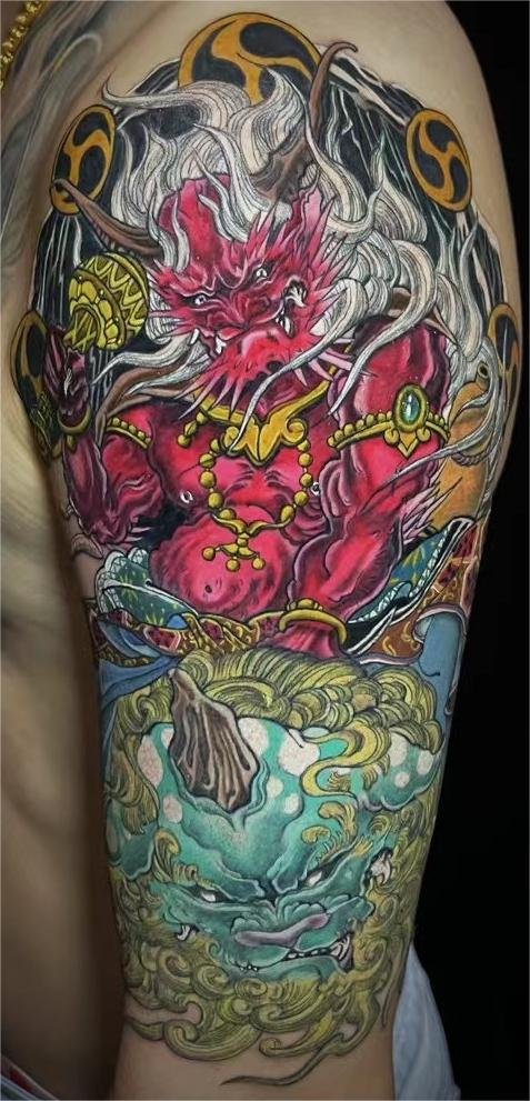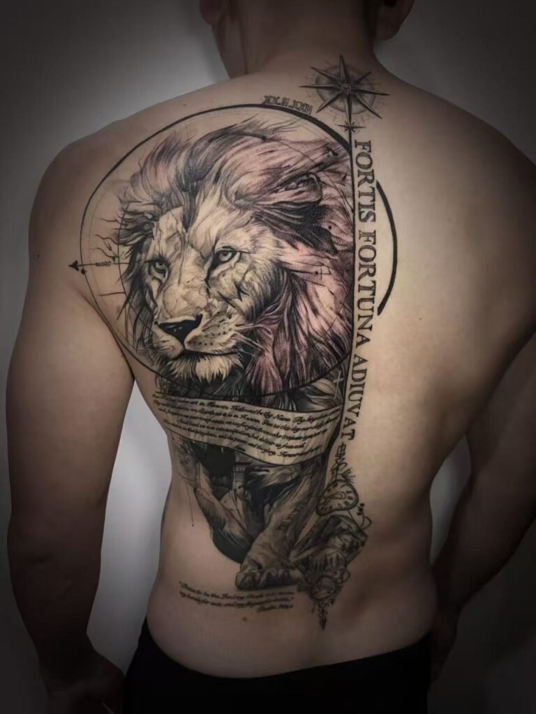
Planning a black and grey tattoo for any skin tone starts with value range: how clearly the darks, midtones, highlights and open skin separate from each other. The right question is not which skin tone is “best” for black and grey. The right question is how to build enough contrast for the design, placement and reference on the person who will wear it.
Skin tone should never be ranked as good or bad for tattooing. It is one part of the visual environment, alongside undertone, sun exposure, placement, skin texture and the design itself. A responsible black grey tattoo design uses the client’s skin as part of the palette and avoids promises about identical healed results. A useful consultation therefore needs unfiltered photos in ordinary light, plus healed examples that resemble the planned density and scale. Good planning leaves enough visual margin for the tattoo to remain understandable in everyday viewing conditions.
Start with respectful language
Clients often arrive with advice they found online: “this shade works on dark skin”, “that tone cannot take grey”, or “black and grey is only for lighter skin”. These are not useful design rules. They flatten people into categories and ignore the work an artist can do with value, scale and composition.
A better conversation sounds more specific. Which part of the design needs to read first? How dark should the shadow mass be? Where can open skin separate the subject from the background? What healed examples can the artist show across a range of clients? Which details can be enlarged or simplified so they do not depend on faint grey?
Use descriptions such as deeper skin tones, lighter skin tones and melanin-rich skin only when they help the design conversation. They describe visual conditions; they are not a beauty scale or ranking.
Why value range matters more than colour labels
Black-and-grey tattooing is built from value: black, dark grey, mid-grey, light grey and skin. On every skin tone, the tattoo only reads if those values remain separated enough for the subject to stand out.
On lighter skin, very pale grey may still be visible because it sits farther away from the surrounding skin value. On deeper skin tones, pale grey can sit closer to the skin’s natural value, so the same soft shading may read less clearly. That does not make the skin unsuitable. It means the design may need stronger darks, larger shapes, more open skin breaks or less dependence on faint tones.
The same principle applies in the opposite direction. A very heavy black design on any skin can lose form if the dark areas are packed without a value plan. Strong black is useful, but a black patch is not automatically a readable tattoo. The artist still needs transitions, edges and space.
How skin interacts with healed ink
Tattoo pigment sits in the skin rather than on top of it. Research on tattoo persistence describes pigment being held in dermal immune cells, while the visible result is still seen through the skin above it. Human skin also has optical properties shaped by melanin, haemoglobin and scattering. In plain language, your skin is not a blank sheet of paper; it is part of how the tattoo is seen.
This is why a digital mock-up cannot guarantee a healed tattoo result. Screens emit light. Skin reflects and absorbs light. The same grey wash that looks distinct on a monitor can look closer to the surrounding skin once healed. Lighting, camera settings and fresh swelling can also make a tattoo photo look different from how it reads in daily life.
For clients, the practical takeaway is to discuss value, not just style. Ask your artist where the darkest darks will sit, where skin will be left open, and which soft values are decorative rather than essential.
Design choices that help contrast across skin tones
A black-and-grey design can be adapted in several respectful ways without changing the client’s idea.
Use stronger value separation
If the reference is soft and low contrast, the tattoo may need a wider value range than the photo. This can mean deeper shadows, cleaner highlights and fewer midtones packed close together. The goal is not to make every tattoo harsh. It is to stop the important areas from blending into one soft field.
Let skin breaks do real work
Open skin can act like a highlight. Around an eye, cheekbone, flower edge or animal muzzle, small breaks can separate one form from another. On any skin tone, deliberate open space often reads more clearly than trying to fill every transition with pale grey.
Make the important shapes larger
Scale is one of the fairest tools. If a portrait, animal head or statue face carries the meaning, it needs enough room. Enlarging the subject protects the relationships between features better than adding more tiny grey marks.
Simplify low-priority texture
Hair, fur, smoke, scales and fabric can all become dense. If every texture receives equal detail, the tattoo loses hierarchy. Choose which texture matters most and let the others support it.
Choose placement with the design in mind
A stable, broad area gives the artist more control than a narrow or highly curved area. Placement will not guarantee a result, but it affects how much room the design has and how viewers see it.
You can compare black-and-grey composition on Yuyi Tattoo’s black-and-grey tattoo page and then browse the portfolio for different scales and body areas.
What to look for in healed examples
When reviewing healed work, do not look only for skin tone match. Look for design thinking. Does the face still separate from the background? Do the darkest values remain organised? Are there skin breaks around the focal point? Does the tattoo read from more than one distance?
A healed example on a similar skin tone can be helpful, but it is still not a promise. The person’s skin, placement, aftercare and sun exposure may be different from yours. A single photo also cannot show how the tattoo looks in every light.
A stronger standard is consistency across examples: clear subjects, controlled darks, readable edges and restraint with small grey detail. Those are design habits, not one-off results, and they matter during consultation.
Consultation questions to ask
Bring clear references and ask specific questions. This keeps the conversation practical and avoids general rules about skin.
- Where is the main focal point? It should be readable before the texture.
- What is the darkest area? The design needs a dark anchor.
- Where will open skin remain? Skin breaks help separation.
- Which soft greys are essential? If they disappear, the design should still make sense.
- Is the placement large enough? Scale should match detail.
- Can I see healed work with similar contrast needs? Similar design problems matter as much as similar skin tone.
- What should be simplified? Removing one weak area can improve the whole piece.
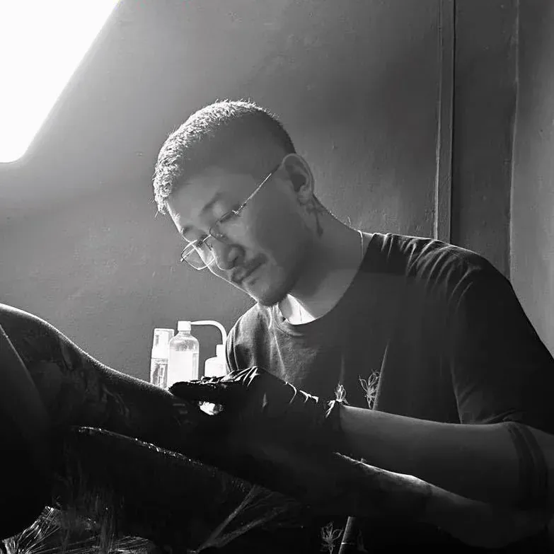
If you want to discuss feasibility with Yuyi, use the artist page for background, then contact the studio with reference, placement and approximate size.
Limits of a design consultation
A design consultation cannot promise that black-and-grey ink will look the same on every person, a fixed level of contrast after healing, a certain lifespan or a medical outcome. Skin conditions, allergies, scarring and treatment are questions for a qualified clinician rather than a tattoo consultation.
For tattoo planning, the useful promise is narrower: the design can be discussed with respect, specificity and evidence. A good consultation should leave you with a clearer understanding of what will be enlarged, simplified, darkened, opened up or moved to help the tattoo read.
Sources and review date
- PubMed Central — Effect of skin color on optical properties and the implications for medical optical technologies: a review — reviewed 24 August 2026.
- NCBI Bookshelf — Biochemistry, Melanin — reviewed 24 August 2026.
- American Academy of Dermatology — Caring for tattooed skin — reviewed 24 August 2026.
- PubMed Central — Unveiling skin macrophage dynamics explains both tattoo persistence and strenuous removal — reviewed 24 August 2026.
Frequently asked questions
Is black and grey tattooing suitable for darker skin tones?
It can be, when the design is planned with enough value separation, scale and open skin. The answer depends on the subject, placement, reference and contrast plan, not on ranking skin tones. Ask for healed examples and a clear explanation of the value range.
Should darker skin always use heavier black?
Not always. Strong darks can help, but too much black without structure can flatten the design. The better question is where the dark anchor belongs, where highlights will remain, and which midtones can be simplified.
Can pale grey shading show on every skin tone?
No artist should promise that. Pale grey can sit too close to some natural skin values or undertones to carry important information. If pale grey is used, it should support the design rather than hold the focal point by itself.
Are colour tattoos impossible on melanin-rich skin?
No. Colour can work on many skin tones when palette and contrast are planned. The same respectful principle applies: design for the individual client and avoid universal claims.
What should I send before asking about contrast?
Send the reference, placement, approximate size and any healed examples you like. If possible, include a clear photo of the body area in normal light. This helps the artist discuss value and placement without guessing.
Planning black-and-grey contrast with Yuyi Tattoo
Send your reference, placement and approximate size to Yuyi Tattoo on WhatsApp: message +65 9128 0501. The studio is in Geylang, Singapore; message first so availability is confirmed before visiting.