
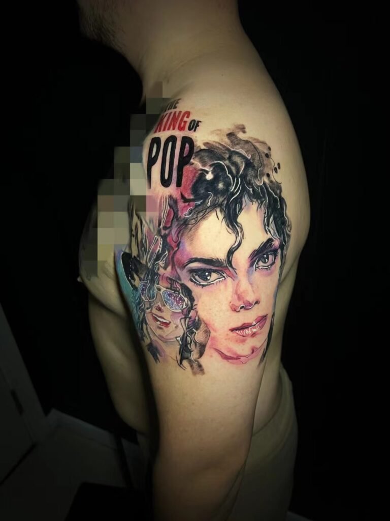
Realism and photorealism do not describe certified grades of tattoo quality. In a design brief, realism usually means that the subject should look convincingly three-dimensional and recognisable, while photorealism often signals closer dependence on the lighting, crop, surface detail and visual character of a photograph. Artists and clients may use the terms differently.
The useful question in a realism vs photorealism tattoo discussion is not which label sounds more advanced. It is how faithfully the tattoo should follow one photograph, what may be recomposed, which details carry identity, and where simplification is acceptable. Describe those choices and the artist has a workable brief rather than a style word open to interpretation.
These are working terms, not quality rankings
In art history, realism is a broad idea with several meanings. It can refer to recognisable subjects, close observation or particular movements and periods. A realistic portrait may still contain selective emphasis, altered edges or a background designed by the artist. Likeness does not require a mechanical copy of every visible mark.
Photorealism has a narrower historical association. The National Gallery of Art describes it as a highly realistic approach that seeks to reproduce the detailed content and momentary composition of photographs. That definition is helpful background, but tattoo conversations are less standardised. One artist may use “photorealistic” for a very close photographic translation; another may call the same result high-detail realism.
Neither word certifies technical skill, healed quality or accuracy. A label in a portfolio category also does not guarantee that every reference suits the treatment. Judge the work itself and ask the artist what the word means in the context of your source image.
What changes when the brief says photorealism
The word usually increases the importance of observed evidence. It tells the artist that the exact direction of light, the small asymmetries of the face, the texture of hair or fabric, and the camera’s crop may be part of what you value. It may also tell the artist that you do not want the subject idealised into a generic, perfectly symmetrical version.
That still leaves several questions unanswered:
| Brief decision | A broader realism brief may allow | A close photographic brief may prefer |
|---|---|---|
| Source relationship | Several references combined into one convincing subject | One primary photograph controlling most visible facts |
| Composition | Reframing, reordered supporting elements or a new background | Crop and camera viewpoint kept close to the source |
| Surface treatment | Selected texture and simplified transitions | More of the source’s pores, fabric, reflections or grain retained where workable |
| Lighting | Values redesigned for clarity | The photograph’s light pattern preserved as a defining feature |
| Stylisation | Sharper edges, softer shadows or selective emphasis | Less visible departure from the photographic appearance |
This is a spectrum, not a test. A realistic tattoo may be highly detailed without copying a single photograph closely. A photorealistic intention may still require major editing before it can work on skin.
“I want it to look exactly like the photo” needs unpacking
Clients often use “exactly” to protect one thing they fear losing. It might be the person’s expression, a pet’s distinctive eyes, the angle of a car, the pattern of an object or the quiet mood created by the light. Few people literally mean that every background object, camera artefact and accidental shadow must remain.
Identify the protected feature. For a portrait, the answer may be facial likeness. For an object, it may be proportion and material. For a scene, it may be the arrangement of figures. Once that priority is stated, incidental information can be judged rather than copied by default.
MoMA defines a portrait as a representation of a particular individual that may be literal, realistic, interpretive or symbolic. That range explains why two realistic portraits based on the same person can look different without either being careless. The artist chooses what to observe, what to emphasise and what the medium can carry.
For a portrait-specific discussion of service fit and documented work, see portrait realism tattoo planning in Singapore. This terminology guide stays with the brief itself rather than making a claim that one label describes every project.
Skin is not a backlit photograph
A photograph is a flat image with fixed lighting. A screen can display bright whites and subtle low-contrast colour transitions. A tattoo is read through skin, on a curved surface, under whatever light is present. It moves when the body moves and it is usually seen from farther away than a photo being enlarged on a phone.
The translation therefore has to preserve visual structure, not every pixel. The Getty’s formal-analysis resources separate value, meaning how light or dark a colour is, from hue and intensity. That distinction matters in realism. If the major light and dark shapes are unclear, adding more small texture will not make the subject feel more photographic. If the values are organised, selective detail can make the image feel specific without covering every area equally.
Some changes are material decisions rather than style drift:
- joining broken dark shapes so the subject reads at the intended size;
- opening a light area that would otherwise close up visually;
- reducing background noise around an eye, mouth or other focal feature;
- turning hundreds of hair strands into directional groups;
- separating two similar values that merge when translated from a bright screen.
Calling those choices simplification does not mean requesting a lower-quality tattoo. It means deciding which photographic information must survive the change of medium.
Source quality sets the evidence available
A photorealistic brief places more weight on the source because small observed details are part of the request. A sharp original file with clear light gives the artist more reliable information than a screenshot, filtered copy or heavily compressed download. A larger file cannot compensate for missed focus, motion blur or a hidden feature.
This does not mean a broader realism brief can rescue any weak image. It may allow the artist to interpret more freely, combine references or simplify an uncertain area, but it cannot turn invented detail into verified likeness. If identity matters, the brief should distinguish what is visible from what is inferred.
Use the portrait tattoo reference photo guide for the full focus, lighting and crop assessment. For this conversation, prepare one primary source and label any supporting images by purpose. “Primary image for expression; second image for the hidden ear; third image for clothing colour” is much clearer than an unranked collage.
Crop and composition can matter as much as detail
Photographic fidelity may refer to the crop, not only the texture. A tightly framed face creates a different impression from the same person shown with shoulders and environment. A low camera angle changes the proportions. Background blur directs attention differently from a hard-edged wall.
Ask whether the crop is one of the must-keep features. If it is not, the artist may be able to give the subject more breathing room, adapt the silhouette to the body area or remove an object that competes with the focal point. If the crop is central, placement and scale should be chosen around it rather than forcing the photograph into a narrow space.
A new composition can still be realistic. The subject may come from one image, the clothing from another and the setting from a third, provided the perspective and light can be reconciled. The guide to combining tattoo references explains how to assign each source a role without asking for a visual collage that contradicts itself.
Decide where interpretation is welcome
A strong brief does not merely list what must be copied. It marks the areas where the artist can solve problems. Divide the project into three groups.
Must remain
These are the recognition anchors: expression, head angle, distinctive asymmetry, a particular object, exact pose or specific lighting mood. Keep the list short enough to guide the design.
May change
These are elements you like but do not need literally: background, clothing edge, crop, depth of field, minor texture or the position of secondary objects. Flexibility here gives the artist room to fit the body and viewing distance.
Remove or avoid
Name anything that would make the result feel wrong: beautifying the face, exaggerating pores, keeping a distracting object, adding dramatic smoke or turning natural light into a harsh spotlight. Negative instructions can be more precise than another style label.
This three-part note also helps when your references point in different directions. The artist can see which source is evidence, which is atmosphere and which visual habits you do not want.
Detail is not the same as likeness
Photorealism is often associated with visible texture, but texture is not what makes a particular face recognisable. The spacing and shape of the eyes, the relationship between nose and mouth, the jaw, hairline, expression and head angle do more of that work. Rendering every pore while shifting those relationships can produce a highly detailed stranger.
For non-portrait subjects, proportion and major edges play the same role. Reflections on metal will not save the wrong wheelbase of a car. Individual feathers will not save the wrong head silhouette of a bird. Put structural accuracy before decorative detail.
Close detail also needs a viewing context. A tattoo can reward inspection without depending on tiny marks for its main read. If every identity cue disappears when the piece is seen at normal distance, the brief may be asking detail to do the job of composition.
Keep ageing questions separate from terminology
Neither realism nor photorealism predicts a fixed long-term appearance. Scale, contrast, placement, exposure and individual skin all affect how a tattoo changes. Calling a design photorealistic does not guarantee that its smallest marks will remain unchanged, and calling it realism does not make it more durable by definition.
Discuss the amount of detail in relation to the proposed size. Ask which edges and value separations carry the subject if the finest texture becomes less prominent. The realism tattoo ageing guide covers that separate decision without treating a style label as an outcome promise.
Turn the label into a useful enquiry
Before you contact Yuyi Tattoo, prepare a short realism brief with:
- one primary image at its best available quality;
- the exact subject and the reason this particular source was chosen;
- the crop, expression, pose or light that must remain;
- the background and texture that may be changed or removed;
- the preferred placement and approximate size range;
- examples of what you mean by realistic, labelled by the feature you like;
- permission information for any image you did not create.
Write “close to this photograph” if that is what matters. Write “recognisable but recomposed for the body” if you want more interpretation. Those sentences say more than choosing the more impressive-sounding label, and they give the artist a clear starting point for feasibility review.
Sources and review date
- National Gallery of Art — Teaching Art Since 1950 — reviewed 24 August 2026.
- Museum of Modern Art — Portrait — reviewed 24 August 2026.
- J. Paul Getty Museum — Understanding Formal Analysis — reviewed 24 August 2026.
Frequently asked questions
Is photorealism automatically more detailed than realism?
Not under a universal standard. In ordinary tattoo use, photorealism often suggests closer visual dependence on a photograph, while realism may allow more interpretation. Either can contain extensive detail. Ask what the artist means and compare actual work rather than ranking the labels.
Does a photorealistic tattoo have to copy one photo exactly?
No. The brief may preserve one photograph’s likeness and light while changing the crop or removing background clutter. Any departure should be discussed, especially when a particular composition is emotionally important or when the image belongs to someone else.
Can several photos be combined in a realism tattoo?
They can, but each source needs a clear role and compatible perspective. One image may control expression, another may clarify a hidden feature, and a third may guide clothing. Combining conflicting ages, angles or light without a hierarchy can weaken the result.
What should I say if I want realistic likeness but not every pore?
State that facial relationships and expression are the priority, while micro-texture may be simplified. Add the intended placement and size. That instruction separates identity from surface detail and gives the artist room to plan for ordinary viewing distance.
Can either term guarantee how the tattoo will age?
No. The terms describe visual intention, not a guaranteed lifespan or healed result. Long-term appearance depends on design, scale, placement, exposure, skin and care. Review those factors separately from the terminology used in the brief.

