
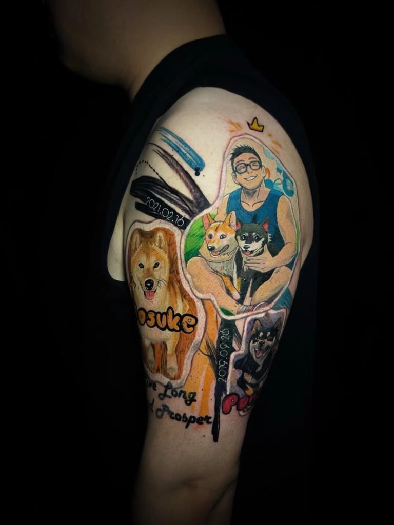
For a tattoo brief, send a photograph when factual appearance matters and a drawing when visual interpretation matters. A photograph is usually stronger for likeness, pose, lighting, material texture and the relationship between real objects. A drawing is usually stronger for composition, emphasis, simplification, line character and the style you want the finished image to suggest.
Sending both is often useful, but neither format is automatically complete. A photograph can contain distracting detail or camera distortion. A drawing can make an elegant design while changing anatomy, proportion or surface texture. The useful question is not which format is better. It is which decision each image is meant to support.
The quickest way to compare the two formats
| Design question | A photograph usually communicates best | A drawing usually communicates best |
|---|---|---|
| What must look recognisable? | A particular face, animal, object or place | A selected feature or deliberately stylised version |
| How does light describe the form? | Actual highlights, shadow direction and reflected light | A chosen value pattern, including invented or simplified light |
| What is the pose? | A moment observed through a camera from one viewpoint | A pose adjusted for rhythm, clarity or body placement |
| What does the surface look like? | Skin, fur, feathers, fabric, metal, stone or wood | A graphic shorthand for texture rather than every real mark |
| What should the eye notice first? | Sometimes clear, but often mixed with background information | Usually deliberate because the artist selected the hierarchy |
| What style is intended? | The photographic look itself, unless another direction is stated | Line, shape, exaggeration, colour and rendering choices |
Treat this table as a diagnostic tool, not a rigid rule. A carefully staged photograph can have a very deliberate composition. A highly observed drawing can contain precise anatomy and texture. The point is to identify what the image actually proves instead of assuming its file type tells the whole story.
What a photograph can tell the tattoo artist
Likeness and identifying structure
If the subject is a specific person, pet, building, heirloom or vehicle, photographs can preserve details that should not be guessed. The distance between facial features, the shape of a dog’s markings, damage on an old watch or the profile of a family home may carry the identity of the subject.
The best source is not always the most dramatic photo. A severe side light can make a face look cinematic while hiding one eye and flattening the far side of the nose. A wide-angle phone photo taken close to the subject can enlarge whatever is nearest the lens. For a portrait, compare the main image with another view before treating every apparent proportion as fact. The separate portrait tattoo reference photo guide explains focus, crop, angle and occlusion in more detail.
Lighting and value
A photo records a particular lighting event. It shows where shadows fell at that moment, how a glossy surface reflected light and which edges disappeared into the background. This can be useful for black-and-grey work because it gives the artist tonal information rather than a list of colours.
Lighting is still a choice, not an obligation. Two photos of the same face may suggest completely different moods because one uses soft frontal light and the other has a hard shadow across the eyes. Label the image that carries the lighting direction you prefer. Otherwise, the artist may preserve likeness from one photo while assuming that the strongest shadow in another is also essential.
Pose, gesture and contact
A photograph is useful when the relationship between parts matters: how hands hold an object, how an animal turns its head, how fabric folds around a shoulder or how two people lean toward each other. It can reveal weight and contact that a decorative sketch leaves vague.
One frame also freezes movement. A running animal photographed mid-stride may look awkward when separated from the sequence. A dancer’s arm may hide the torso. Send a second angle or an adjacent moment if the chosen frame makes the body hard to understand. The artist then has evidence for the gesture without being trapped by an accidental overlap.
Texture and small physical facts
Photographs can distinguish fur from feathers, polished metal from worn metal, or smooth petals from serrated leaves. They can also show irregular facts that give a subject character. That does not mean every pore, hair or scratch belongs in the tattoo. Texture should support the main form at the intended scale.
When texture is the reason for the photo, say so. “Use this for the weathered wood, not for the camera angle” is a clear instruction. Without that note, the artist has to decide whether the image controls texture, composition or both.
What a drawing can tell the tattoo artist
Selection and hierarchy
A drawing shows what its maker chose to include. A plant illustration may separate the blossom, leaves and stem more clearly than a garden photo. A character sketch may enlarge the face and reduce the costume. A rough thumbnail may establish one dominant shape before any texture is added.
This selective quality is valuable for tattoo planning. Skin has a finite area, and a design needs an order of attention. If you like how a drawing makes one element dominant, identify that decision: “The mask should be the focal point; the flowers can remain secondary.” The drawing then communicates hierarchy rather than becoming an instruction to reproduce every line.
Composition and negative space
Drawings can arrange parts that never appeared together in one photograph. They can turn a vertical animal pose into a diagonal composition, leave open space beside a face or move foliage away from an important silhouette. They can also show how a subject might fit a long calf, a shoulder cap or a broad upper back.
Look at the outside shape before studying interior detail. Does the design read as one mass or several disconnected icons? Where does open skin separate the subject from its support? Which edge is meant to face the hand, shoulder, spine or chest? These are compositional messages that a drawing can state more clearly than an unedited photograph.
Line, exaggeration and visual tone
A drawing can show whether you prefer controlled contours, broken marks, bold graphic shapes or a softer illustrated finish. It can lengthen a dragon, widen a flower, simplify a wave or exaggerate an expression. These changes may be the whole reason you chose it.
Describe the visible choice instead of relying on a broad style label. “I like the large dark shapes and restrained facial detail” is more precise than “make it traditional.” “Keep the long body and angular wings, but not the decorative border” separates form from ornament. This gives the artist usable direction even when you do not know the name of the style.
What a drawing may leave unresolved
A beautiful illustration may not show what the subject looks like from another angle. It may hide a hand, invent impossible lighting or stretch anatomy to suit the page. It also does not show how large the image needs to be on skin. A narrow drawing can look clean on a screen while carrying more interior linework than the proposed placement can support.
If a drawing is central to your idea, add factual references where accuracy matters. A tiger drawing can be paired with a clear tiger photograph for muzzle and stripe structure. A building sketch can be paired with straight-on and three-quarter photographs. The drawing sets the interpretation; the photos prevent unintended invention.
Choose the anchor and the instruction
A practical brief often needs two roles:
- The anchor establishes what must remain accurate. This is commonly a photograph when the subject is specific.
- The instruction shows how that subject should be interpreted. This is commonly a drawing, print or illustration.
For a family portrait, the anchor may be a high-resolution photograph and the instruction may be a charcoal drawing that shows the desired crop and tonal restraint. For a botanical tattoo, the anchor may be a clear specimen photo and the instruction may be an illustration with a cleaner stem rhythm. For a Japanese-inspired subject, a museum print may communicate pose and graphic structure while separate placement photos show the body area.
Sometimes the roles reverse. Your own finished drawing may be the accurate anchor because its shapes are the subject. A photograph of a tattoo on a similar body area may then be useful only to show scale or direction. State the role of each image rather than asking the artist to infer it.
If you have several files, the guide to combining tattoo references helps assign one job to each without turning the pack into a collage to copy. This article stays narrower: it asks what information comes from a photo and what comes from a drawing.
When one format is enough
A photograph may be enough when you want a straightforward study of a specific object and can explain the crop, placement and finish in words. A drawing may be enough when you own the artwork, the subject is already fully designed and factual likeness is not part of the request. A simple abstract mark may need neither format if a clean vector or your own diagram states it better.
Use both when the main image answers one question but leaves a costly ambiguity. Add a drawing when a photo has the right subject but the wrong composition. Add a photo when a drawing has the right style but uncertain anatomy. Add body photos when neither visual reference explains placement.
Do not add an image merely to make the pack look comprehensive. Each extra source creates another possible instruction. A compact set with labelled roles is easier to assess than a folder in which every image competes to be primary.
Inspiration, ownership and permission are separate
A useful reference is not automatically a lawful request to copy. IPOS lists drawings, paintings and photographs among works that may receive copyright protection. Its guidance on images found through online portals also advises checking the portal terms and, when those terms do not cover the intended use, contacting the copyright owner for consent.
This means a photograph can be visually accurate while still presenting a rights question. A drawing can express the perfect composition while still belonging to another illustrator. Credit, ownership of a downloaded file and permission to reproduce are different matters. Use the tattoo reference image permission checklist when a professional photograph, contemporary artwork, online image or another artist’s tattoo is central to the idea.
The Library of Congress guide to analysing photographs and prints offers a useful habit: observe what is present, reflect on why the image was made and ask what is missing. Applied to a tattoo brief, that prevents mood and assumption from being mistaken for visual evidence.
Send a brief that resolves the remaining questions
Label each attachment with one sentence:
- Photo 1, identity: use this face and expression as the likeness source.
- Photo 2, texture: use this only for the fabric and metal surfaces.
- Drawing 1, composition: I like the diagonal pose and open space above the head.
- Drawing 2, style: I like the restrained linework, not the added flowers.
- Placement photos: left outer upper arm, shown relaxed and raised.
Add the subject, body area, approximate dimensions and any element that must stay or must be excluded. The tattoo enquiry guide gives a complete first-message structure. When your references have clear roles, contact Yuyi Tattoo with the original files rather than compressed screenshots where possible. Sending a brief starts a discussion; it does not confirm a design, price, artist or appointment slot.
Sources and review date
- IPOS: Introduction to Copyright | reviewed 24 August 2026.
- IPOS AskGov: Using images from Google Images or other portals | reviewed 24 August 2026.
- Library of Congress: Teacher’s Guide to Analyzing Photographs and Prints | reviewed 24 August 2026.
- IPOS and PDPC: Copyright and Personal Data in Portrait Photography | reviewed 24 August 2026.
Frequently asked questions
Should I send a photo, a drawing or both for a tattoo?
Send the format that answers the important question. Use a photo for factual likeness, pose, lighting or texture. Use a drawing for composition, simplification, line and emphasis. Send both when one image supplies the subject and the other supplies the intended interpretation.
Can a drawing replace a poor portrait photograph?
It can show the crop or style you want, but it cannot reliably restore facial information that was never recorded. If likeness matters, send every usable photo of the same person and identify the most trustworthy features. The artist can then explain what can and cannot be supported by the evidence.
Is a screenshot of an illustration a useful drawing reference?
It may communicate a broad visual preference, but screenshots often lose resolution, source information and context. Find the original post or publication when possible, record the creator and check permission before asking for close reproduction. Use the image for a named quality rather than treating it as a template.
How do I explain that I like the style but not the subject?
Name the visible feature: line weight, amount of black, colour range, edge treatment, background density or level of exaggeration. Write “Use this for the line and open space, not for the bird.” That is clearer than asking the artist to copy the image’s overall look without limits.
Do more references produce a more accurate tattoo brief?
Only when each reference resolves a different question. Repeated or conflicting images can make the brief less accurate because the artist cannot tell which one controls the design. Choose an anchor, state the role of every supporting image and remove anything that adds no new information.

