
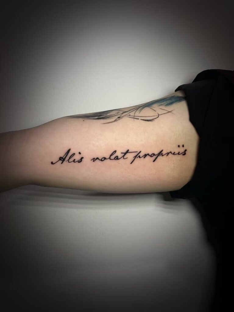
Choose horizontal text when familiar, immediate reading from one main view matters most. Choose vertical text when a short phrase suits a long body axis, but decide whether the characters stay upright or the entire line rotates. Text can also curve with the body or wrap around a limb, with the trade-off that the full wording may not be visible at once.
Vertical text tattoo placement has no fixed best answer by language. A useful decision starts with six points: the exact verified wording, the path of the line, the order in which it should be read, the orientation of each character, the intended viewing angle, and space for future additions. Set those points before judging a placement from a single close-up image.
Separate the text path from the character orientation
“Vertical” is incomplete as a design instruction. It can describe at least three different layouts:
- A normal horizontal line rotated 90 degrees so the whole word runs along the length of the body.
- Upright letters stacked one below another.
- A script with an established vertical writing convention, arranged as a true vertical line or column.
Those layouts do not read in the same way. An English name rotated as one unit keeps its normal letter sequence and word shape, although the viewer must turn their head or change position. The same name stacked letter by letter keeps every letter upright but removes the usual horizontal word shape. A vertical Chinese line uses a language-specific reading order and may require different treatment of punctuation or mixed Latin characters.
Define the path separately: straight across, straight down, diagonal, arcing with a body landmark, or wrapping around a limb. Then define what counts as the top of every character. A labelled mockup should make both decisions visible.
Compare four placement structures
| Structure | Main strength | Main trade-off | Question to settle |
|---|---|---|---|
| Horizontal line | Familiar reading for languages normally set horizontally | Needs enough width and a reasonably clear main view | Which side is the beginning when the body is relaxed? |
| Vertical line or column | Uses a long, narrow area efficiently | “Vertical” may leave character orientation and start point unclear | Do characters stay upright, and does reading begin at the top or bottom? |
| Curved line | Can follow a collarbone, shoulder, rib edge or another body contour | The baseline changes as the body moves | Which view should make the curve look intentional? |
| Limb wrap | Makes the turn around the arm or leg part of the composition | The complete phrase is rarely visible from one angle | Is sequential reading acceptable? |
This is a framework, not a placement ranking. A short name and a long quotation have different space demands. A public-facing sentence and a private reminder have different viewing priorities.
Horizontal text: the clearest baseline for English
For an English quote, name or date, horizontal layout is the most familiar starting point. A controlled study of English reading on displays found that horizontal text was read faster than three vertical formats, including rotated text and upright letters stacked vertically. That research was not conducted on tattoos, so it does not predict how a particular piece will perform on skin. It does support a modest design point: a familiar reading format asks less of the viewer.
Horizontal does not mean flat. A line can rise, dip or disappear as posture changes, and a forearm line changes angle as the wrist turns. Judge the final stencil on the body rather than from a level digital file.
Long quotations need more than a preferred body part. Count the words, identify natural phrase breaks and decide whether the text remains one line or becomes several. Reducing every letter simply to force a long sentence into a narrow space can weaken text tattoo readability. Editing the quotation, increasing the available area or choosing a different line structure may be cleaner than compressing it.
Vertical English: rotated line or stacked letters?
A rotated English line preserves the ordinary sequence of the word. Its letters share a baseline, and the full line turns as one object. The unresolved choice is direction. On a forearm, for example, the first letter might begin near the wrist or near the elbow. Neither choice is universally correct. One may suit the wearer’s own view; the other may suit a person facing the wearer.
Stacked upright letters work as individual shapes before they work as a word, which can suit a short name or acronym. A sentence treated this way becomes a long chain. Word spaces and punctuation also need deliberate handling.
Do not approve a sketch labelled only “vertical.” Ask for two versions at the same size: one rotated as a complete line and one with upright stacked letters. Add an arrow marked “read from here” and photograph each version from the intended main view. That simple comparison resolves more than a description such as “facing up.”
Chinese reading direction must be specified, not assumed
The W3C Requirements for Chinese Text Layout describes standard vertical composition with characters running from top to bottom and multiple lines progressing from right to left. It describes modern horizontal composition with characters running left to right and lines progressing downward. A one-column tattoo removes the page-level column question, but the start, finish and character order still need to be stated.
Vertical Chinese is not produced by rotating a horizontal screenshot. Han characters normally remain upright in vertical layout, while punctuation placement or form can change. Unicode’s vertical text guidance also shows why mixed-script phrases need attention: Han characters generally remain upright, while Latin words within East Asian vertical text are commonly turned sideways, with some short Latin elements treated differently.
Calligraphic style adds another layer. Standard, running and cursive scripts do not merely decorate identical typed forms; they differ in stroke articulation, abbreviation and connection. Confirm the exact characters and meaning first, then choose the script and layout. The Chinese calligraphy tattoo guide explains that language check in more detail.
For wording you do not read fluently, keep three items together: selectable text, the intended meaning in a full sentence, and review by a competent native reader or language professional. Ask the reviewer to check the arranged version as well as the plain text. Correct characters can still be placed in the wrong order. Yuyi can plan the tattoo composition, but language verification remains a separate step.
Decide who should read it and from which position
A text tattoo can prioritise the wearer, another person, or a neutral standing view. That decision often matters more than “up” or “down.” A wrist phrase facing the wearer may appear inverted to someone opposite. Turning it outward reverses that relationship. There is no rule that removes the trade-off.
Use one ordinary body position as the reference. Let the arm hang naturally, stand without twisting, or rest the hand as it usually sits. Then check one or two common movements. A layout that works only when the wrist is fully turned or the torso is stretched is relying on a posed view.
Curved surfaces control how much can be seen. An arm or calf may show only part of a word, while a line across the shoulder or ribs can change direction between body planes. Choose a “front door,” the view from which the phrase should begin to make sense.
For the practical photo language that helps an artist locate boundaries, use the separate guide on how to describe tattoo placement. For this text-specific decision, add the reading arrow, character orientation and intended viewer.
Plan the empty space around the words
Text can be the complete tattoo or one part of a later composition. If future imagery may surround it, decide whether the words should remain isolated, sit inside a frame, or connect to a larger visual path. A strong circular wrap can act like a border. A centred horizontal line can divide a broad area. A vertical line can leave useful space on both sides, but only if its scale and offset are planned with that possibility in mind.
Do not reserve future space for an imaginary detailed design. State the likely direction instead: possible sleeve, possible chest extension, or no planned additions. The current tattoo should still work as a finished piece.
Test the options before the stencil is final
Make simple paper versions at the approximate proposed size. Use the exact spelling, capitalisation, accents and punctuation. Prepare the layouts you are genuinely considering rather than changing font, size, direction and placement all at once.
Tape each paper version lightly over clothing or hold it against the area without distorting it. Photograph the body from the main view and from a slight turn. Check five things:
- Can you identify the first character without explanation?
- Does the phrase read in the intended order?
- Are the characters upright from the chosen viewpoint?
- Does a joint or body turn interrupt an important word?
- Is the surrounding space compatible with likely future work?
This check does not replace stencil placement. Inspect the stencil in a full-length mirror and an ordinary non-mirrored photograph. Read it character by character, then move the nearby joint. If the views differ, return to the declared priority rather than trying to make every angle identical.
Three schematic design comparisons
These are schematic layout examples, not client cases or finished Yuyi projects.
A short English name could be set as a sideways word or as upright stacked letters. The sideways version preserves the familiar word shape. The stacked version gives each letter more visual independence. Compare both at the same physical size before changing the type style.
A verified four-character Chinese phrase could use one top-to-bottom column or two shorter columns. One column creates a clear vertical path. Two columns reduce the total height but introduce column order, so the native-reader review must cover the final arrangement. The decision should not be inferred from a reference image with an unknown source.
A longer quotation following a body curve may look fluid from the selected front view, while a wrap can make the same line feel continuous around the body. The curved version may show more of the sentence at once. The wrap makes turning part of the reading experience. Neither is automatically more readable; they answer different priorities.
Send a brief that fixes the direction
Before a consultation, prepare:
- exact text as selectable text;
- language, source and intended meaning;
- language-review status where needed;
- body side, area and approximate boundaries;
- layout choice: horizontal, rotated line, stacked, vertical column, curve or wrap;
- start point, finish point and a reading arrow;
- intended main reader and neutral body position;
- plans for nearby additions;
- clear body-area photos and two labelled layout mockups.
If two options remain, send both without asking the artist to guess what “vertical” means. Use the Yuyi Tattoo contact page to share the exact wording, preferred reading direction and placement photos. A precise brief leaves the consultation free to compare composition rather than repair basic ambiguity.
Sources and review date
- W3C — Requirements for Chinese Text Layout — reviewed 24 August 2026.
- Unicode Consortium — Unicode Standard Annex #50: Unicode Vertical Text Layout — reviewed 24 August 2026.
- PubMed — Comparing reading speed for horizontal and vertical English text — reviewed 24 August 2026.
- The Metropolitan Museum of Art — Chinese Calligraphy — reviewed 24 August 2026.
Frequently asked questions
Should a vertical text tattoo read from top to bottom or bottom to top?
For a Chinese vertical line, the standard reading direction is top to bottom. For English text placed along a vertical body axis, there is no single tattoo rule: the whole line may read toward the hand, shoulder, foot or torso. Label the start point and test both directions from the intended main view.
Is horizontal text always easier to read?
Horizontal text is the familiar format for English and is a sensible baseline when quick public reading is the priority. Short rotated or stacked text can still work when the vertical shape matters more. Judge the exact wording at actual size and remember that display-reading research does not predict a tattoo result.
Should wrist text face me or face other people?
Choose the primary reader. Text facing you will usually appear inverted to a person opposite, while outward-facing text changes your own view. Apply both stencil directions, relax the arm and compare them in a mirror and a non-mirrored photograph before deciding.
Can a long quote wrap around an arm or leg?
It can, but the whole quotation may not be visible from one angle. A wrap asks the viewer to follow the limb, so the start point, spacing and word breaks need to remain clear as the surface turns. If seeing the full sentence at once is essential, compare a broader or less circular path.
Who should check non-English wording and reading order?
Use a competent native reader or qualified language professional for the wording and the arranged layout. Provide the source, intended meaning and final character order. The tattoo artist can solve placement and composition, but should not be expected to invent or validate unfamiliar language.

