A Chinese calligraphy tattoo has two jobs. It must say the right thing, and it must remain a strong composition on the body. Do not solve the second problem before the first. Confirm the exact characters, intended meaning and reading order before choosing a script or drawing the final layout.
That sounds obvious. It is also where most avoidable mistakes begin.
Characters are language before they are design
An English word can map to several Chinese characters or phrases, each carrying a different tone and context. A translation app may produce something technically related yet unsuitable for a name, value, memorial phrase or four-character idiom.
Write down the intended meaning as a full sentence. Is it a name, a quotation, a family phrase or a single idea? Should it sound classical, modern, formal or personal? Those details give a fluent reader something real to verify.
If the wording matters, ask more than one qualified reader to check it independently. Do that before the appointment. A beautiful rendering cannot repair the wrong phrase.
Choose the script after the wording is fixed
Chinese calligraphy is not one visual style. The Metropolitan Museum of Art describes the development of seal, clerical, running, cursive and standard scripts, each with a different relationship between structure and movement.
For a tattoo brief, three broad directions often start the conversation:
- Standard script (kaishu): clearly articulated strokes and strong legibility.
- Running script (xingshu): more movement and connection while remaining readable to many readers.
- Cursive script (caoshu): highly abbreviated and expressive; the visual energy increases while immediate legibility can decrease.
These are not font choices in a dropdown. The same phrase changes rhythm, density and negative space when the script changes. Bring visual references for the movement you like, but keep the verified characters in plain text beside them.
Reading direction changes the composition
Modern horizontal text is familiar, but calligraphic work may also run vertically. A vertical phrase can follow the forearm, upper arm, ribs or spine; a horizontal phrase may suit a chest, shoulder line or broader part of the back.
Decide the reading order explicitly. Do not assume everyone involved will infer whether a multi-column layout reads left-to-right or follows a traditional right-to-left order.
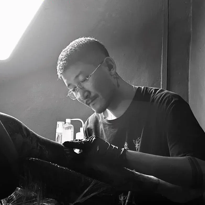
The body adds another constraint. An arm rotates. A shoulder rounds forward. A spine gives a vertical centre but not a flat sheet of paper. Yuyi’s fine-art background at the LuXun Academy of Fine Arts informs the discussion of proportion and balance; it does not replace checking the language itself. You can read more about Yuyi’s path from fine art to tattooing.
Scale protects the spaces inside the character
Every character contains internal gaps. If the whole piece is made too small, those gaps can lose clarity as the tattoo ages. Dense cursive forms and long phrases need more room than a single open character.
Before deciding on size, test the phrase at actual scale. Print it, place it against the body and look from normal conversation distance. If the character only works when enlarged on a phone screen, the tattoo version may need a larger scale or a simpler script.
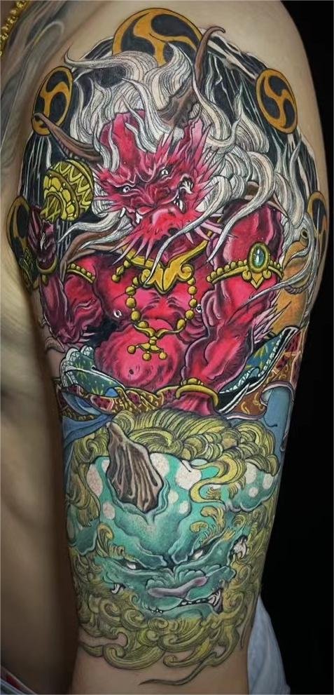
The same rule applies when calligraphy sits beside an image. Text should belong to the composition, not look pasted over it after the drawing was finished. Browse the current portfolio to judge how larger images use space and visual weight.
A brief that prevents expensive mistakes
Send these items together:
- The exact characters as selectable text, not only a screenshot.
- The intended meaning in a complete sentence.
- Any source for the phrase, such as a poem, family record or published quotation.
- Independent language verification if the wording is not your own.
- Preferred script direction, with one or two visual references.
- Placement and approximate dimensions in centimetres.
If one of those pieces is uncertain, say so. “Wording not yet verified” is useful information. Pretending it is final is not.
Questions people should ask earlier
Can I use one Chinese character for an English word?
Sometimes, but context matters. The closest dictionary entry may not carry the personal meaning you intend. Verify the character in the full context of the tattoo.
Is cursive script always better for tattoos?
No. It can create strong movement, but highly cursive forms may be difficult to read and may require more space. Choose it because the script fits the purpose, not because it looks mysterious.
Can a screenshot be used as the final reference?
Use it as visual direction, not as the only language source. Send the characters as text and identify where the screenshot came from.
Should the artist translate the phrase?
Translation and tattoo design are separate responsibilities. Ask who verified the wording and keep that confirmation with the brief. The final composition begins after the language is settled.
Settle the words, then draw the movement
Bring the exact phrase, the meaning, the script direction and the body placement. The project can then move from language checking to composition without guessing in the middle.
Send a calligraphy tattoo brief on WhatsApp or use the contact page.
Source
This article was reviewed on 25 July 2026. It is a design-planning guide, not a substitute for independent language verification.