
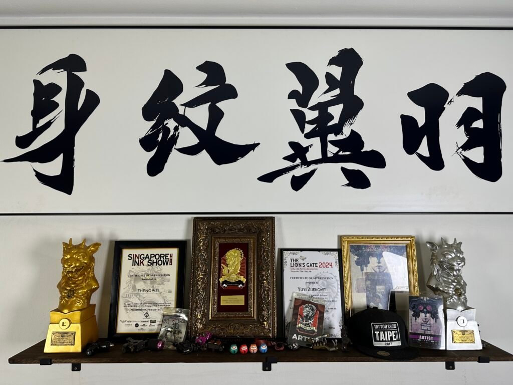
When choosing a lettering tattoo in Singapore, start with the text and the physical space, then compare styles. Clean lettering usually gives each character the clearest separation. Connected script adds rhythm but can merge letters. Brush-style calligraphy can carry strong movement, yet its thick, thin and abbreviated strokes often need more scale and language review.
No category is automatically the most readable. The result depends on stroke density, contrast, spacing, body movement and how familiar the reader is with the writing system. Compare one or two references using the same approved wording at the intended tattoo size before deciding.
First define what “script” means in your brief
People use the word “script” for several different things. It may mean connected Latin handwriting, a formal calligraphic alphabet, Chinese running script, highly abbreviated cursive characters, or simply any text that looks handmade. Those directions cannot be evaluated as one style.
Label the writing system and the visual quality separately. For example:
- English name in restrained connected handwriting;
- Roman capitals with wide spacing;
- Chinese phrase in standard script structure;
- Chinese characters with running-script movement;
- a brush-like title treatment used as visual reference only.
This distinction prevents a common problem: approving the mood of a reference without knowing whether its letterforms or characters match the intended words. A tattoo artist can adapt composition and stroke weight, but the exact wording must be settled before style comparison.
If the project uses Chinese text, the Chinese calligraphy tattoo guide explains why meaning, character form, script and reading direction should be reviewed as separate decisions.
Compare the three broad directions
The categories below are practical planning labels rather than a complete history of lettering.
| Direction | Visual character | Main readability question | Often needs attention to |
|---|---|---|---|
| Brush stroke or calligraphy | visible changes in pressure, speed and stroke width | do the thick strokes, dry-brush gaps and overlaps still form the intended characters? | scale, character structure, language review, negative space |
| Connected script | flowing joins, loops, ascenders and descenders | can each letter be distinguished without already knowing the word? | joins, counters, repeated humps, baseline and flourish length |
| Cleaner lettering | separated letters or characters with a more regular rhythm | does the simple structure still have enough weight and personality at the chosen size? | spacing, proportion, line weight and body alignment |
Cleaner does not mean generic, and expressive does not mean unreadable. A restrained serif name can be customised through proportion and spacing. A brush stroke can remain clear when the character structure is sound and the scale gives every internal space room. The purpose of comparison is to find where expression starts to obscure recognition for this particular word.
Brush strokes need room for contrast inside each character
Brush writing is built through changes in direction, pressure and speed. A single character may contain heavy deposits, tapering ends, turns and intentional gaps. On paper, these changes can be seen at close range. On skin, the design also has to work around physical scale, surface curve and ordinary viewing distance.
The Metropolitan Museum of Art describes seal, clerical, running, cursive and standard scripts as distinct developments in Chinese calligraphy. Standard script articulates strokes clearly, while running and cursive forms introduce increasing abbreviation and connection. That history matters because a running script tattoo is not simply standard text with a rough brush filter placed over it.
Seal script and clerical script also carry particular structures and historical associations. A seal script tattoo should not be chosen merely because the characters look ancient, and a running script tattoo should not be chosen merely because it looks fast. Confirm the actual text, the specific script reference and who has reviewed it. Historical script names describe writing traditions, not a menu of tattoo services. Ask which directions are supported by relevant portfolio examples before treating a reference as feasible.
At small scale, several brush effects can compete:
- a thick turn may close an internal opening;
- two dark strokes may appear as one mass;
- a dry-brush texture may become visual noise;
- a long taper may disappear before the main stroke;
- abbreviated forms may be unrecognisable to a reader unfamiliar with the hand.
Ask for a version that protects the character structure first. Texture can be reduced, openings widened or the whole composition enlarged. The correct adjustment depends on the exact characters and placement.
Connected Latin script can hide letters in its rhythm
A script tattoo often looks elegant because the eye follows one continuous movement. That movement can also disguise where one letter ends and the next begins. Names with repeated m, n, u or i shapes are especially dependent on rhythm and spacing. Capitals with large flourishes can compete with the remaining word.
Check the design without being told what it says. Ask another person to read it once, at the proposed size, rather than tracing it slowly on a phone. If the reader guesses from context, identify the uncertain letters. A small change to a join or counter may do more for clarity than making every stroke heavier.
Flourishes should have a job. One may lead into the first letter, balance a short surname or follow the line of an arm. Several decorative loops can create false letters and use the empty space needed around the word. Remove a flourish if the composition becomes clearer without losing the intended character.
For multiple words, review spaces and line breaks as carefully as individual letters. A gap that looks generous on a flat page may narrow when text wraps around an arm. A descender from one line can collide with an ascender from the next.
Cleaner lettering makes errors easier to see
Separated capitals, open lowercase forms and restrained serif or sans-serif lettering often make spelling review simpler. Each character can be compared directly with the approved text. This is useful for a date, name, short instruction or phrase where immediate recognition matters.
The trade-off is that simple lettering exposes proportion. Uneven spacing, inconsistent stroke weight or a weak baseline has nowhere to hide. Custom lettering still needs careful drawing, especially when the word follows a curved anatomical line.
Do not confuse clean lettering with very thin lettering. Readability comes from clear shapes and sufficient separation, not from chasing the narrowest possible stroke. A label such as “minimal” or “fine” does not establish feasibility. Discuss the actual wording, size and placement, then compare them with relevant portfolio evidence.
Use the guide to tattoo design readability to examine hierarchy, contrast, scale and open skin before deciding how much detail the letters can support.
Stroke density matters more than the style name
Count visual decisions, not just letters. A five-character brush phrase may contain more dense intersections than a longer line of open capitals. A short script name may use a large capital and sweeping underline that require more width than the letters alone suggest.
Look for three kinds of separation:
- Inside a character or letter. Counters and enclosed spaces should remain visible.
- Between neighbouring forms. Joins should feel intentional rather than accidental.
- Around the whole text. The wording needs enough open skin to sit apart from borders, images and existing tattoos.
Contrast also works at more than one level. Thick and thin strokes create internal contrast. Dark text against open skin creates figure-ground contrast. A light decorative image behind dark lettering may help, while a busy image with similar values may make the text harder to find.
Typography guidance for screens is not a tattoo specification, but it illustrates a useful distinction between a style label and the variables that make text readable. The GOV.UK Design System sets type size and line height together to create a consistent, scannable rhythm. On skin, the review must happen at physical scale and on the body, with letter spacing and form assessed directly.
Skin movement changes the baseline and spacing
Lettering is drawn flat but worn on a body that bends and rotates. A forearm turns. A shoulder rolls forward. Ribs expand. A word that appears straight in one pose may arc in another.
Decide which neutral posture should govern the layout. For an arm, that is often the arm relaxed at the side, but the choice can differ when the tattoo is mainly for the wearer to view. Mark the top of the design and the direction it should read. Do not use “vertical” alone when you mean letters stacked one by one, a rotated Latin word, or a column of upright Chinese characters.
W3C’s Chinese layout requirements distinguish horizontal text from vertical text, where characters run top to bottom and columns traditionally progress right to left. That publishing convention does not dictate a tattoo layout, but it shows why reading direction must be specified rather than assumed. Mixed Latin letters, numbers and Han characters need an especially clear mock-up.
Test the layout on a placement photograph or an actual-size paper strip. Look at it straight on, from the side and with the nearby joint bent. If the word is only clear in one posed angle, discuss whether the baseline, width or placement should change.
Cultural fit includes language, source and visual tone
A brush treatment should match the language and source, not serve as a generic symbol of “Asian style.” If you want Chinese calligraphy, provide the verified Chinese text and a reference for the script direction. If you want Japanese kanji, verify the Japanese word and reading in Japanese context. Shared characters can have different readings, forms or usage across languages.
Unicode explains that Han characters are shared across Chinese, Japanese and Korean writing systems, while regional fonts can show different preferred glyph forms. This is another reason not to copy a single screenshot without recording its language and source. The same encoded character may be displayed with a shape that feels unusual to a reader from another region.
If cultural context matters to your design, ask a language specialist about the wording and a tattoo artist about composition. Neither review replaces the other.
Use portfolio evidence before choosing a direction
Style labels on search results are inconsistent. Review completed work and ask whether the visual direction is supported by current examples. View Yuyi Tattoo’s works for portfolio evidence, then select one or two references that show the type of stroke movement, density or spacing you want.
Describe the useful feature in each reference. “I like the open counters and restrained capital” gives clear direction. “I want this exact tattoo” does not. If an example does not come from Yuyi’s portfolio, present it as visual discussion material, not proof that the same result or service is available.
Prepare a brief with the exact text, language, independent verification status, preferred style direction, placement, approximate size and intended reading orientation. Mark optional flourishes separately. Then contact Yuyi Tattoo for a project-specific feasibility discussion. The goal is to select one workable direction, not collect every lettering category in a single design.
Sources and review date
- The Metropolitan Museum of Art: Chinese Calligraphy, reviewed 24 August 2026.
- The Unicode Consortium: FAQ, Chinese and Japanese, reviewed 24 August 2026.
- W3C: Requirements for Chinese Text Layout, reviewed 24 August 2026.
- GOV.UK Design System: Type scale, reviewed 24 August 2026.
Frequently asked questions
Is clean lettering always easier to read than script?
It often makes character separation easier, but poor spacing or proportions can still reduce clarity. Compare the exact word at the intended size. A well-drawn script may read better than badly spaced capitals.
Does a brush stroke tattoo have to be large?
There is no universal minimum. Dense characters, strong thick-to-thin changes and textured brush effects generally require more room than open, simple forms. The actual characters, body area and desired detail need to be reviewed together.
What is the difference between running script and cursive script?
Both introduce movement and abbreviation, but cursive forms can be more compressed and connected. The distinction is part of a calligraphic tradition, not a visual filter. Use a verified reference and language review for the exact phrase.
Can I combine English script with Chinese calligraphy?
Possibly, if the reading direction, relative scale and visual hierarchy are planned as one composition. Confirm each language independently first, then decide which text should lead and how the different stroke systems will relate.
What should I send for a lettering tattoo consultation?
Send the exact selectable text, its language and meaning, verification status, one or two style references, placement, approximate dimensions and intended reading direction. State which flourishes or supporting elements are optional.

