
Greywash gives black-and-grey tattoos a range of tones rather than a single solid black. For a client, the useful question is how those tones describe the subject, not which dilution formula an artist uses.
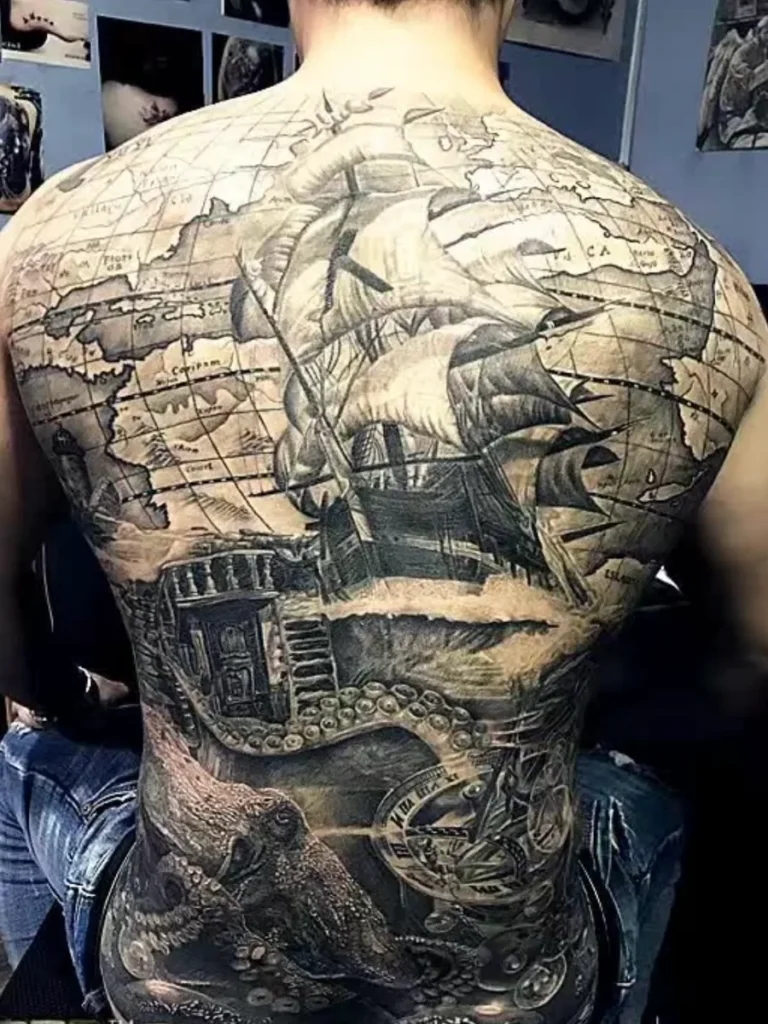
Look for separate jobs within the shading
Dark areas establish the strongest accents. Midtones connect those accents to lighter passages. Open skin can provide highlights and breathing room. A ship, for example, needs enough separation between hull, sails and background for the rigging to remain legible.
A design made entirely from similar mid-grey values may look soft but can lose its focal point. A design with black everywhere can become difficult to read for the opposite reason.
What to ask when viewing examples
- Where should my eye land first?
- Which details will be simplified at the proposed size?
- Is this photograph fresh, settled or of an unconfirmed age?
- Can we compare the full composition as well as a close-up?
Review Yuyi’s black-and-grey portfolio with those questions in mind. Exact ink mixtures and machine settings do not provide a reliable client-side shortcut for assessing a design.

