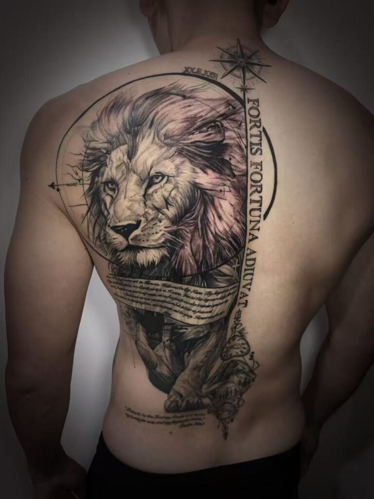
Black and grey back piece planning changes at large scale because contrast has to be organised across the entire image, rather than perfected one detail at a time. The first task is a value hierarchy: decide where the deepest darks, quieter greys, light passages and open skin will lead the eye when the whole back is seen at once.
For realism, that hierarchy protects the main face, figure or object from being lost among secondary textures. For an Asian-inspired composition, it separates the principal subject from waves, clouds, smoke, flowers or other supporting forms. In both directions, the back gives you room for complexity, but extra room does not make every area equally important. A strong plan decides what should command attention, what should connect, and what should recede.
The tonal plan becomes the project map
A smaller black-and-grey tattoo may be dominated by one subject and one lighting idea. Across a back piece, the viewer meets several regions at once. A dark upper section, a soft central figure and a busy lower background can each look convincing in isolation while failing to read as one image. The tonal plan is what makes those regions belong together.
This article focuses narrowly on that value structure. Coverage, overall silhouette, anatomical flow and future extensions have their own decisions; the full-back tattoo planning guide covers those broader composition questions. Once the overall layout is settled, a black-and-grey plan asks a different set of questions:
- Which shape should be recognised first?
- Where does the widest light-to-dark range belong?
- Which secondary forms need reduced contrast?
- Where should open skin interrupt a dense passage?
- Can the subject still be understood when small texture is ignored?
These questions should be answered across a full view, not by finishing one corner and hoping the remaining values will balance later.
Give each part of the value range a job
A useful value map can be described through five roles. This is a planning vocabulary, not a fixed formula or a required percentage of black.
- Deep anchors are the darkest, most decisive masses. They can hold the focal subject, frame a light form or stabilise one end of a directional movement.
- Structural darks connect major forms without competing with the deepest anchors. They may define a fold, background band, hair mass, wave trough or shadow plane.
- Midtones turn forms and bridge transitions. They are valuable, but too many similar midtones can flatten the separation between subject and setting.
- Light fields and open skin provide contrast against dark areas. They can preserve a face, edge, cloud break or patch of atmosphere without filling every gap.
- Texture accents reward close viewing. Hair, stone, cloth, scales and foam belong here only after the large tonal structure works.
The order matters. If texture is carrying the subject, the design may depend on close-up viewing. If the deep anchors and light fields already identify the image, texture can add character without being responsible for clarity.
Build one contrast route across the back
Value hierarchy is easier to assess when the design has a contrast route, a sequence that guides the eye through the composition. It may begin with a pale face against a dark surround, continue through a midtone hand or object, then finish in a quieter background. Another design may reverse that logic, using a dark animal or figure against lighter atmosphere.
The route does not need to be a straight line, and the darkest area does not automatically belong in the centre. Its shape should follow the chosen subject and the broader body layout. What matters is that the viewer is not asked to solve several unrelated high-contrast events at the same time.
A practical test is to reduce the design to a few flat grey shapes. If its direction disappears without linework, the composition may be relying on edges and texture that are too small to organise a full back. If the route remains clear, detailed rendering has a stable framework.
Scale realism by controlling emphasis
Black-and-grey realism often uses subtle transitions, but a full-back realism project cannot give every feature the same sharpness and tonal range. The main subject needs the strongest modelling. Secondary faces, architecture, fabric, foliage or atmosphere can use narrower values and softer edges so they remain present without taking over.
Consider a large figure composition. The expression may depend on the eyes, mouth and turn of the head, while clothing and background establish setting. Giving the clothing seams, stone texture and distant objects the same contrast as the face would divide attention. A better hierarchy preserves enough information to identify those supporting elements while reserving the clearest separation for the focal area.
Multiple subjects require even firmer choices. One figure can lead, another can support, and a third can sit deeper in the scene. Making all three equally sharp often produces three competing portraits rather than one large composition. When comparing Yuyi Tattoo’s documented black-and-grey direction, look beyond isolated details and ask how dark mass, light passage and scale organise the complete piece.
Separate an Asian-inspired subject from its environment
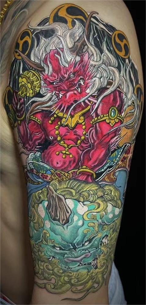
In a black-and-grey Asian-inspired back piece, background is active structure. Waves, clouds, wind, smoke, rocks and flowers can carry movement around a dragon, warrior, guardian figure or other principal motif. Their tonal role still needs to remain distinct from the subject.
One approach gives the subject firmer edges and a wider value range while keeping the environment within a quieter middle range. Another uses a dark background to reveal a lighter subject. Either can work. The weak option is to render scales, foam, cloud curls, petals and clothing with the same density and edge strength, because the eye then receives many textures with no clear order.
Black and grey does not mean the background should become a single dark fill. Within a monochrome palette, rhythm can come from alternating dense passages with calmer ones. Open channels can separate a claw from a wave or a face from smoke. The specific motifs, cultural references and flow should be discussed as an original composition rather than copied from another finished tattoo.
Control density by zone without designing in fragments
The back is viewed from several angles, and parts of the tattoo can disappear from one view while remaining visible from another. This makes tonal continuity more useful than identical detail density. A section that turns toward the side can repeat a dark or light family from the central image without repeating the same texture.
Planning by zone is therefore a coordination exercise. Mark where dense rendering is justified, where transitions need room, and where a value echo can connect distant areas. Then return to the full view. A shoulder section should not become a separate poster merely because it was drawn on a separate template, and a lower section should not introduce a new contrast system unless the composition gives it a clear reason.
This is also where future scope matters. If the back may later connect toward a shoulder, chest or side, say so before the values are locked. The large-scale tattoo planning page explains why project boundaries and extension plans should be raised before detailed work begins.
Test the value map before approving close detail
Artists and clients can discuss contrast without pretending a digital preview will predict healed skin. Several simple viewing tests reveal different problems:
- Greyscale reduction: remove any colour cast from the references and compare only their light and dark structure.
- Thumbnail view: shrink the composition until texture drops away. The main subject and route should still be understandable.
- Soft-focus view: blur or squint at the image to see whether the largest masses remain distinct.
- Full-placement mock-up: view the design on an uncropped back photograph, rather than judging only a close section on a bright screen.
- Ordinary-light check: compare the tonal idea under less dramatic lighting, because a high-contrast edit can make weak separation look stronger than it is.
Tate describes chiaroscuro as the use of light and dark, especially when their contrast is prominent. Vision science uses contrast sensitivity for the ability to detect changes in luminance between regions. Neither reference supplies a tattoo formula, but both explain why value differences shape what the eye notices before small surface information.
Treat skin and portfolio photographs as evidence, not promises
Skin is part of the final value range. The same grey reference will not appear identical on every person, and screen brightness cannot reproduce a settled tattoo. Contrast should be planned for the individual body area using clear, unfiltered placement photographs and an in-person assessment when required. The guide to black-and-grey contrast across skin tones covers that question in depth without ranking natural skin colours.
Portfolio review should be equally specific. Ask for examples close to your intended scale, density and subject structure. Then ask which images are fresh and which are healed; do not infer healed status from a caption that does not say. A healed photograph can help you inspect whether the value hierarchy remains readable after the surface has settled, but it cannot guarantee the result of a different design on different skin.
Yuyi Tattoo’s documented portfolio includes black-and-grey realism, large back pieces, portraits and Japanese or Asian-inspired compositions. That evidence supports a style-fit conversation. It does not establish a fixed session count, a guaranteed healed result or automatic acceptance of every project.
Plan stages without inventing a session count
People searching for how many sessions for a black and grey back piece often want a number before the design has been mapped. A responsible answer is project-specific. Coverage, value density, detail, body area, working sequence, skin response and healed review all affect how the work can be organised. A portfolio example cannot supply your schedule.
Instead, ask how the value map will stay consistent as the project develops. Which tonal decisions must be fixed before tattooing begins? How will completed and unfinished areas be compared? When will settled photographs be used to review balance? The studio can then discuss stages and availability after assessing the actual brief.
A black and grey back piece healing plan also needs to remain project-specific. Follow the aftercare provided for each appointment, raise concerns promptly, and do not assume a universal interval before more work. For long-term care after healing, the American Academy of Dermatology notes that ultraviolet light can fade some tattoo inks, which makes ongoing sun protection relevant to preserving contrast. This is sensible care, not a promise that any design will age in a fixed way.
Bring a contrast brief to the consultation
A useful consultation pack makes the value discussion concrete. Prepare:
- clear photographs of the entire back in even, ordinary light, plus natural side or three-quarter views;
- a one-sentence subject hierarchy, naming what should be read first and what should support it;
- references labelled for lighting, dark mass, softness, atmosphere or texture, rather than a request to copy one finished tattoo;
- a note on whether you prefer an open, light composition or a denser, darker one;
- clear photographs of existing tattoos or skin features in the intended area so suitability can be assessed rather than assumed;
- the intended boundaries and any possible future extension toward neighbouring areas;
- questions about comparable portfolio examples, including whether any are documented as healed;
- availability windows, without treating an enquiry as a confirmed artist or appointment slot.
Use the contact page to send the subject, coverage, placement photographs and selected references. Ask which documented work is closest in scale and contrast, and what still needs to be assessed before design and scheduling can be confirmed.
Sources and review date
- Yuyi Tattoo — Black-and-Grey Tattoo Singapore — reviewed 24 August 2026.
- Tate — Chiaroscuro — reviewed 24 August 2026.
- NCBI Bookshelf — Contrast Sensitivity — reviewed 24 August 2026.
- American Academy of Dermatology — Caring for tattooed skin — reviewed 24 August 2026.
Frequently asked questions
What is different about contrast planning for a full black-and-grey back piece?
The values must work across one large view. A smaller piece may rely on one focal subject, while a back piece can contain several subjects, transitions and background regions. Deep darks, midtones, light passages and open skin need defined roles so those areas form one hierarchy rather than several competing images.
How dark should a black-and-grey back piece be?
There is no universal ratio of black, grey and open skin. The right density depends on the subject, desired mood, skin, placement and amount of supporting material. Ask where the deepest anchors will sit and whether the focal subject still reads when the design is reduced to a few values.
How many sessions will a black-and-grey back piece take?
That cannot be confirmed from a generic size label or another client’s project. The artist needs to review coverage, detail, tonal density, placement, working sequence and how each stage settles. Share your availability as windows, then ask for the project-specific planning process without expecting a fixed number in advance.
Should I ask to see healed back-piece photographs?
Yes, if documented examples are available. Ask which images are healed, how close they are to your planned scale and density, and whether the full composition is shown. Use them to assess settled value hierarchy, not as a guarantee that your skin or design will produce an identical result.
Can black-and-grey realism and an Asian-inspired background share one back piece?
They can be discussed within an original composition when their visual roles are clear. The realistic focal subject may use the widest value range, while waves, cloud, smoke or floral elements support its direction with quieter contrast. Feasibility depends on the actual references, body layout and portfolio fit.