
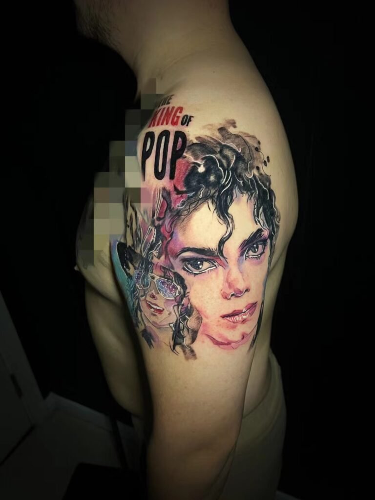
A strong colour portrait tattoo reference photo shows a recognisable face under light that can be understood. The artist should be able to separate the person’s actual features and local colours from temporary effects created by lamps, filters, reflections or the camera’s white balance. Clear shadow information matters as much as bright colour.
Do not expect every screen colour to reproduce exactly on skin. A colour portrait brief should state which identity features, lighting mood and palette relationships must remain, then allow the artist to simplify or rebalance colours for the chosen placement and skin. The source is evidence and direction, not a colour guarantee.
Start with the light, not the saturation
Colour is convincing when it describes form. A warm light may sit on one side of the face while a cooler shadow turns away. A window can create a broad, soft transition across the cheek. Hard flash may produce small bright highlights and abrupt shadows. Before deciding that a photograph has the right palette, identify what its light is doing.
Ask four questions:
- Where is the main light coming from?
- Can you still see the eyes, nose and mouth in the shadows?
- Are the brightest areas holding detail, or are they plain white?
- Does one coloured light cover the whole face, or do several light sources disagree?
A photograph can be vivid and still be a poor source. Strong saturation may hide lost shadow detail. A neon colour cast may make skin look dramatic while removing the small hue differences that explain lips, cheeks and eyes. The reference needs usable information beneath the effect.
White balance changes every colour in the frame
Our visual system adapts to different light sources. A camera has to interpret them. Nikon’s white-balance guidance explains that the colour of an object changes with the lighting conditions and that camera settings compensate so a neutral object can appear neutral. It also notes that mixed light is harder to balance than a scene lit mainly by one source.
That matters when a portrait combines window light with a warm room lamp, or fluorescent light with flash. One side of the face may be blue while the other is orange or green. The split can be intentional and visually strong. It can also be an accident that the client does not want preserved.
Do not automatically “fix” a cast before sending the file. First decide whether it is part of the desired mood. Send the original and, if useful, a second version with a restrained correction. Label them clearly: “warm light is intentional” or “please treat the green cast as a camera problem.” Without that note, the artist cannot know whether colour accuracy or atmosphere has priority.
Look for clipped highlights and blocked shadows
Exposure limits the information available. A forehead highlight that has become flat white no longer shows skin texture or its gradual turn away from the light. A shadow that has become featureless black may hide an eyelid, nostril or edge of the jaw. Increasing saturation will not bring those shapes back.
Zoom into the original file and check the features that carry recognition. One eye in shadow can be workable if its position and lid remain visible. A reflective patch on glasses may be a problem if it covers the iris. Dark hair can be usable when its large shape and a few directional changes remain; it does not need every strand.
The general portrait tattoo reference photo guide covers focus, crop and file quality. For a source already chosen for colour, the additional test is whether hue and exposure help describe the face or conceal it.
Separate local colour from lighting colour
Local colour is the colour associated with the subject: hair, clothing, eyes and other visible surfaces under ordinary light. Lighting colour is the tint placed over those surfaces by the scene. A white shirt under amber light may photograph as warm yellow. Dark hair beside a blue sign may take on a blue edge.
Both can belong in the tattoo. The brief simply needs to distinguish them. If the red coat is an identity cue, mark it as a must-keep local colour. If the sunset glow is the main appeal, ask to preserve the warm light even if the coat shifts. If eye colour matters, provide a second neutral photograph instead of asking the artist to guess through a cast.
This distinction prevents a common mismatch: a client expects natural skin colour while choosing a reference whose entire face is lit by a coloured source. The artist can interpret the photograph, but cannot derive a single objectively correct palette from information the image never shows.
Palette should keep relationships, not chase every screen swatch
The Getty describes hue as the name of a colour, value as how light or dark it is, and intensity as how bright or dull it appears. Those three properties can change independently. Two colours that look very different on a bright display may become similar when their values are close. A less saturated colour may still be important because it separates the cheek from the background.
A tattoo palette therefore needs organisation. It may preserve the warm-versus-cool relationship while reducing the number of nearly identical hues. It may strengthen the value gap between hair and background. It may reserve the highest intensity for a small focal area instead of distributing bright colour evenly.
Use a palette note rather than a list of digital colour codes:
| Priority | Useful brief language |
|---|---|
| Identity | “Keep the dark brown eyes and the copper section of hair recognisable.” |
| Light | “Preserve the warm side light and cooler shadow.” |
| Mood | “Keep the muted, low-saturation feeling rather than making it vivid.” |
| Flexibility | “Background colours may change if the face needs stronger separation.” |
Screen codes imply a precision the medium cannot promise. Relative instructions tell the artist how the colours are meant to work together.
Facial identity has to survive colour adaptation
Colour attracts attention, but likeness still depends on relationships between features. The eye spacing, lids, nose, mouth, jaw, hairline, expression and head angle should remain coherent if the palette is altered. A highly accurate eye colour cannot compensate for a shifted mouth or generic face shape.
The Smithsonian National Portrait Gallery’s elements of portrayal include facial expression, pose, setting, medium and artistic style. That list is a useful reminder that a portrait communicates through more than complexion or hair colour. Decide which elements identify this particular person and which merely establish atmosphere.
When colour is dramatic, make a mental greyscale check. Can the face still be read through its light and dark structure? If removing hue causes the features to disappear into one mid-value mass, the palette is carrying too much of the likeness. The design may need clearer value separation before colour is applied.
For documented service direction and project fit, refer to portrait realism tattoo planning. A colour reference still needs individual review; the label “portrait” does not make every lighting setup or palette workable.
Skin is part of the final colour relationship
A screen begins with emitted light. A tattoo is seen through and beside the wearer’s skin. Untattooed skin can act as a light area, a transition or part of the face. The same ink selection will not look identical on every skin tone, undertone, placement or lighting condition.
This is why a reference cannot guarantee a matching result. The artist may need to adjust value, intensity or neighbouring colours so important forms remain distinguishable. A pale highlight on a display may become an open-skin decision. A low-contrast blush may need to be simplified. A dark background may need a different boundary against hair.
Do not use a photograph of someone else’s healed tattoo as a colour chart. It records a different person’s skin, camera, light, editing and stage of healing. Use it only to explain a relationship you like, such as “muted warm face against a cool dark field,” and ask how that idea would be adapted for you.
The black-and-grey versus colour tattoo guide helps with the earlier decision between approaches. This page assumes colour has already been chosen and focuses on whether the proposed photograph supplies a usable colour brief.
Filters can change the reference beyond recognition
Portrait filters may alter more than colour temperature. They can smooth skin, brighten eyes, narrow a face, deepen shadows or replace the background. Social platforms may also compress the file. A filtered image can be useful for mood, but it should not be the only evidence for likeness.
Send the unfiltered original whenever possible. If the edited version contains the palette you want, send both and state their roles: original for features, edited version for colour direction. Avoid stacking new edits on a screenshot because each step makes it harder to know what the camera actually recorded.
If the original was captured as a RAW file and is available, keep it. A normal high-quality exported image can still be sufficient for review, so do not create a new format merely to sound technical. The point is to retain information, not to meet a file-extension rule.
Use supporting references without averaging the face
One primary image should control age, expression, head angle and light. Supporting photographs can answer specific colour questions: natural eye colour, hair in neutral light, clothing detail or the unlit side of the face. They should not silently replace parts of the primary expression.
Label each image. “Primary for face and light; second for eye colour only” is useful. An unranked album invites conflicting information from different cameras, seasons and edits.
Image rights still apply. A professional portrait, film still or photograph taken by another person may require permission. The tattoo reference image permission guide explains the distinction between owning a copy, appearing in an image and controlling copyright. IPOS advises obtaining the copyright owner’s permission before using a third party’s work unless a relevant exception or licence applies.
Prepare a colour-reference brief
Before you contact Yuyi Tattoo, send a small, clearly labelled set:
- one unfiltered primary file at its best available quality;
- the intended crop, placement and approximate size range;
- the expression and facial features that must remain;
- the local colours that matter, such as eyes, hair or clothing;
- the lighting colour or mood that should be preserved;
- any cast, filter or background colour that may be corrected;
- one or two supporting files with a stated purpose;
- confirmation of who created the images and whether they may be used.
Ask for a feasibility assessment, not exact colour matching. The useful outcome is a shared understanding of which colours describe identity, which describe light and which can be changed so the portrait remains clear on the selected body area.
Sources and review date
- Nikon — Setting White Balance — reviewed 24 August 2026.
- Adobe — Adjusting white balance settings to improve photos — reviewed 24 August 2026.
- J. Paul Getty Museum — Elements of Art — reviewed 24 August 2026.
- Intellectual Property Office of Singapore — Ownership and commercialisation — reviewed 24 August 2026.
Frequently asked questions
Is natural daylight always the best colour portrait reference?
No. Clear, consistent light is more important than one required source. Daylight can give usable colour, but it can also create deep shade or mixed colour near windows and indoor lamps. Check whether facial detail and the intended mood remain understandable.
Can a colour cast be removed before the tattoo is designed?
Sometimes it can be reduced, but first decide whether it is accidental or part of the image’s appeal. Send the original and a restrained corrected version rather than overwriting the source. Missing detail in clipped highlights or black shadows cannot be restored through white-balance correction.
Should I send a black-and-white copy as well?
It can help you discuss value structure, but the artist should still receive the original colour file. A greyscale preview can reveal whether the eyes, nose, mouth and hair remain separate without hue carrying all the contrast.
Will the tattoo match the photograph’s skin colour exactly?
No exact match can be promised. Screens, cameras, ambient light, ink and the wearer’s skin all affect colour appearance. The design should protect relationships and recognisable features while adapting the palette to the actual body area.
How many colour references should I send?
Start with one primary image and add only the files that answer a defined question. A neutral-light photo may clarify eye or hair colour. Label it as support so it does not compete with the chosen age, expression and lighting of the main reference.

