
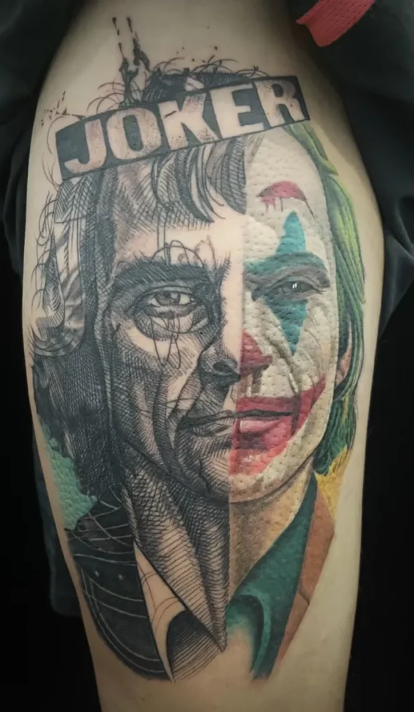
A multiple face portrait tattoo needs more than enough room for several heads. The references must support compatible angles, lighting and apparent age, while the composition gives each face enough separation to remain recognisable. One person may lead the design, but differences in scale should be intentional rather than caused by whichever photograph is easiest to crop.
Start with one authorised reference for each person and state the visual priority. If the faces come from separate photographs, identify which expression and age each image must preserve. The artist can then judge whether the sources belong in one composition, need adaptation or would be clearer as separate tattoos.
More faces multiply relationships
A single portrait asks whether one face reads. A two-person portrait also asks how those faces relate: equal or hierarchical, close or separated, facing each other or sharing one direction. Add a third face and the design gains more eye lines, overlaps, light patterns and gaps to resolve.
The difficulty is not simply “twice the detail.” Every face must work alone and as part of the whole. A strong likeness can still feel misplaced if one head is lit from the left, another from below and a third from hard frontal flash. Equal-sized faces can still feel unequal if one carries much darker contrast.
Decide whether the tattoo is meant to read first as a group or as one primary person with supporting portraits. That decision influences scale, position and the amount of background the composition can afford.
One group photograph gives consistency, not automatic suitability
A photograph containing everyone may provide the most coherent starting point. The camera angle, light direction and moment already agree. Relative height and body language are also visible.
But check how large each face is inside the original. A high-resolution group file can still contain very small faces if the people were photographed from far away. Cropping does not create new facial information. Someone at the edge may also be distorted by lens perspective, blocked by another person or partly out of focus.
Ask whether the group arrangement itself matters. If it does, preserve the relationships before adding any new setting. If only the people matter, the artist may be able to rearrange them for the body area, provided the change does not imply a moment the client does not want.
Use the portrait tattoo reference photo guide to assess each face, not merely the overall image. A reference passes only when the required features of every intended subject remain visible at a workable scale.
Separate photographs need a compatibility check
Separate sources are common, especially when the desired ages, expressions or people were never photographed together. They can work, but the artist has to build a shared visual world from evidence captured under different conditions.
Compare the sources across these factors:
| Factor | Easier to combine | Harder to reconcile |
|---|---|---|
| Head angle | Similar front or three-quarter views | One overhead view beside one low-angle view |
| Camera distance | Comparable facial perspective | Close phone selfie beside distant formal portrait |
| Light | Similar direction and softness | Left window light beside hard flash from below |
| Expression | Compatible level of movement | Calm closed mouth beside extreme laugh if equality is intended |
| Image quality | All faces have visible landmarks | One sharp file beside a very small or blurred face |
| Age | Clearly chosen period for each person | Unlabelled photos from different life stages |
Compatibility does not require identical photographs. It requires enough information to make the differences deliberate. If one source is weak, a supporting image may clarify a hidden ear or natural hairline. It should not quietly replace the selected expression.
Label every file with the person’s name or neutral identifier, chosen age, and its role. “Person A, primary for expression; A2, support for hair” prevents errors that an unmarked collage invites.
Relative scale communicates hierarchy
If all people have equal visual importance, begin with comparable face sizes and contrast. Small adjustments may still be needed for head angle or placement, but one person should not appear secondary because their reference was cropped farther away.
A deliberate hierarchy can use a larger central face with smaller supporting portraits. State that intention. The artist can then decide how much difference the composition can carry without making a supporting face too small for its required features.
Relative scale can also imply physical or emotional distance. Overlapping heads may feel close. Widely separated portraits may feel formal or archival. A face placed high and central will usually attract attention before one placed low at the edge. These effects are compositional, not claims about the people or their relationships.
Write a priority order even when everyone is meant to be equal. It can be practical rather than emotional: “All faces should read equally; Person B’s glasses and Person C’s smile are non-negotiable.” That tells the artist where adaptation would be most noticeable.
Head angle and eye line create the group
The Smithsonian National Portrait Gallery lists facial expression and pose among the elements through which a portrait communicates. In a multiple-person design, those elements also direct the viewer from one face to the next.
Two people facing slightly inward can create a contained composition. Several faces looking in unrelated directions can feel active, but they need a clear outer shape. Straight-on faces can produce a formal arrangement. Profiles create strong silhouettes but depend heavily on accurate forehead, nose, lip and chin edges.
Do not flip a photograph casually to make the face point the other way. Mirroring reverses asymmetry, hair parting, scars, jewellery, clothing details and text. If direction needs to change, identify which features would be affected and decide whether another reference is more honest.
Eye line deserves a close check. A face photographed from above may seem to look down even after it is placed beside a level portrait. Adjusting the pupils alone will not correct the skull perspective. The head angle, not a small feature edit, is the first constraint.
Lighting should feel shared, even when sources are not
Faces can be photographed under different light and still form one tattoo, but the final value structure needs a plan. Decide whether one source controls the shared light or whether each portrait remains visibly separate, like individual framed images.
When the faces occupy one continuous scene, shadows should generally agree about direction. A highlight on one left cheek and another on the opposite side can be coherent if a central light explains both. It looks less coherent when every person seems to stand under a different lamp with no visual boundary between them.
Do not solve the problem by flattening every face into the same grey range. Lighting gives cheeks, brows and jaws their form. The artist may simplify a shadow or strengthen separation, but missing information cannot be reconstructed with certainty. If the weakest face cannot support the shared treatment, splitting the idea may protect the likenesses better.
Faces need room between important edges
Space between portraits is active design. It separates hair from hair, cheek from background and one dark mass from another. Too much gap can make the group feel unrelated; too little can merge silhouettes or place an overlap across a recognition feature.
There is no fixed distance or universal face-to-face ratio. The required room changes with contrast, crop, hair shape, head angle and tattoo size. A dark-haired profile beside a light cheek needs a different boundary from two pale, front-facing faces.
Overlaps work best when they cross less important contours. One shoulder may sit behind another. Hair can sometimes form a transition. An eye, mouth, distinctive jaw or profile edge should not be sacrificed merely to make the group fit a narrow area.
Negative space can connect the portraits without drawing a literal background. A shared light opening, calm tonal field or repeated edge direction may be enough. If extra framing is needed, the portrait tattoo background guide compares open skin, simple frames, objects and fuller scenes around a portrait.
Background information becomes more expensive with every face
Each additional face uses scale, contrast and attention. Names, dates, flowers, buildings, scenery and text use the same resources. A large body area may support them, but the design still needs a reading order.
Decide which elements are evidence and which are optional context. An item shown in a primary photograph may help identify the moment. A new symbol may carry meaning but compete with the faces. Avoid giving every person a separate set of equally detailed objects unless the placement and scale genuinely support them.
The Getty’s formal-analysis resources describe emphasis, balance, value and space as separate parts of composition. Use that distinction during review. Balance does not mean making every part equally dark. A group can feel balanced while one face remains the focal point and other elements stay quieter.
Placement must support the whole group shape
Multiple portraits usually need width as well as height. A narrow forearm may force the faces into a vertical stack or reduce them too far. A broader thigh, upper back, chest or other area may offer more options, but no body part guarantees feasibility.
Plan the outside silhouette before fine detail. Will the group form an oval, triangle, column or wider band? Does the body area bend through a face? Can the composition be seen from one main angle, or will one person disappear around the side?
The portrait tattoo placement guide covers body curvature, orientation and viewing distance. Apply it to the group as one shape, then check every face inside that shape. If either level fails, reconsider the crop, hierarchy or number of portraits.
Separate tattoos may be the clearer route when the faces require incompatible placements, ages or visual treatments. They can still be planned as a related set through scale, value and framing without forcing every person into one panel.
Permission and privacy apply to every source
Collecting several family or couple photographs can involve several photographers and several people. Owning the prints does not automatically resolve copyright. IPOS explains that creators generally own copyright in their work, including commissioned work unless a contract changes the arrangement, and advises seeking the owner’s permission for third-party material.
Confirm the source of each image separately. A casual photo taken by one relative, a wedding photograph and a school portrait may have different ownership and usage terms. The tattoo reference image permission guide offers a practical way to label those differences.
Privacy is a separate decision. Remove people who are not part of the design from working copies where appropriate. State whether reference files, names or the finished tattoo may be shared publicly. Do not assume that agreement to the tattoo also means agreement to portfolio or social-media use.
Prepare a multi-person portrait brief
Before you contact Yuyi Tattoo, organise the project so every face can be reviewed independently and together:
- one primary authorised file for each person;
- the chosen age and expression for each face;
- labelled supporting images with one stated purpose each;
- equal priority or a clear visual order;
- the intended relationship between head angles and eye lines;
- any light, clothing or object that must remain;
- preferred placement and approximate total size range;
- permission and privacy notes for every source;
- willingness to enlarge, simplify, rearrange or split the composition.
Ask for an assessment of source compatibility and total space. A documented single-portrait direction does not by itself prove that a particular multi-face arrangement will work. The answer should come from the actual references, face count, body area and hierarchy rather than a promise of likeness.
Sources and review date
- Smithsonian National Portrait Gallery — Elements of Portrayal — reviewed 24 August 2026.
- J. Paul Getty Museum — Understanding Formal Analysis — reviewed 24 August 2026.
- Intellectual Property Office of Singapore — Ownership and commercialisation — reviewed 24 August 2026.
- IPOS and PDPC — Copyright and personal data in portrait photography — reviewed 24 August 2026.
Frequently asked questions
Can two portraits from different photographs be combined?
Yes, when the sources contain enough facial information and their angles, perspective and lighting can be reconciled. Label one primary image for each person and explain the intended relationship. The artist should review compatibility before the composition is promised.
Do all faces need to be the same size?
No. Equal size can support equal visual weight, while a larger central face can create deliberate hierarchy. The difference must leave every supporting portrait large enough to preserve its important features. It should not happen by accident because one reference was easier to crop.
Is one group photo better than separate references?
It gives consistent light and natural relationships, but each face may be small, blurred or partly blocked. Judge the facial information inside the file. Separate photographs may be stronger if they are compatible and clearly assigned.
Can a background help connect several faces?
It can, but it also uses space and contrast that the portraits need. Open skin, a quiet tonal field or a simple shared frame may connect the group without a full scene. Add narrative detail only when the total size supports a clear hierarchy.
When should several portraits become separate tattoos?
Consider splitting them when the sources have incompatible angles or light, the chosen placement is too narrow, or reducing the faces would weaken recognition. Separate pieces can still share scale, values or framing so they feel related.

