
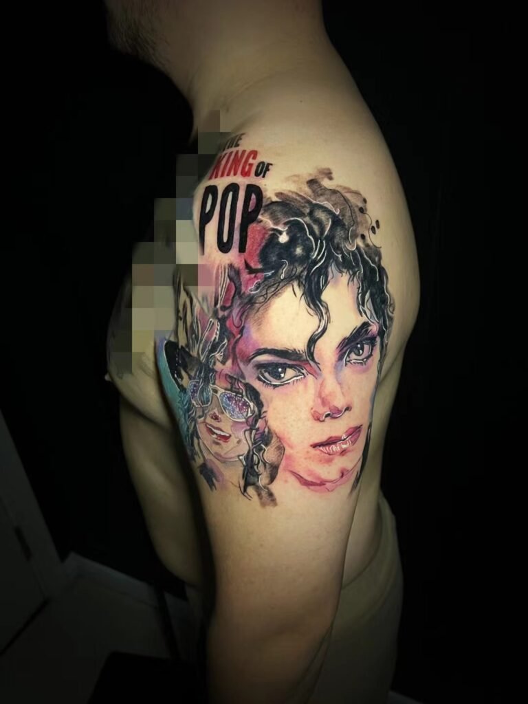
Portrait tattoo placement should be decided by space, orientation and viewing distance, not by a fixed minimum size. A face needs enough room for the eyes, nose, mouth, jaw and surrounding value to remain readable on a moving body. The artist should confirm whether the chosen placement can support the reference before the design is finalised.
A portrait can sit on an arm, back, thigh, calf or chest, but each area changes the composition. The question is not whether one placement is universally better. The question is which placement gives the specific portrait enough room, stable skin and a natural viewing angle.
A portrait is not a sticker on a flat surface
A photo is flat. Skin is not. Shoulders round forward, arms rotate, thighs change shape when seated, and backs widen and narrow with posture. A portrait that looks balanced on a screen may feel stretched, tilted or crowded if it is placed without adapting to the body.
Portraits are unforgiving: a small shift in eye angle, mouth shape or jawline can make the result feel unlike the reference. That does not mean an artist can promise exact likeness. It means placement should reduce avoidable distortion rather than create it.
Before discussing detail, look at the body area. Is it wide enough for the head shape? Does it bend through the face? Will the portrait be seen straight on, from the side, or only when the body is turned? These questions shape the design before shading begins.
Space: why size is a design relationship
Portrait tattoo size is not a universal number. It is a relationship between the amount of detail in the reference and the amount of skin available. A simple bust with strong lighting can work at a more compact scale than a group portrait, a soft childhood photo or a face surrounded by text and background.
If the space is too small, the artist has three options: enlarge the tattoo, simplify the design, or choose a different crop. Trying to keep every eyelash, wrinkle and hair strand at a small scale usually weakens the whole tattoo. The viewer may see texture, but not the person.
The most useful consultation question is: “What information must stay for this face to read?” For some portraits, the eyes and expression are enough. For others, the hairline, shoulders or clothing help identify the person. Placement should protect the features that matter most.
Arm vs back vs thigh: practical trade-offs
No placement guarantees likeness or long-term clarity. Each one offers a different set of trade-offs.
| Placement | What it can support | Main trade-off |
|---|---|---|
| Outer upper arm | Single portrait, bust crop, character face | Curved surface; design must wrap carefully |
| Forearm | Visible portrait with clear vertical orientation | Narrow width can limit face size and background |
| Upper back | Larger portrait or paired elements | Less visible to the wearer day to day |
| Full back | Portrait within a large composition | Requires a broader design plan, not just a face |
| Thigh | Good width for portrait and frame | Movement and clothing affect how often it is seen |
| Calf | Strong vertical placement for a single subject | Curvature and sun exposure need planning |
| Chest | Symmetry or memorial positioning | Movement and personal visibility choices matter |
Use the table as a planning tool, not a rulebook. A small, clear animal or character portrait may suit a placement that would not work for a detailed human portrait. A large back can carry more information, but only if the design is composed as one image.
You can study larger body planning on the large-scale tattoo page and compare how finished work sits in the Yuyi Tattoo portfolio.
Orientation: where the face looks and how the body turns
Portrait orientation affects mood and readability. A straight-on face feels direct and formal. A three-quarter turn can feel more natural and gives the artist more structure through the cheek and jaw. A profile can be elegant but depends heavily on silhouette.
The body area may suggest the orientation. A forearm often favours a vertical portrait that reads when the arm hangs naturally. The outer upper arm can support a three-quarter face that wraps slightly. A back allows more surrounding space, so the portrait can be part of a larger scene.
Think about how the tattoo will be viewed. If the portrait faces inward on the arm, it may be more personal but less readable to others. If it faces outward, it may be seen more often but may need stronger design control so it does not twist with the arm. There is no single correct direction; there is only the direction that suits the wearer and the composition.
Viewing distance: close detail versus social read
A portrait on the forearm may often be seen up close. A portrait on the back may usually be seen from several steps away. The viewing distance changes how much detail is useful.
At close distance, small features can reward attention. At social distance, the overall head shape, dark mass, light path and expression matter more. If a portrait is planned for a large area such as the back, the design can include more structure, but it also needs stronger large shapes because viewers see it from farther away.
This is where visual acuity and contrast become practical design ideas. Fine low-contrast detail is harder to separate from a distance than bold high-contrast structure. A portrait that uses clear value blocks and skin breaks will usually read faster than one built from many similar midtones.
Movement, friction and sun exposure
Placement also affects how a portrait settles into daily life. Areas that bend sharply through the face, such as inner elbows or wrists, can distort important features. Areas under repeated clothing friction need a practical aftercare plan. Sun-exposed placements need more care because ultraviolet light can fade some tattoo inks.
This does not mean visible placements are wrong. It means they should be discussed honestly. A forearm portrait may be exactly what a client wants, but the design may need stronger contrast, simpler background and a crop that avoids placing the eyes across the most mobile part of the area.
For black-and-grey realism, black-and-grey tattoo work gives useful examples of how value, subject and placement interact. The design should not simply copy the reference; it should translate the reference into a body-aware composition.
When the placement is too small
If the chosen area cannot support the reference, the artist should say so. That answer is not a rejection of the idea. It is a design boundary.
The solution may be a tighter crop: face only instead of full body. It may be a larger placement: upper arm instead of wrist, thigh instead of ankle, back instead of shoulder cap. It may be a different style: illustrative instead of full realism. It may be removing text, background or secondary faces.
The earlier this happens, the better. It is easier to change a plan before the drawing than to force a portrait into a space that cannot hold it.
Placement checklist before consultation
Before you contact Yuyi Tattoo, prepare these notes.
- Primary reference. Use the clearest image, not a collage.
- Preferred placement. Name the body area and side.
- Approximate size. Give a rough height and width if possible.
- Visibility preference. Decide whether the piece is public-facing or private.
- Orientation idea. Front-facing, three-quarter, profile or artist’s recommendation.
- Must-keep features. Eyes, expression, hairline, clothing, hands or object.
- Flexibility. Say what can be simplified if the placement is tight.
The final feasibility call belongs to the artist after seeing the reference and body area. A good portrait plan should tell you what will be enlarged, simplified or moved before any appointment is confirmed.
Sources and review date
- NCBI Bookshelf — Evaluation of Visual Acuity — reviewed 24 August 2026.
- NCBI Bookshelf — Contrast Sensitivity — reviewed 24 August 2026.
- American Academy of Dermatology — Caring for tattooed skin — reviewed 24 August 2026.
- PubMed Central — Unveiling skin macrophage dynamics explains both tattoo persistence and strenuous removal — reviewed 24 August 2026.
Frequently asked questions
Is the arm a good place for a portrait tattoo?
It can be, especially on the outer upper arm where there is more width and stability. The trade-off is curvature and rotation. A forearm can work for a simpler vertical portrait, but narrow space may limit background and fine detail.
Is the back better than the arm for portrait realism?
The back offers more space and a broader viewing field, which can help larger portrait compositions. It is not automatically better for every client. If you want to see the tattoo often yourself, an arm or thigh may suit you more. Design feasibility should be confirmed from the reference.
How small can a portrait tattoo be?
There is no honest universal minimum. The workable size depends on the reference, crop, placement and amount of detail. If the eyes, nose and mouth cannot remain separate at the planned size, the tattoo is too small for that design.
Should a portrait face inward or outward?
That depends on personal preference and body flow. Inward can feel more private; outward can read more clearly to others. The artist should check how the face turns when your arm or body moves.
Can placement guarantee likeness?
No. Placement can reduce distortion and give the design enough room, but it cannot guarantee likeness, aging or an identical result. Reference quality, design decisions, execution, healing and care all matter.
Planning portrait placement with Yuyi Tattoo
Send your reference, placement idea and approximate size through Yuyi Tattoo contact or WhatsApp +65 9128 0501. The studio is in Geylang, Singapore; message first so availability is confirmed before visiting.

