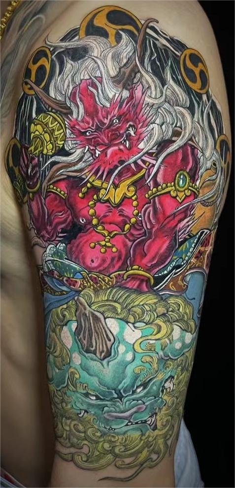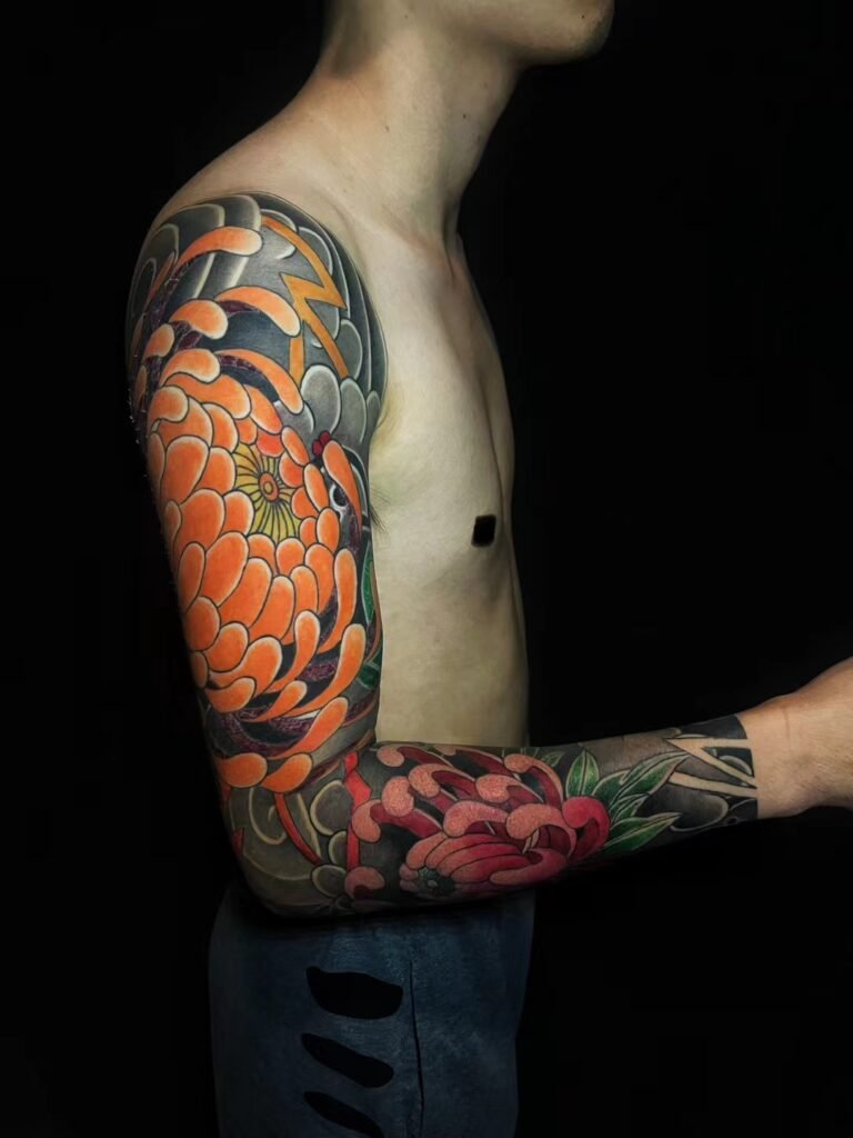
A neo-Japanese vs traditional Japanese tattoo comparison is best made through visible design choices, not through a claim that one label certifies an artist. Traditional-leaning work often uses a more stable outline grammar, flatter colour separation, established background vocabulary and restrained modelling. Neo-Japanese work may retain Japanese body flow while varying line weight, widening the palette, exaggerating forms or adding more illustrative depth.
These are tendencies, not a universal test. Two artists can use the same term for different results, and one tattoo can sit between the two. Compare the actual line, colour, silhouette, background and placement in a portfolio. Do not infer apprenticeship, tebori practice, lineage or cultural authority from a style tag alone.
First separate design language from identity and method
“Traditional Japanese” can refer to several different things in conversation: historical imagery, compositional conventions, an artist’s training lineage, a hand method, a relationship between artist and client, or simply a visible style. “Neo-Japanese” is also used loosely for contemporary work that reinterprets some Japanese tattoo vocabulary.
An academic article hosted by J-STAGE notes that even the boundary between “tattoo” and “irezumi” is not clear in modern Japanese society. That observation does not define neo-Japanese work, but it shows why English style labels should be handled carefully. A short portfolio caption cannot prove how a piece was taught or applied.
This guide therefore compares design systems only. It asks what can be observed in a finished composition. It does not use appearance to award a title, authenticate a lineage or say that one approach is more Japanese than another.
Both sides can draw from a shared visual history
The Asian Art Museum traces the growth of large-scale, densely composed Japanese pictorial tattoos alongside nineteenth-century woodblock prints of tattooed heroes. Its exhibition includes the influence of Utagawa Kuniyoshi’s Water Margin series and records motifs such as dragons, peonies, lions and snakes in the print and tattoo relationship.
The Japanese American National Museum likewise links Japanese tattooing to ukiyo-e while presenting historical tradition, modern practice and offshoots. The Japan Foundation describes Japanese tattoo as a living tradition whose contemporary practitioners continue to engage with older forms, techniques and aesthetics.
That shared history explains why a traditional-leaning and a neo-Japanese design may use the same tiger, koi, hannya mask, peony, wave or cloud. The difference often lies less in the subject list than in how the artist draws, separates and moves those subjects on the body.
A practical visual comparison
| Design feature | More traditional-leaning approach | More neo-Japanese approach |
|---|---|---|
| Line | Consistent, decisive contours with a clear hierarchy | Greater variation in contour weight, interior line and edge treatment |
| Colour | Clearly separated fields and a comparatively restrained relationship between hues | Wider or less expected palettes, additional transitions and stronger colour effects |
| Volume | Flatter graphic modelling and selective shading | More dimensional modelling, layered light or illustrative rendering |
| Form | Recognisable stylisation tied closely to established visual vocabulary | Further exaggeration of anatomy, expression, motion or decorative shape |
| Background | Waves, clouds, wind-shaped fields and florals organised as a connected system | Traditional vocabulary may remain but can be fragmented, enlarged, softened or mixed with other effects |
| Composition | Body-wide continuity and established foreground-background order | Body flow may remain, with more freedom in focal scale, crop and visual collision |
No single row decides the label. A wide palette does not automatically make a tattoo neo-Japanese. Mixed line weights do not erase a traditional composition. Read the rows together and compare several works by the same artist.
Line changes the character before colour arrives
In traditional-leaning Japanese design, the principal outline often carries much of the image. It separates a dragon from cloud, a flower from wave and a face from hair or mask. Interior marks then describe scales, fabric, petals and movement without competing with that outer structure.
A neo-Japanese drawing may create more contrast between thick and thin lines, allow some edges to dissolve into shading or use sharp interior accents for expression. A tiger’s cheek, a snake’s turn or a hannya mask’s brow can become more angular and dramatic. The result may feel more illustrative even when the subject and background are familiar.
When comparing references, cover the colour mentally and look at the contour. Ask whether the main figure would still be recognisable. Then ask which lines control the eye. This makes the difference easier to discuss than saying that one image feels “modern.”
Colour can be restrained, expanded or reorganised
A traditional-leaning colour system often relies on clean areas with strong separation between the main subject and its background. Restraint does not mean dullness. A limited relationship between black, open skin and selected colours can create a forceful overall read.
Neo-Japanese work may use more hues, unusual combinations, coloured shadows or smoother transitions. It can push one feature into a bright focal point or let colour model a form more gradually. Some artists bring in palettes influenced by contemporary illustration, printing or painting.
Do not choose from a list of supposedly mandatory colours. Compare full compositions under similar photography. Fresh tattoos, healed tattoos, studio lighting and edited images can make the same palette appear very different. State what you like in visual terms: “large black fields with two restrained colours” or “a broader palette with a bright focal mask.”
Black-and-grey work also fits this comparison. Without colour, the distinction may appear through line consistency, depth, texture and background treatment. Neo-Japanese does not have to mean bright colour, and traditional-leaning does not have to mean a fixed palette.
Exaggeration changes the subject’s energy
Japanese visual vocabulary already includes stylisation. A traditional-leaning dragon, tiger, wave or mask is not a neutral anatomical diagram. Neo-Japanese work may push that stylisation further through longer claws, sharper turns, enlarged eyes, broader mouths, compressed perspective or a more dramatic crop.
The useful question is whether the exaggeration supports the composition. A very large head can create a clear focal point on an upper arm but leave too little route for the body. A wide mask can command a back or thigh but crowd the floral support. Extra expression can make a subject powerful while moving it away from a specific historical reference.
If source accuracy matters, show the exact print, object, story or character and identify what must remain. If the goal is a contemporary reinterpretation, say which changes are welcome. This prevents “neo” from becoming permission to combine unrelated details without a hierarchy.
Depth and texture alter foreground-background separation
Traditional-leaning designs often establish depth through overlap, scale, open skin and clear graphic boundaries. A figure sits in front of waves because its silhouette and line hierarchy say so. The background connects the body while remaining subordinate.
Neo-Japanese rendering may add graduated shadow, atmospheric depth, reflected light or more complex surface texture. Those tools can make a face, scale pattern or cloud feel dimensional. They can also blur the boundary between main subject and support if every area receives equal modelling.
Compare how the artist protects the focal point. Does the face sit inside a quieter field? Do darks collect behind a light edge? Does texture decrease where the background passes behind the subject? The amount of rendering matters less than whether the visual order remains clear.
Background reveals whether the composition is still body-led
Waves, clouds, wind forms, rocks and seasonal plants can build continuity across a sleeve, back or leg. In a more traditional system, those elements often form a strong connective environment around the subject. Their direction helps the tattoo turn around joints and curved surfaces.
A neo-Japanese approach may enlarge one wave into a focal shape, break a background into graphic fragments, mix soft atmosphere with hard contours or use a less conventional transition. This can create a distinctive result, but the body still matters. A dramatic poster composition that ignores the shoulder, elbow, knee or hip may look strong as an image and weak as a worn design.
When viewing Japanese and Asian-inspired tattoo work, compare a complete placement rather than cropping straight to the face. Look at the edges, turning points, open skin and how the background behaves when the body is not shown flat.
Motif rules cannot be reduced to a style toggle
Choosing traditional-leaning linework does not automatically validate every motif pairing. Choosing a neo-Japanese finish does not automatically remove cultural context. Flowers, animals, deities, masks, historical figures and seasonal settings may carry relationships tied to a particular print, story, school or period.
Ask two separate questions:
- What is the source and context of the subject?
- How should that subject be rendered in this tattoo?
The first question protects meaning and reference accuracy. The second decides line, colour, depth and exaggeration. Keeping them separate lets a client request a contemporary finish without treating the underlying imagery as a decorative parts catalogue.
Compare portfolios like for like
A useful comparison controls as many variables as possible. Put sleeve beside sleeve, back beside back or isolated motif beside isolated motif. Compare similar subjects at similar scales. Whenever possible, examine unfiltered views that show the full body area and identify whether the image is fresh or healed.
Then note observable choices:
- outer contour: steady or strongly varied;
- interior detail: sparse, patterned or heavily rendered;
- colour: separated fields or layered transitions;
- focal form: restrained or strongly exaggerated;
- background: continuous environment or more independent graphic shapes;
- body route: clear from a normal view or dependent on a cropped photo.
This method is more reliable than selecting one online image labelled “traditional” and one labelled “neo.” The labels may have been written for search, social media or the creator’s own vocabulary rather than as a shared classification.
Brief the visual result without claiming a lineage
You do not need to decide the perfect label before making an enquiry. The tattoo enquiry guide explains the full first-message structure. For this style comparison, add a short preference statement:
I want a Japanese-inspired tiger on my left thigh. I prefer a strong connected background and a clear outer contour. I like the more exaggerated face and varied interior lines in reference 2, but I prefer the restrained black, red and open-skin balance in reference 1. Please use the images as direction rather than copies.
That message describes a design problem an artist can assess. It does not ask the artist to prove a title, lineage or application method. It also leaves room to explain when two preferences conflict at the proposed scale.
Yuyi Tattoo’s documented portfolio includes Japanese and Asian-inspired compositions. This does not mean every work should be advertised as neo-Japanese, wabori, irezumi or traditional Japanese tattooing. When ready, contact Yuyi Tattoo with the subject, placement, approximate size and labelled references. Project acceptance, price, schedule and artist availability still require a specific reply.
Sources and review date
- Asian Art Museum: Tattoos in Japanese Prints | reviewed 24 August 2026.
- Japanese American National Museum: Perseverance, Japanese Tattoo Tradition in a Modern World | reviewed 24 August 2026.
- The Japan Foundation, Sydney: Uncovering Japanese Tattoo | reviewed 24 August 2026.
- Japanese Review of Cultural Anthropology: Living with Tattoos, hosted by J-STAGE | reviewed 24 August 2026.
Frequently asked questions
Is neo-Japanese the same as neo-traditional tattooing?
The terms are often used differently. Neo-traditional commonly refers to a contemporary development from Western traditional tattoo vocabulary, while neo-Japanese usually signals a reinterpretation of Japanese subjects or composition. A label alone is unreliable, so compare the artist’s actual line, background, colour and body flow.
Does traditional Japanese tattoo style require tebori?
This article does not use visible style to infer application method. A design may look traditional-leaning and be applied by machine, hand method or a combination, depending on the practitioner. Ask the artist directly and do not assume tebori training or lineage from photographs.
Can a neo-Japanese tattoo still use waves and wind forms?
Yes. A contemporary interpretation may retain connected waves, clouds or wind-shaped background fields while changing line weight, palette, depth or exaggeration. Assess whether those elements still support the main subject and follow the body rather than whether they satisfy a single label.
Is one approach better for black-and-grey tattoos?
Neither label guarantees a better result. In black and grey, compare the strength of the silhouette, separation between foreground and background, amount of open skin and control of texture. The artist’s relevant portfolio is more useful than a broad style claim.
What should I send if I like features from both approaches?
Send a small set of labelled references and assign one visible feature to each. For example, choose one for contour and background, another for facial exaggeration and a third for tonal finish. State which preference is essential and which can change to suit the placement.