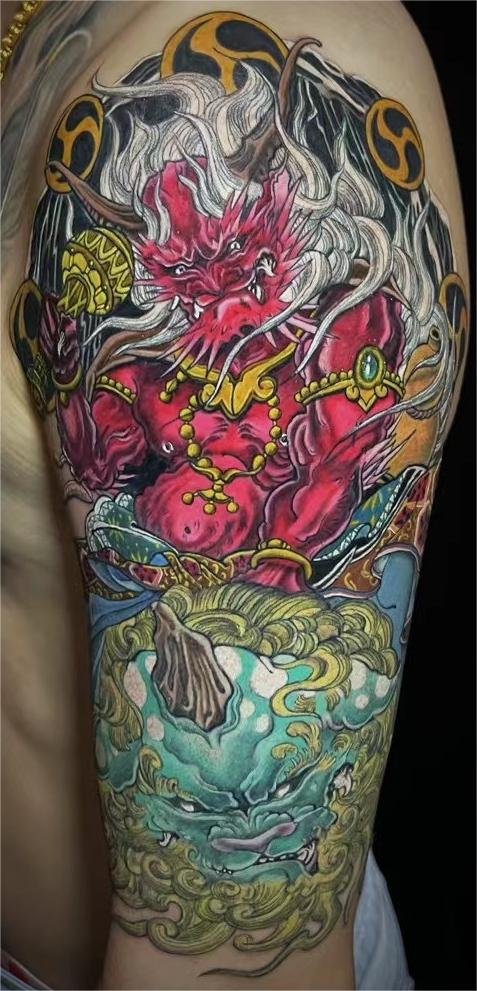
Stippled shading uses visible marks to suggest a tone. From close up, you notice grain; from farther away, those marks can read as a softer dark area. That change in viewing distance is part of the appeal.
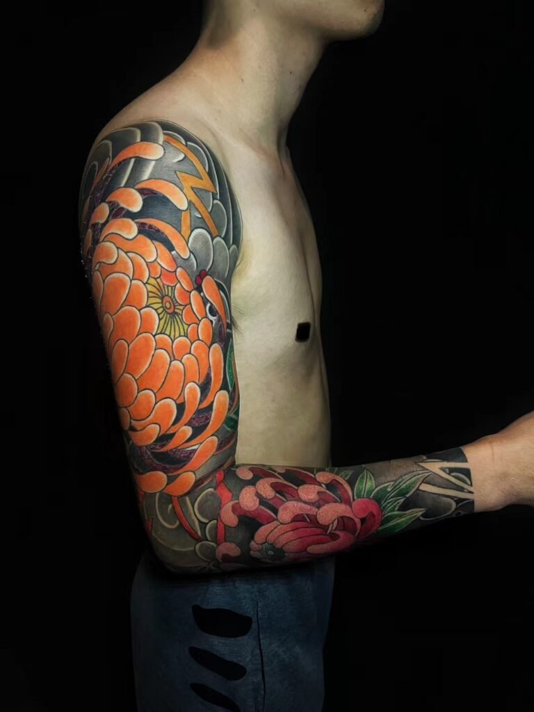
Use grain for a reason
A textured shadow can suit an illustrated flower, an aged object or a deliberately sketch-like drawing. It may also separate the subject from a smoother background. If every surface has the same grain, however, the tattoo can lose the distinction between petal, metal and skin.
Judge the density, not just the dots
- Look at the darkest patch and the lightest transition.
- Check whether the subject remains clear when the image is viewed small.
- Ask which edges need to stay sharper than the surrounding texture.
- Compare close-up and full-placement photographs.
A stippled finish is an aesthetic choice, not evidence that a tattoo will heal faster or age better than every smooth or colour design. Size, spacing and overall contrast still need attention.
Review Yuyi’s black-and-grey work for the kind of tonal texture you prefer. No machine speed or ink recipe is needed to describe that preference clearly.