
Two black-and-grey tattoos can use a similar range of tones and still feel very different. One may show a deliberate grain; another may have broad, soft transitions. For a client, that visible texture matters more than the name of the hand movement used to create it.
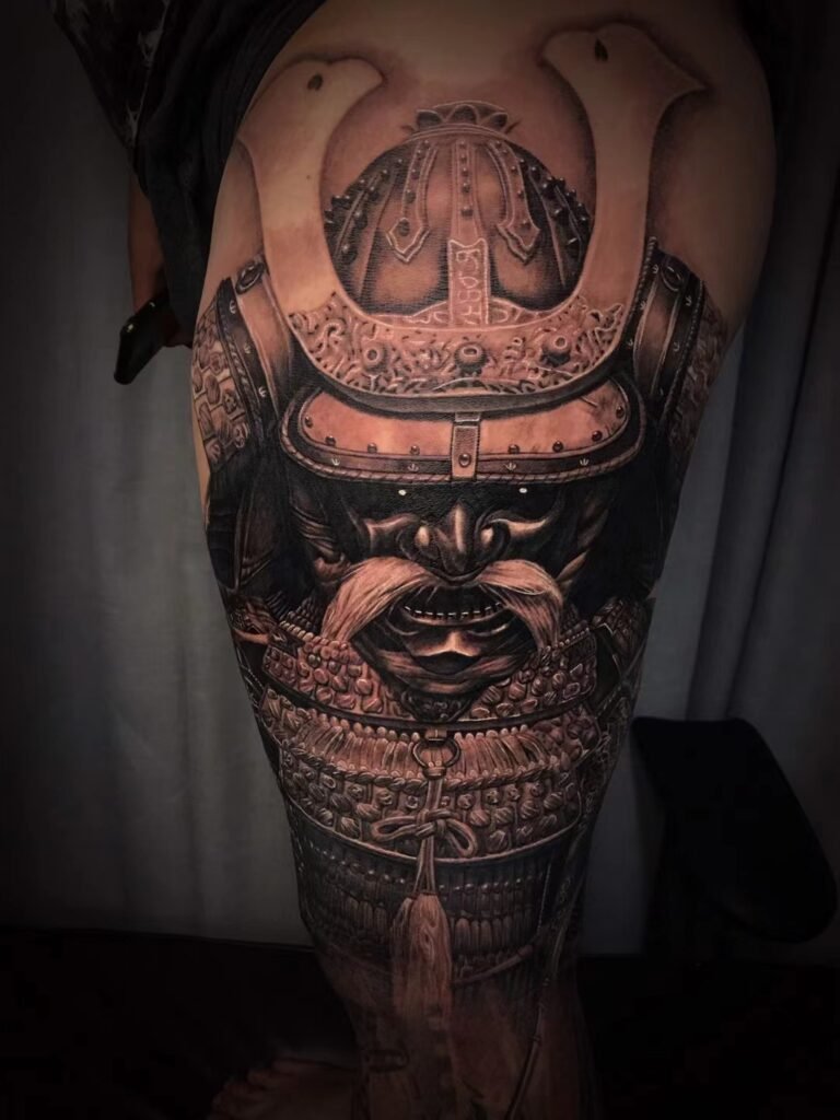
When texture is part of the drawing
Stippled or pepper-like marks can give a flower, mask or illustrative subject an etched quality. The marks remain part of the image. They can also distinguish a rough surface from a smooth one within the same composition.
When transitions should stay quiet
Smoother gradients can make a rounded cheek or curved helmet read as volume without drawing attention to individual marks. That does not mean every area should be equally soft: sharper edges may still be needed around the focal point.
You do not have to choose one texture everywhere
Imagine a helmet beside fabric: a quieter gradient can describe the hard rounded shell while visible grain distinguishes the material beside it. This is a hypothetical design example, not an analysis of the featured tattoo’s exact technique. Ask where contrasting textures would improve your subject and where they would only add noise.
Collect one example of each finish and compare them at the size you actually want. Ask how the chosen texture will relate to outlines, dark accents and open skin. Avoid choosing on the assumption that either approach is automatically less painful or longer lasting.
Yuyi’s black-and-grey work can help you discuss the result you like, without turning a consultation into a machine-setting lesson.

