
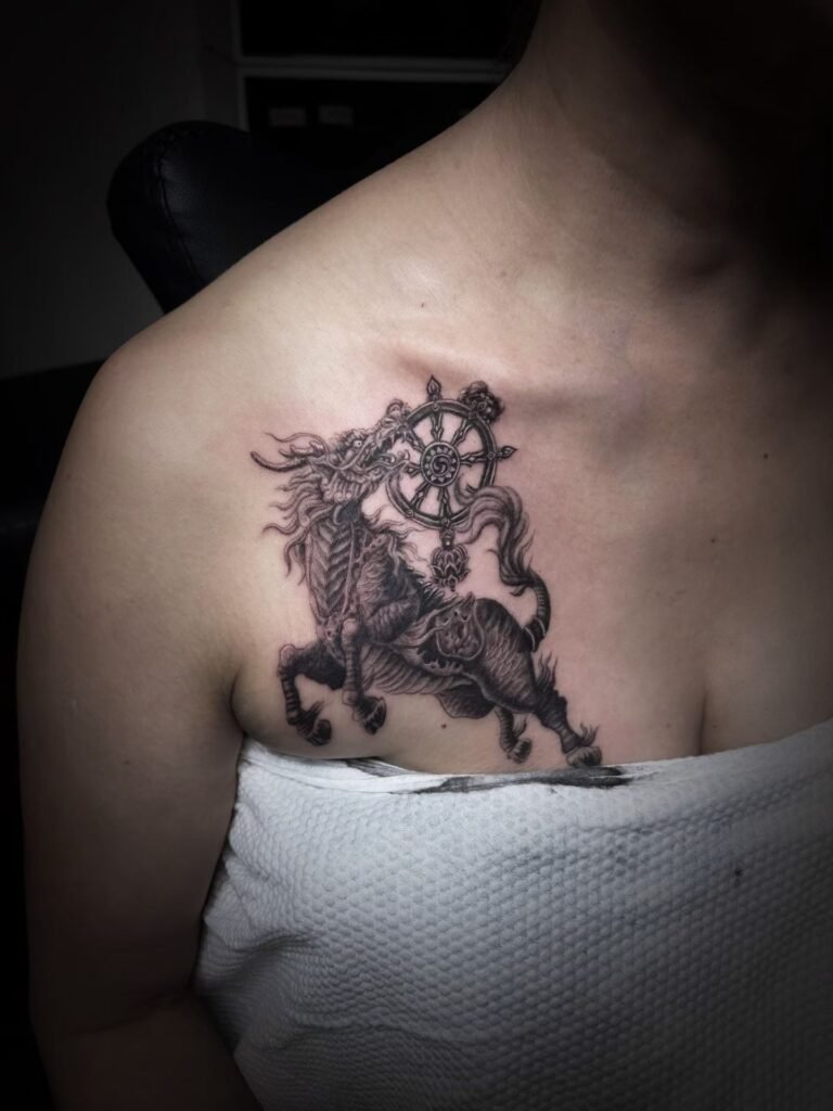
A strong shoulder-to-chest tattoo design starts with one readable shape. The shoulder cap and chest should not look like two stickers placed beside each other; they should share a silhouette, an overlap, a value plan or a line of movement that makes the upper body read as one composition.
The details come later. Before faces, feathers, scales, flowers, smoke or fabric are drawn, the artist has to decide where the mass begins, where it turns over the shoulder, how far it enters the chest, and which areas stay open as negative space. This early map also makes it easier to compare front, side and arm-relaxed views before small decisions hide the overall shape.
Build the silhouette before the detail
Silhouette is the large outside shape of the tattoo. It is what someone reads before they can see fine linework. On the shoulder and chest, silhouette matters because the body changes plane quickly: the shoulder rounds, the chest broadens, the collarbone cuts a diagonal, and the upper arm drops away.
If the silhouette is weak, adding more detail rarely fixes it. The tattoo may look impressive up close but unclear from a normal distance. If the silhouette is strong, the viewer can understand the project even before seeing the small textures. This is especially important for black-and-grey or realism-influenced work, where value and edge control do much of the design work.
A useful early test is to imagine the tattoo as a single dark shape. Does it have a clear direction? Does it fit the upper body, or does it look like a rectangle pasted across the shoulder? Does the chest side feel connected, or does it trail off without purpose? Those questions should be answered before rendering begins.
The shoulder cap needs a role
A shoulder cap tattoo can be the main subject, the turning point or the frame. It should not be leftover space.
When the shoulder cap is the main subject, the chest supports it. The design might use a head, mask, flower, animal shoulder, armour form or abstract mass that sits over the deltoid and rounds with the body. The chest can then carry background, secondary forms or negative space that makes the cap feel anchored.
When the shoulder cap is the turning point, the main read may begin on the chest and move onto the arm. In that case, the cap has to carry the curve. A wing, robe, cloud, wave, mane, smoke path or floral cluster can pass over it and guide the eye around the body.
When the shoulder cap is the frame, it can hold the edge of a chest panel. This works when the chest is the main statement and the shoulder gives it structure without pulling attention away.
The NCBI Bookshelf shoulder anatomy summary describes the shoulder as a complex and highly movable region. For design purposes, that means the stencil should be checked with the arm relaxed and slightly moved, not treated as a flat placement.
Chest composition: centre, side or diagonal
Chest tattoo composition usually follows one of three routes.
A centred route uses the sternum area as a visual anchor. It can work for symmetrical or near-symmetrical concepts, but it becomes difficult if the tattoo must also travel strongly to one shoulder. The central shape has to be balanced with the side extension so the piece does not look lopsided by accident.
A side-chest route places the main mass on one pectoral area and lets it turn into the shoulder. This is common for shoulder-to-chest designs because it keeps the project readable even when only one side is visible. The risk is a hard stop near the sternum. Negative space or a soft fade can make the inner edge feel intentional.
A diagonal route moves from upper shoulder toward the chest or from chest toward upper arm. This can be very strong for animals, fabric, wings, smoke, waves and botanical forms because the diagonal follows the body’s natural change of plane. It also helps avoid a boxy outline.
Overlap is what makes the areas belong together
Overlap means one element visibly passes in front of or behind another. It is one of the simplest ways to make a shoulder-to-chest tattoo feel connected. Without overlap, the design can become a line of separate elements placed side by side.
Overlap can be literal, such as a flower in front of a mask or a wing crossing a cloud. It can also be tonal, such as a dark shoulder mass fading into a softer chest background. In black-and-grey work, overlap often comes from value: a foreground edge stays crisp while the supporting area drops into softer grey.
The overlap should be large enough to matter. A tiny connector near the shoulder seam will not unify a large upper-body tattoo. The viewer should be able to see that one area passes into the other from a normal conversational distance.
For examples of value-led planning, review Yuyi Tattoo’s black-and-grey tattoo work. The point is not to copy a subject, but to notice how contrast, edges and empty skin separate one form from another.
Use landmarks without becoming mechanical
Visual landmarks help the design sit on the body. Useful landmarks include the collarbone, shoulder cap, sternum line, pectoral edge, upper arm line and the fold where the chest approaches the armpit. They help the artist decide where the tattoo should turn, taper or stop.
But landmarks are guides, not mechanical borders. A tattoo that rigidly traces the collarbone may feel stiff. A design that fills the chest to a straight vertical line may look cut off. A shoulder piece that ignores the arm line may look strong from the front and strange from the side.
The better question is: what does each landmark do for the composition? The collarbone can create an elegant upper boundary. The pectoral edge can give the main subject a natural base. The shoulder cap can round the design outward. The upper arm can carry the exit if the piece may later extend into a sleeve.
If future sleeve extension is possible, mention it early. The large-scale tattoo planning page explains why edges and exits should be discussed before a project is treated as finished.
Negative space keeps the shape readable
Negative space is not unused skin. It is the space that lets the design breathe. On the shoulder and chest, negative space can separate the collarbone from the tattoo, keep the armpit-side transition clean, or give the main silhouette a sharper outline.
A common mistake is to fill every gap because the project feels large. That often makes the shoulder-to-chest area darker but not clearer. If the main subject is already strong, supporting background should give it depth, not compete with it. If the tattoo uses several motifs, bare skin can be the border that keeps them from becoming a pile.
Negative space is also useful for future options. A shoulder-to-chest tattoo may later become part of a sleeve or upper-body project. A little planned breathing room gives the next stage somewhere to connect. Dense detail to every edge leaves fewer options.
How to brief a shoulder-to-chest design
A useful brief should let the artist see the upper body as a three-dimensional area. Send:
- Front torso photo from neck to upper abdomen, standing relaxed.
- Side photo showing the shoulder cap, upper arm and chest edge.
- Three-quarter photo so the turn between shoulder and chest is visible.
- Close photos of existing tattoos near the shoulder, chest or upper arm.
- The main subject and whether it should lead from the shoulder or the chest.
- Style preference: black and grey, colour, Japanese-inspired, realism-influenced or undecided.
- Whether the design may later extend into a sleeve.
You can view Yuyi Tattoo’s portfolio for large-surface composition references, then contact Yuyi Tattoo with your placement photos and brief. The studio is in Geylang, Singapore. WhatsApp enquiries can be sent to +65 9128 0501.
Sources and review date
- NCBI Bookshelf — Anatomy, Shoulder and Upper Limb, Shoulder — reviewed 24 August 2026.
- NCBI Bookshelf — Anatomy, Shoulder and Upper Limb, Glenohumeral Joint — reviewed 24 August 2026.
- American Academy of Dermatology — Caring for tattooed skin — reviewed 24 August 2026.
Frequently asked questions
Should a shoulder-to-chest tattoo start on the shoulder or the chest?
Start wherever the main silhouette belongs. If the shoulder carries the main mass, the chest can support it. If the chest carries the main panel, the shoulder should bridge or frame it. The order matters less than the hierarchy.
What makes a shoulder cap tattoo look connected to the chest?
Connection usually comes from overlap, shared direction, consistent value or background that crosses the turn. A small filler element near the edge is rarely enough. The shoulder needs a visible role in the whole design.
How much negative space should I leave?
Enough for the main shape to stay readable. The exact amount depends on the subject, contrast and future plans. Negative space can separate the collarbone, soften the inner chest edge, protect the armpit-side transition or leave room for sleeve extension.
Can black-and-grey work well for shoulder-to-chest designs?
Yes. Black-and-grey can be strong when the value plan is clear: dark foreground, softer support and controlled empty skin. Without that plan, a large black-and-grey piece can become heavy. Review healed and large-surface work before choosing density.
What should I avoid in this placement?
Avoid treating the shoulder and chest as separate flat panels. Avoid tiny detail at the main turning point, hard borders that block future extension, and references that only work as a front-facing picture. The design has to survive side and three-quarter views.

