
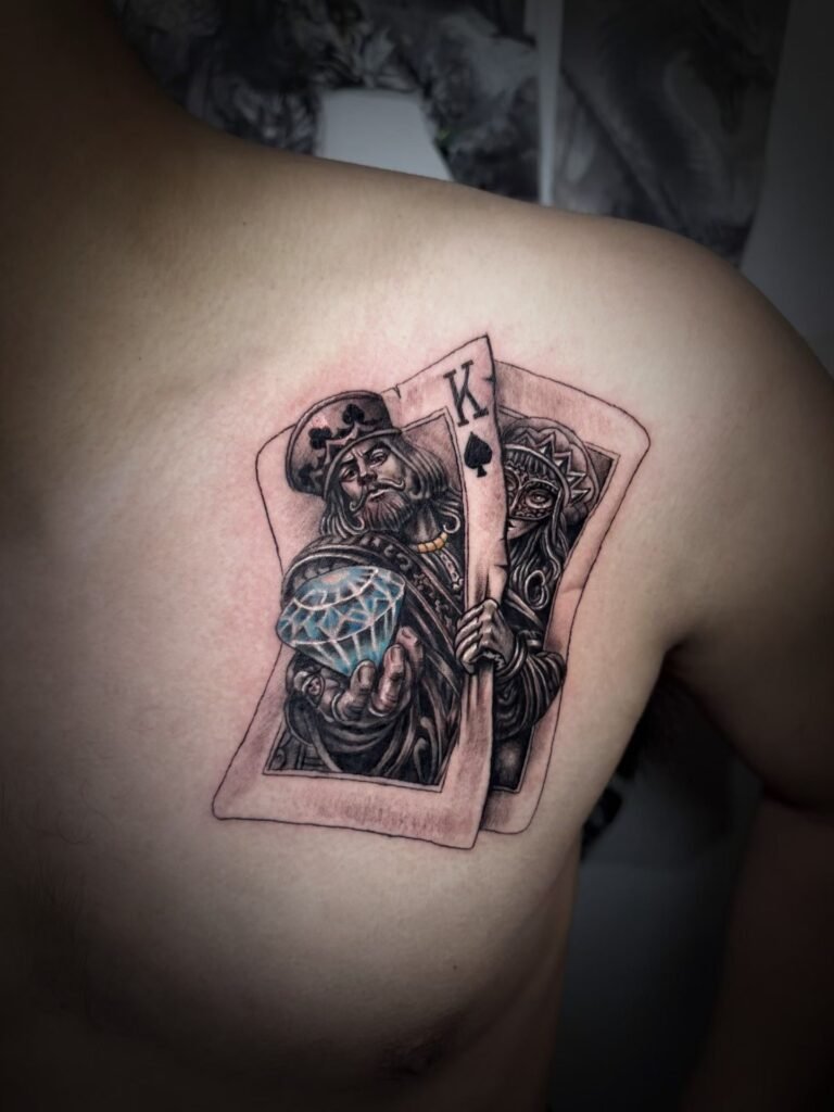
A portrait tattoo does not need a detailed background to feel complete. Leave the background open when the face, expression and silhouette should command attention. Add a frame, object or scene only when it improves the boundary of the portrait, explains useful context or helps the composition fit the body without competing with likeness.
The best portrait tattoo background ideas begin with hierarchy. From an ordinary viewing distance, the viewer should find the face before the frame, flowers, architecture, text or atmosphere. If the supporting information becomes equally dark, detailed or sharp, it can split attention and reduce the space available for recognisable facial structure.
Four background routes solve different problems
“Background” can mean anything from untouched skin to a full setting. Treating all of those options as one decision makes the consultation vague. Separate them by what they are meant to do.
| Approach | What it gives the portrait | What can go wrong |
|---|---|---|
| No illustrated background | Maximum visual emphasis on face and silhouette | The crop may feel abrupt if the lower edge is not resolved |
| Soft tonal field or skin breaks | Gentle separation without a literal setting | Similar mid-tones can make hair and background merge |
| Simple frame | A clear outer boundary and planned shape | An ornate edge can crowd the face or look pasted on |
| Objects or fuller scene | Narrative context and a larger composition | Secondary detail can compete for scale, contrast and attention |
There is no fixed face-to-background ratio that suits every portrait. A close face on an upper arm, a bust on a thigh and a portrait within a back composition have different amounts of room and different viewing distances. Choose the route after the subject, crop and body area are known.
No background keeps the decision on the face
An isolated portrait is useful when likeness is the whole point. Without scenery, the viewer reads the head angle, expression, hair shape and value pattern immediately. The Metropolitan Museum of Art describes Richard Avedon’s white-background portraits as stripping away props and extraneous detail so face, gaze, dress and gesture remain specific. A tattoo with open skin can use a related principle without trying to imitate that photographic style.
“No background” does not mean placing a face on skin with no thought about its edges. The top, sides and lower crop still need a designed finish. Hair may create one boundary. Shoulders, clothing, a collar or a controlled shadow may create another. A face cut sharply at the chin can look incomplete even when the reference itself was cropped that way.
Open skin also acts as negative space. It gives dark hair, an eyelid or the jaw enough separation to read. Filling every gap because it appears empty can remove the very contrast that makes the portrait clear.
This route tends to suit a brief such as “keep the expression and head shape; no story elements.” It asks the artist to solve silhouette and crop rather than invent context.
A soft field can anchor a portrait without becoming a scene
Some portraits need a small amount of tone behind them. Light skin and pale hair may disappear at the edge. A dark clothing shape may need a lighter area around it. A soft field, shadow, halo of value or restrained texture can give the portrait a visual boundary while remaining secondary.
MoMA’s description of figure-ground relationship focuses on the depicted form and the pictorial space around it. That relationship is practical in tattoo design. The face is not read in isolation; it is read against whatever surrounds it, including bare skin. A background value should therefore be chosen for separation, not simply because the reference contains a wall or cloudy backdrop.
Keep the edge hierarchy deliberate. A crisp eyelid against a quieter cheek can draw attention to the eyes. A softer background edge can recede. If every edge is equally sharp, the background may sit on the same visual plane as the face.
The tattoo design readability guide explains the larger relationship between value, negative space and viewing distance. For a portrait, apply those ideas with one priority: the features that carry likeness should win the first read.
Simple frames create shape, but they also claim space
A frame can turn an irregular crop into a clear overall form. It may be geometric, ornamental, architectural or built from a restrained natural element. The frame can help a portrait fit a vertical forearm, settle into a wider thigh area or connect to an existing composition.
Before adding one, ask what problem it solves. Does it give the head room? Does it separate pale edges? Does it establish a vertical or oval silhouette? Does it connect the portrait to other elements already planned? “It looks finished” is less useful than a specific compositional job.
The frame should not touch every important contour. Space between the border and the face prevents the forehead, hair or shoulders from feeling trapped. An intricate frame also creates its own focal points. If it contains dense leaves, lettering, filigree and sharp corners, it may demand as much attention as the portrait.
A partial frame can be enough. One side may follow the body while the opposite edge dissolves into open skin. That approach often feels more integrated than a complete badge placed over a curved area, but feasibility depends on the reference and placement.
Supporting objects should identify a role, not carry a whole biography
An object can give a portrait context: a flower, piece of jewellery, tool, item of clothing, instrument or architectural detail. Generic examples do not imply a particular client’s story. They show how a supporting element can work when its purpose is clear.
The useful questions are visual:
- Does the object help identify the period, occupation or atmosphere?
- Is it recognisable at a smaller scale than the face?
- Does its value separate from the jaw, hair and clothing?
- Can part of it be cropped without losing its meaning?
- Is it primary evidence from the source, or a new addition?
One object with a clear role is easier to rank than several objects of equal importance. If the viewer must decode five symbols before finding the eyes, the composition has lost its hierarchy.
Object scale deserves attention. A small flower can remain readable through silhouette; a miniature photograph, watch face or detailed building may require more room than expected. Do not reduce every item until it technically fits. Remove or simplify secondary information before shrinking the face.
A full scene changes the project from portrait to composition
A portrait inside a landscape, interior or narrative setting is no longer only a face with decoration. The artist has to reconcile perspective, light direction, scale and depth across the whole image. A reference with soft window light will not automatically sit naturally in a hard-lit city scene. A close-up head photographed from eye level may not fit a background seen from above.
Full scenes work best when the environment has a strong reason to exist and enough body area to read. Large scenery can establish depth through foreground, middle ground and background. On a narrow placement, those layers may compress into one band around the portrait.
Assign each source a role before they are combined. The face reference may control likeness and light. A location photograph may control architecture. A third image may only describe atmosphere. The guide to combining tattoo references helps keep those roles separate so the design does not become a collage of incompatible viewpoints.
Match background contrast to visual priority
Value describes how light or dark a colour is. The Getty’s formal-analysis materials also treat emphasis, balance and space as distinct design decisions. Together, those ideas provide a useful portrait check: the background can contain detail, but its darkest darks, strongest light breaks and sharpest edges should not accidentally pull attention away from the face.
This does not require making every background pale. A dark field may be exactly what separates a light face. A bright opening may frame dark hair. What matters is the value relationship at the boundary and the order in which the viewer sees the forms.
Try a simple test on the proposed composition. Reduce it mentally to three groups: dark, middle and light. If the face disappears into the same group as the setting, added detail will not repair the separation. The values need to be reorganised first.
Colour backgrounds create the same issue through hue and intensity as well as value. A saturated supporting object can become the focal point even when it is physically small. If likeness is the priority, colour strength should follow the hierarchy rather than the emotional importance of every object.
Reading distance changes how much context survives
A close phone view rewards texture. A tattoo on an arm, thigh, chest or back is often seen from farther away and while the body is moving. At that distance, the portrait’s outer shape and main light pattern arrive before tiny background detail.
Step back from the design preview. If the face remains clear and the frame recedes, the hierarchy is working. If the background becomes one dark block around a weak face, reduce its density or create more separation. If the portrait appears to float, adjust the crop or add only the amount of anchoring it needs.
The intended placement affects the test. A back composition needs strong large shapes because it may be viewed across a room. A forearm portrait can be seen more closely, but its narrow width limits how much setting can sit beside the face. Use the portrait tattoo placement guide to settle body area and viewing angle; return here to decide what belongs around one portrait.
Protect the crop before decorating its edges
The lower crop is often where background decisions go wrong. Adding flowers, smoke or geometry can disguise an abrupt cut, but it can also cover the neck and shoulders that help the head feel naturally placed. Decide first whether the portrait ends at the face, bust, clothing or an object held near the body.
Check the top and sides as well. Hair, hats and profiles need room. A frame placed too close can flatten the silhouette. Background texture pushed behind the light side of a face may remove the clean edge that the original photograph relies on.
For one portrait, keep a short list of protected contours: perhaps the hairline, far cheek, chin and one shoulder. Background elements should support those boundaries rather than cross them at random.
Prepare a background brief before consultation
When reviewing portrait realism tattoo planning, note which examples feel clear because of open skin and which use surrounding values to hold the subject. Do not ask to copy another finished tattoo. Name the compositional quality you want.
Then prepare these decisions:
- the primary face reference and intended crop;
- the preferred placement and approximate size range;
- no background, soft field, frame, supporting object or fuller scene;
- the single job the background must do;
- any object that is essential and any that can be removed;
- the face contours and expression that must remain unobstructed;
- separate references for setting or objects, labelled by role.
To have the hierarchy assessed, contact Yuyi Tattoo with the face reference and background notes. The documented portfolio includes portrait realism, but the suitability of a particular frame or scene depends on the image, body area and scale. The consultation should resolve those variables without promising likeness or imposing a fixed ratio.
Sources and review date
- The Metropolitan Museum of Art — Richard Avedon: Portraits — reviewed 24 August 2026.
- Museum of Modern Art — Figure-ground relationship — reviewed 24 August 2026.
- J. Paul Getty Museum — Understanding Formal Analysis — reviewed 24 August 2026.
Frequently asked questions
Does a portrait tattoo look unfinished without a background?
No. A face can feel complete when its crop, silhouette and lower edge are designed intentionally. Open skin may give the portrait stronger separation than extra scenery. A background is useful only when it solves a compositional or contextual problem.
Is a frame safer than a full scene?
It is usually simpler, but it still uses space and contrast. An ornate frame can compete with the face as easily as scenery can. Decide the frame’s purpose, leave room around important contours and keep its visual priority below the portrait.
Can flowers or objects be placed over part of the face?
They can overlap secondary areas when the design supports it, but features that carry likeness need protection. An object crossing an eye, mouth or distinctive face edge changes recognition. Test the overlap from normal viewing distance before approving it.
How many supporting objects should a portrait include?
There is no fixed number. Use only the objects that remain readable at the planned scale and have a clear role. One well-placed object often communicates more than several reduced to tiny, equally detailed symbols.
Should the background come from the same photograph as the face?
Not necessarily. It may be removed, simplified or replaced. If several sources are combined, their viewpoint, light and scale must be reconciled. Label which image controls likeness and which only supplies setting or atmosphere.

