
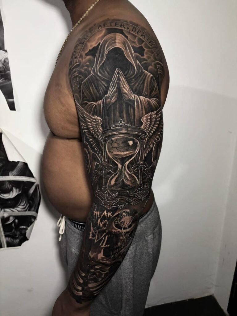
A skull-and-clock tattoo can suggest mortality, limited time, urgency, acceptance or an interest in dark imagery, but it has no compulsory meaning. For a strong composition, decide whether the skull or the clock is the lead subject. Keep the clock centre, hands and enough of its rim clear, then use overlap to connect the pair without making either object look accidental.
There is no useful fixed percentage for negative space. The pair has enough when the skull silhouette, clock face and hand positions remain separate at the intended viewing distance. If the dial only becomes readable in a close-up, enlarge the piece, reduce the clock detail or remove another element. A specific time should come from the wearer; the design should never invent a personal or memorial story to justify it.
What can a skull and clock mean together?
There is no single skull tattoo meaning, and the same is true of clock imagery. Mortality and the passage of time are established possible readings because skulls and timepieces appear together in European vanitas art and memento mori objects. The National Gallery describes the skull in Harmen Steenwyck’s Still Life: An Allegory of the Vanities of Human Life as a reminder of life’s brevity and the pocket watch as a sign of passing time. The Metropolitan Museum of Art also holds a watch in the form of a human skull whose motto refers to the shortness of time.
That history supplies context, not a rule for a modern tattoo. The Walters Art Museum notes that a Victorian skull-shaped watch may have reminded its wearer of mortality, while also allowing that novelty jewellery could make the object more light-hearted. Your tattoo could be reflective, defiant, decorative or deliberately ambiguous. A broken case, missing numeral or particular hour does not carry a universal coded message.
Choose which subject leads
The first composition decision is hierarchy. Giving the skull and clock equal size, equal contrast and equal detail often produces two focal points that compete. Pick the object that should be recognised first, then make the other one complete the reading.
| Hierarchy | What the viewer sees first | Useful structure |
|---|---|---|
| Skull-led | Brow, eye sockets, cheekbones and jaw | Put the clock behind or below the cranium; keep its centre visible and reduce case ornament |
| Clock-led | Dial, hands and outer case | Use the skull as a lower anchor, side crop or shadowed frame; keep it away from the hand pivot |
| Near-balanced | The pair reads as one emblem | Change scale, angle or value so the objects still have different jobs rather than mirroring each other |
A skull-led design usually feels more figurative. Expression comes from the tilt of the cranium, the jaw position and the direction of the empty sockets. A clock-led design feels more graphic because the circle becomes the dominant shape. Near-balance can work on a broad thigh, chest or back, but one object should still win through contrast or position.
Test the hierarchy as a small black-and-white thumbnail. If you cannot say which subject arrives first, adding teeth, gears, cracks or smoke will not solve it. The large dark and light shapes need to establish the order before surface detail begins.
Keep the clock face readable
Clock-hand legibility depends on a few simple relationships. The hand pivot needs a quiet field around it. The hour and minute hands should differ clearly in length, and their angle should not merge into one bar. The most important hour markers need enough separation from the rim, cracks and shadows to register as part of a dial.
Decide early whether the clock shows an exact time. If the time matters, write it numerically in the brief and check the drawn hands before approving the design. If no exact time matters, the hands can be arranged for separation and body flow. Do not attach a birth, death or life-event claim after the fact simply because a clock appears in the design.
Roman numerals, Arabic numerals, dot markers and an unnumbered face have different space needs. Twelve ornate Roman numerals plus a second hand, reflected glass, exposed gears and cracks can overwhelm a modest dial. Removing the second hand or simplifying the markers may preserve the clock more effectively than shrinking every part.
Perspective matters too. A clock facing the viewer gives every marker similar room. A tilted clock becomes an ellipse, compressing the far-side numerals. That angle can create depth, but the hands and a recognisable section of the rim still need to survive. Ask to see the design at the physical size planned for the body, not only enlarged on a screen.
Use overlap to create one object group
Overlap should explain depth. A clock behind the skull can lose part of its case, but its dial should not disappear behind the widest part of the cranium. A clock in front can cover a cheek or lower jaw, yet it needs a believable edge and shadow so it does not resemble a round sticker. A clock partly nested into an eye socket is a more surreal option, but the socket, dial and hand pivot must remain distinguishable.
Choose one main overlap rather than scattering small intersections everywhere. The clearest version often preserves the skull’s brow-to-jaw contour on one side and the clock’s rim on the other. This lets the eye complete both forms. If smoke, cloth, chain or foliage crosses the same boundary, it should reinforce the chosen depth instead of hiding the join.
The National Gallery’s Steenwyck painting is useful as composition study rather than tattoo template. Its description points to a strongly lit skull, a smaller visible watch and a large area of emptiness. The objects are connected, but they are not assigned equal visual force. That principle transfers well even when the final tattoo looks nothing like the painting.
How much negative space does the pair need?
Negative space may be untouched skin, a pale value or a calm area with very little texture. What matters is contrast between zones. For a skull-and-clock pair, protect four places first:
- a visible run of the clock’s outer rim;
- a clean area around the hand pivot and the chosen hour markers;
- separation between the skull’s jaw or cheek and the adjacent clock edge;
- one open channel between the combined subject and its background frame.
You do not need an empty halo around everything. A dark background can touch selected edges and make the light planes of bone or dial stand forward. The problem starts when every light gap is filled with smoke, gears, roses, text or texture. Then teeth, numerals and clock hands all occupy the same visual frequency.
Use a reduction test. View the composition small enough that individual teeth and numerals are no longer the attraction. The skull, dial and hand direction should still be identifiable. Next, wrap a printed outline around a cylinder or view the stencil on the body. A gap that looks generous on flat paper may narrow when the limb turns away.
Frame the pair without building a symbol pile
Framing should solve shape or flow. Smoke can soften an awkward outer edge. A chain can lead the eye away from a pocket watch case. Drapery can connect a round clock to a long limb. A geometric shadow can make the pair more graphic. Pick the frame for its compositional job before assigning it another meaning.
Extra motifs reduce the room available to the main pair. Roses, compasses, script, dates, wings and gears can each redirect the story and create another focal point. If one is essential, decide what it replaces. A focused skull-and-clock design is usually stronger than a catalogue of popular skull tattoo ideas compressed into one panel.
If you prefer an Asian-inspired background or larger body flow, review Japanese and Asian-inspired tattoo composition for examples of how a main subject and supporting movement can hold different levels of contrast. The motifs should still be planned in their own cultural context rather than used as generic filler.
Clock tattoo placement for a two-subject design
Placement determines the available silhouette. A round dial and an irregular skull need enough width to separate, so narrow placements usually favour a vertical stack or a decisive crop.
| Placement | Composition that often fits | Main check |
|---|---|---|
| Outer forearm | Skull above clock, or a clock-led vertical panel | Will the dial wrap so far that the hands vanish from the main view? |
| Upper arm | Overlapping pair with the rim turning slightly around the arm | Which subject faces outward when the arm rests naturally? |
| Calf | Long stack with chain, shadow or restrained framing | Does the clock remain readable from the rear or outer viewing angle? |
| Thigh | Wider diagonal, tilted clock or near-balanced pair | Is the surrounding space being used for hierarchy rather than extra motifs? |
| Chest or back | Broad grouping with stronger asymmetry and background | Does the pair occupy the body area confidently without floating in the centre? |
The inner forearm can suit a simpler clock-led piece, but a detailed skull plus full ornate dial may require more width than the surface offers. The shoulder can carry a round clock well, although the skull may need to extend toward the upper arm, chest or back so both subjects do not crowd the cap. On a calf, choose the primary viewing side before placing the dial centre.
Do not decide clock tattoo placement from a flat reference alone. State the body side, the upper and lower limits, and the direction the skull should face. Photos taken with the limb relaxed help show where the main view sits. The final scale and stencil still need to be assessed on the body.
Build a focused enquiry brief
Before writing to the studio, settle the decisions that control the drawing:
- skull-led or clock-led hierarchy;
- exact time, or permission to choose a clear hand angle;
- intact, aged, cracked or simplified clock case;
- frontal, three-quarter or profile skull angle;
- placement, side and approximate dimensions;
- black-and-grey or restrained colour direction;
- one necessary framing element and a short list of exclusions.
Send separate references for skull anatomy, clock design and body flow rather than one finished tattoo to reproduce. The tattoo enquiry guide explains how to label references and provide the practical details needed for a custom discussion. Make clear which image controls the skull, which controls the dial and which only shows placement.
Discuss a custom skull-and-clock composition
Yuyi Tattoo’s documented work includes black-and-grey realism and larger Asian-inspired compositions. For a focused custom enquiry, send your hierarchy, clock time, reference images, placement and approximate size through the Yuyi Tattoo contact page. The first design question is simple: which object must be understood first?
Sources and review date
- National Gallery, London — Harmen Steenwyck, Still Life: An Allegory of the Vanities of Human Life — reviewed 24 August 2026.
- The Metropolitan Museum of Art — Watch in the form of a human skull — reviewed 24 August 2026.
- The Walters Art Museum — Watch in the Form of a Skull — reviewed 24 August 2026.
Frequently asked questions
What does a skull and clock tattoo mean?
It can refer to mortality, passing time, urgency, acceptance or a personal attitude toward life’s limits. Those are possible readings, not a fixed code. Historical vanitas works pair skulls and timepieces, but a modern tattoo can also be decorative or intentionally ambiguous. The wearer should define any personal meaning.
Should the skull or the clock be larger?
Make the subject that should be recognised first larger, higher in contrast or more complete. A skull-led design can crop the clock case while protecting its centre and hands. A clock-led design can use the skull as a lower anchor or side frame. Equal size only works when angle and value still create hierarchy.
How can clock hands stay readable in a tattoo?
Keep the pivot clear, make the hour and minute hands different lengths, and avoid placing a crack or skull edge through the same centre. Use fewer dial details when space is limited. If the time is meaningful, verify the drawn hand positions before the design is approved.
How much negative space should a skull-and-clock tattoo have?
There is no dependable percentage. Reserve enough light or open area to separate the clock rim, hand pivot, skull contour and background when the design is viewed at real size. If those shapes merge in a reduced preview or on the curve of the body, simplify or enlarge the composition.
Where is the best placement for a skull and clock tattoo?
The outer forearm and calf suit vertical arrangements, while the upper arm and thigh allow more overlap and width. The chest or back gives room for a broader grouping. The best option depends on which object leads, how much of the dial must show and where the main viewing angle falls.

