
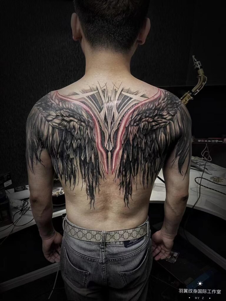
Choose a symmetrical tattoo design when a clear centreline, paired anatomy or formal front-facing view is central to the idea. Choose an asymmetrical composition when the design needs to travel around a shoulder, follow a rib line, turn along a limb or create directional movement. Neither structure is automatically more balanced, readable or durable.
The deciding test is how the artwork fits your body in its main viewing position. A symmetrical drawing still needs adjustment to the person wearing it, because the body is not a perfectly mirrored sheet. An asymmetrical drawing still needs visual balance, so one dark, detailed area does not pull the whole piece off course. Placement photos and a stencil viewed from several angles are more useful than asking for a mirrored template by default.
The choice is between two kinds of balance
Symmetry and balance are related, but they are not synonyms. The Getty describes balance as the way visual weight is spread across an artwork. It may be symmetrical, with similar elements on both sides, or asymmetrical, with different elements that still feel balanced. That distinction applies well to tattoo composition.
In a symmetrical tattoo, the central axis is obvious. A moth may open its wings on either side of the sternum, an ornamental form may rise along the spine, or two supporting elements may frame a central subject. The eye compares left and right immediately.
In an asymmetrical tattoo, balance comes from relationships rather than mirroring. A large pale form may be countered by a smaller dark form. A face near the shoulder may be balanced by leaves or smoke travelling down the arm. Open skin on one side may be deliberate space rather than a missing half.
Both approaches can be clear or crowded. The separate question of what remains legible at the intended size is covered in the tattoo design readability guide. Here, the issue is where the composition finds its balance on the body.
When formal symmetry supports the placement
Symmetry is strongest when the body provides a meaningful axis and the tattoo is expected to be seen primarily from a centred view. Common examples include the sternum, the middle of the chest, the upper back and a vertical area aligned with the spine. Paired shoulders or collarbone areas can also support a formal structure, although they are two curved surfaces rather than one flat panel.
Consider symmetry when several of these statements are true:
- The subject has an intentional left and right half.
- The central point should be noticed before the outer detail.
- The tattoo will usually be read straight on or straight from behind.
- Equal spacing from a visible body landmark matters to the concept.
- A stable, ceremonial or emblem-like presence suits the subject.
A centreline brief should name the landmark, not merely say “in the middle”. OpenStax defines the midsagittal plane as the vertical plane dividing the body into right and left sides, but a tattoo is fitted to visible surface anatomy, posture and the chosen boundaries. On the front torso, the sternum, navel and base of the neck may offer useful reference points, yet they do not turn the whole surface into a ruler.
If you are considering a front-centred piece, the chest and sternum tattoo guide can help you separate a narrow vertical placement from a wider composition that spreads across the chest.
A mirrored drawing still needs an individual fit
The goal of tattoo symmetry is convincing visual alignment, not a claim that both sides of the body are identical. Shoulder height, rib shape, breast or chest contour, muscle development, posture and the way someone stands can create visible differences. Breathing also changes the torso while a static digital mock-up does not.
This affects more than the outer border. Suppose a central ornament has two long side elements. Matching their length on paper may place their tips at slightly different apparent heights once they follow separate curves. Adjusting one side by a small amount can make the finished placement look more balanced from the agreed view. Literal measurements and visual alignment are not always the same decision.
For that reason, decide what “centred” means before placement begins. It might mean:
- aligned to a visible anatomical landmark;
- balanced inside the available skin area;
- level from the main standing view; or
- centred relative to an existing tattoo.
Those targets can conflict. A good placement discussion makes the priority explicit instead of quietly choosing one.
When asymmetry follows the body more naturally
Asymmetrical tattoo composition is often better suited to surfaces that turn, taper or connect several views. The shoulder flows into the upper arm. A rib piece moves from front-side to side-back. A hip design may travel towards the thigh. A forearm presents one shape with the palm forward and another after rotation.
On these areas, forcing a mirrored outline may ignore the strongest line already present in the body. An asymmetrical design can place the focal subject on the broadest panel, then let secondary forms narrow, wrap or dissolve as the surface changes. It can also direct attention towards a future extension without pretending that the current piece is half of an unfinished mirror image.
Asymmetry is particularly useful when:
- one primary view matters more than a perfectly centred front view;
- the subject has a clear direction, such as a climbing plant, turning animal or wind-driven background;
- the available space is interrupted by existing work, scars that need separate assessment, or an edge you want to keep clear;
- the composition crosses from torso to limb;
- movement and visual sequence are more important than formality.
Asymmetry does not mean placing an object at random and calling the empty side “flow”. The focal point, direction and ending still need to be planned.
Visual weight keeps different sides in conversation
Visual weight describes how strongly an area attracts the eye. Size matters, but it is only one factor. Dark value, dense detail, a face, a sharp edge or a high-contrast shape may command attention more strongly than a larger quiet form.
Imagine a composition with a portrait on the upper right and foliage travelling down the left. Equal surface area would not necessarily create balance because a face naturally becomes a focal point. The foliage may need a darker anchor, a stronger directional curve or a deliberate cluster at a different height. The solution is a counterweight, not a copied face.
Use four questions when judging asymmetrical balance:
- Where does the eye land first?
- What leads the eye away from that point?
- Is there enough quieter space for the focal area to remain clear?
- Does the composition end deliberately, or does it appear cut off?
The same questions reveal weak symmetry. Two matched wings can still feel unbalanced if one contains much darker shading or more detail. Mirrored outlines do not correct unequal visual weight inside them.
A hybrid structure can be more useful than either extreme
Many successful body compositions combine a stable centre with unequal supporting movement. A centred mask may have clouds extending farther over one shoulder. A sternum ornament may begin symmetrically, then taper differently around existing work. A back piece may hold a central figure while landscape elements move on separate paths.
This hybrid approach preserves a clear anchor without forcing every branch, petal, wave or background form to match. It also helps when the concept feels formal but the placement is not a simple front-facing panel.
Decide which layer carries the symmetry. It may be the main silhouette, the negative-space channel, a pair of eyes, or only the first section nearest the centre. Everything else can support that anchor with controlled variation. If every layer is mirrored, organic subjects can become rigid. If no layer relates across the axis, the intended formality may disappear.
Test the design in the views that will actually matter
A flat artwork preview answers only part of the placement question. OpenStax’s anatomy text describes flexion, extension and rotation as distinct body movements. Those movements alter which parts of a tattoo share one view. A shoulder-to-arm composition can separate when the arm lifts. A rib design can narrow from the front and open from the side. Paired chest elements may appear level with arms relaxed and different with one arm raised.
Choose a primary view, then identify the secondary views that must still make sense. For a sternum design, the primary view may be straight on. For a shoulder piece, it may be a three-quarter view. For a forearm piece, decide whether the relaxed arm or a presented palm is the reference position.
Useful placement photos show the body relaxed, the relevant joint moving and enough surrounding area to understand the boundaries. The guide to describing tattoo placement explains how to name the side, surface, direction and edges without relying on specialist anatomy terms.
During stencil review, check the whole shape before inspecting tiny details. Stand normally. Look from the intended distance. Photograph the placement straight on and from each important angle, then ask whether the focal point stays intentional. A small change in height or rotation may solve a structural problem that cannot be fixed by adding more decoration.
Compare the structures by decision, not by trend
| Planning question | Symmetrical structure | Asymmetrical structure |
|---|---|---|
| Main anchor | A visible centreline or paired landmark | A focal panel, directional line or dominant view |
| First impression | Formality, stability and repetition | Movement, sequence and controlled imbalance |
| Best fit | Centred torso or back placements, paired areas | Wrapping, tapering or connected body surfaces |
| Main risk | Treating the body like a perfect mirror | Letting one area become visually heavy without a counterweight |
| Placement check | Alignment and equal apparent spacing | Focal point, direction, ending and secondary views |
Do not choose symmetry because it seems safer, or asymmetry because it seems more original. Choose the structure that explains the subject and placement with the fewest forced decisions.
What to review before approving the composition
Ask for the design at a scale and orientation that relate to the planned body area. If it is symmetrical, identify the axis and the landmarks used to align it. If it is asymmetrical, identify the focal point, the counterweight and the intended direction. Then confirm which parts may shift when the stencil is fitted.
The tattoo design review checklist covers scale, crop, spelling, reference use and approval boundaries. For this particular decision, add five composition questions:
- What is the main view?
- What body line or landmark organises the design?
- Which area should attract attention first?
- What needs to remain balanced when the body moves?
- Is any difference between the two sides intentional or a placement error?
For a useful consultation, send clear relaxed and movement photos, the approximate boundaries, your preferred view and any nearby tattoos. Explain whether symmetry is essential to the meaning or simply the first layout you imagined. You can contact Yuyi Tattoo to discuss the composition and placement. The review should establish what fits the actual body; it cannot promise perfect bodily symmetry or a universal ageing advantage for either structure.
Sources and review date
- J. Paul Getty Museum — Vocabulary for describing an artwork — reviewed 24 August 2026.
- OpenStax — Anatomical terminology and body planes — reviewed 24 August 2026.
- OpenStax — Types of body movements — reviewed 24 August 2026.
- PubMed Central — Facial asymmetry: a current review — reviewed 24 August 2026.
Frequently asked questions
Does a sternum tattoo have to be perfectly symmetrical?
No. Symmetry may suit a sternum tattoo because the placement has a strong vertical axis, but “perfect” mirroring on paper is not the only goal. The fitted design should look balanced on your actual contours and in the agreed standing view. Small adjustments between sides may improve apparent alignment.
Does an asymmetrical tattoo look unfinished?
It should not if the focal point, direction, counterweight and ending are deliberate. An asymmetrical design can feel complete even when it occupies one side of the body or travels farther in one direction. The problem is unplanned imbalance, not the absence of a mirrored half.
Is symmetry better for tattoo ageing?
There is no universal rule that a symmetrical structure ages better. Scale, contrast, spacing, placement, application, skin response and long-term care all affect how a tattoo changes. Symmetry organises a composition; it does not guarantee retention or readability.
Can an existing tattoo be included in an asymmetrical composition?
Potentially, but the artist needs clear photos and boundaries before deciding how the new visual weight should relate to the existing piece. Do not assume the older tattoo can be hidden or altered. If covering existing ink is part of the request, suitability must be assessed case by case.
What photos help compare symmetry and body flow?
Send a straight-on relaxed image, relevant side or three-quarter views, and a view showing normal joint movement. Keep the camera level and include enough surrounding body to see the centreline and boundaries. Mark the intended area on a duplicate image rather than drawing over the only clean photo.

