
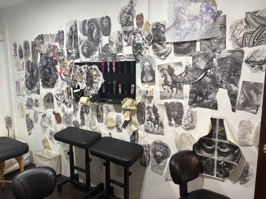
Fine-art training can influence a tattoo through the decisions that happen before linework: what the eye should see first, how a figure sits in space, where contrast is held, and how the design follows the body. It does not guarantee a good tattoo, and an art-school name cannot replace finished work. The useful question is whether the artist turns those ideas into a composition that is clear, suitable for the placement and honest about scale.
Yuyi’s artist profile describes fine-art training at the LuXun Academy of Fine Arts. For a client, the useful question is how that background informs composition, value, anatomy, reference images and body flow, and how those choices appear in the portfolio.
Fine art is a way of looking, not a tattoo style
A fine-art background does not automatically mean oil painting, realism, Japanese tattooing or any other fixed style. Fine art is a broad field with different media, histories and methods. Its transferable value is a habit of looking closely and making choices on purpose.
The National Gallery of Art’s art education resources describe elements such as colour, line, shape, form and texture. The Getty’s formal-analysis material similarly gives viewers a vocabulary for line, shape, space, colour, value and texture, and asks how those elements affect a composition. Tattoo design uses the same basic questions, but on a curved, moving and changing surface.
Composition: arranging one readable whole
Composition is the relationship between parts. In a tattoo, those parts may be a face, hands, flowers, clouds, armour, a background and the edge of the body area. The client may arrive with each element saved as a separate reference. The artist’s job is to decide whether they can belong to one visual system.
A composition review should answer four questions:
- What is the primary subject?
- Where does the viewer look first?
- What carries the eye from that focal point to the rest of the design?
- Where should the composition stop, fade or leave skin open?
A face can be beautifully drawn and still fail as a tattoo if it is placed too close to a crease, cropped by the edge of a sleeve or surrounded by competing symbols. A large back piece can contain excellent individual drawings and still feel disconnected if there is no main silhouette. Fine-art composition helps an artist test the whole field before polishing isolated details.
This is why a client should ask to see the proposed layout at the actual body area, not only a close-up of the main subject. A thumbnail, a full-size printout or a simple body mock-up can reveal whether the design reads as one image. The large-scale tattoo planning guide explains why silhouette and body transitions need attention before detail.
Value: making form readable in black and grey
Value means how light or dark a passage appears. In a black-and-grey realism tattoo, value is what separates the forehead from the hair, the face from the background and the foreground subject from the supporting atmosphere. A design can use many grey tones and still be flat if those tones sit too close together.
A fine-art approach to value does not mean making everything dark. It means deciding where the deepest darks, middle values and open skin will do the most work. The face may need the cleanest value hierarchy. A background can stay quieter. A narrow highlight may separate overlapping forms. If every section is rendered at the same intensity, the eye has no reason to stay with the subject.
The Getty’s value exercises describe value as a way to give objects the illusion of three-dimensional form. On skin, the same principle is filtered through healing, movement, lighting and the body’s natural colour. No value plan guarantees a fixed long-term result, but a clear hierarchy gives the tattoo more visual margin than a dense field of similar grey.
When reviewing a black-and-grey tattoo in Singapore, look beyond the dramatic close-up. Ask whether the main subject still reads in ordinary light and from a few steps away. Check if the darkest areas are placed intentionally or simply spread across the entire image. Good value control is quiet; it makes the subject easier to see.
Drawing and anatomy: adapting a reference to a body
Anatomy in tattoo design is not limited to drawing a convincing face or muscle. It also means understanding the anatomy of the placement. A shoulder rotates, an elbow folds, a back expands and a thigh changes shape as a person stands, walks or sits.
For a portrait, anatomy helps the artist judge the relationship between eyes, nose, mouth, cheek planes and jaw. For a figure, it helps the artist avoid placing a joint through a critical gesture. For a large animal, it keeps the spine, shoulders, paws and movement believable even when the animal wraps around a limb.
A reference image is flat. The tattoo is not. The artist may need to turn a head, widen a crop, enlarge a hand or simplify a background so the design works on the client’s body. That is not a failure to copy the reference. It is the necessary translation from one surface to another.
Line, edge and texture: controlling attention
Fine-art study also appears in how an artist handles edges. A hard edge can bring a feature forward. A soft edge can let a form recede. A broken edge can let open skin enter the design. In tattooing, edge control is connected to line weight, shading transitions and the amount of detail placed in one area.
Texture should support form. Hair, fur, scales, fabric and smoke all use marks, but repeating marks everywhere creates a flat wall of noise. The face, hand or eye that matters most may need calmer surroundings. The least important areas can be simplified so the focal area has room to speak.
The National Gallery of Art separates line, form and texture as basic elements for looking at art. That vocabulary can make a client’s feedback more useful. Instead of saying “make it more realistic,” you can say that the face needs a clearer edge, the background is competing with the subject, or the texture is too even across the piece. Specific language gives the artist something to solve.
Body flow: from picture plane to skin
A painting or drawing has a defined frame. A tattoo has an edge, but it also has a body around it. Flow is the plan for how the subject, background and negative space travel across that body.
On an upper arm, the shoulder cap can hold a focal point while the design narrows toward the elbow. On a sleeve, the elbow is a turning zone rather than empty filler. On a back, the spine can create a central axis, while the shoulder blades and waist change the width of the field. On a chest, the sternum and collarbone affect symmetry and breathing room.
Fine-art composition offers principles such as balance, movement, rhythm and unity. Tattoo design applies them to a surface that moves and stretches. A sweeping line can carry the eye around a shoulder. Repeated cloud shapes can connect separate panels. A gap of open skin can prevent two faces from merging. These are practical tools, not decorative theory.
Before approving a large layout, ask to see it standing and, where relevant, from the side. A design that only works flat on a screen may need to be redrawn. The artist should also know whether you want future extensions. Leave an exit where a sleeve might connect to the chest, or where a back piece might later move toward the shoulder, only if that future plan is real. Do not fill the body with “maybe” background.
What art-school background can and cannot tell you
An artist’s education can tell you something about where they learned to observe, analyse or make images. It cannot tell you what they can tattoo today without portfolio evidence. A school name does not prove a particular major, degree, graduation date, teacher, award or result. It also does not guarantee that the artist is right for your subject.
Use education as context, then check four forms of evidence:
| Question | Evidence to look for | Why it matters |
|---|---|---|
| Can the artist compose? | Whole tattoos with a clear focal point and supporting structure | Separate good drawings need to read as one piece |
| Can the artist control value? | Black-and-grey work with readable darks, greys and skin breaks | Contrast carries form and hierarchy |
| Can the artist adapt to anatomy? | Shoulder, back, sleeve or thigh images shown on the body | A flat reference must become a moving design |
| Can the artist adjust scale? | Small, medium and large pieces with appropriate detail | Detail that works at one size may fail at another |
This is also why “fine art tattoo artist Singapore” is not enough as a search phrase. Treat it as a starting point. Open the relevant portfolio section and compare work that resembles your planned subject, scale and placement. If the artist’s background sounds impressive but the evidence is unrelated, keep asking questions.
Turning these ideas into a consultation brief
A useful message should help the artist make decisions, not ask for an instant finished drawing. Include:
- the subject and what it means to you;
- two or three references, with the parts you want to preserve marked clearly;
- the body area, approximate size and desired orientation;
- colour or black-and-grey preference;
- existing tattoos, scars or design constraints in the area;
- whether the piece may connect to a future sleeve, chest or back composition;
- the level of detail you consider essential versus optional.
Then ask a small set of design questions: What is the main focal point? What needs to be larger for the body area? Which reference elements should be removed? Where will the design need negative space? How will the composition read when the body is relaxed and moving?
Yuyi’s documented portfolio directions include black-and-grey realism, large-scale back pieces, portraits and Japanese or Asian-inspired compositions. His artist profile describes fine-art training at the LuXun Academy of Fine Arts. If the visual direction matches your project, use the tattoo artist Singapore profile for context, then send the actual brief through the contact page. Artist assignment, timing and project fit still need direct confirmation.
Sources and review date
- LuXun Academy of Fine Arts — official charter naming the institution — reviewed 24 August 2026.
- National Gallery of Art — The Elements of Art — reviewed 24 August 2026.
- Getty Education — Understanding Formal Analysis — reviewed 24 August 2026.
- Getty Education — Exploring Value to Create Form — reviewed 24 August 2026.
Frequently asked questions
Does fine-art training guarantee a better tattoo?
No. It can support skills such as observation, composition, value and form, but the tattoo still has to be designed for skin and supported by finished portfolio evidence. Judge the work, the placement decisions and the consultation rather than relying on an education label.
What is the confirmed art-school background for Yuyi?
Yuyi’s artist profile describes fine-art training at the LuXun Academy of Fine Arts. Compare the portfolio examples and ask how composition, drawing and tonal planning can support your idea.
How does fine art influence a black-and-grey realism tattoo?
It can influence how the artist organises value, edges, form and texture. The deepest darks can establish hierarchy, lighter skin breaks can separate forms, and controlled texture can keep the focal subject readable. The actual result still depends on the design, placement and tattooing process.
Why does composition matter for a large back piece?
A back piece is read as a whole before the viewer notices small details. Composition sets the silhouette, focal point, movement and relationship between the spine, shoulder blades and waist. Without that structure, well-drawn details can still look like disconnected panels.
What should I ask an artist about a reference image?
Ask which parts must remain recognisable, which can change for your body, and what the artist would simplify at the planned size. Also ask where the focal point will sit, how the design will move around the placement and what negative space must remain open.
Is an art-school background more important than a portfolio?
No. The portfolio is the direct evidence of what the artist has translated into skin. Education can add useful context, but compare several finished pieces in the style, scale and body area you want before making a decision.

