
Let the sun and moon face each other when their relationship is the main idea. Keep them apart when each symbol needs an independent role or a different view of the body. Combine them inside one outline when you want a single emblem rather than two separate scenes. Moon tattoo meaning and sun tattoo meaning can inform that choice, but neither dictates it.
Fit the pair to the body by choosing the main viewing angle first, then comparing the width of the sun’s rays with the moon’s outer curve. Paired shoulders or limbs can hold two separate discs; a forearm, calf or side of the torso often calls for a vertical arrangement; a broad back, chest or thigh can give an integrated composition more room. The final route should still read when the body is relaxed, not only when a reference image is viewed flat.
Meaning is personal, but the forms are observable
Balance, contrast, companionship, change and continuity are possible readings of a sun-moon pair, not a universal code. The images have appeared in religious, astronomical and decorative art with different purposes.
Museum records make that variation visible. The British Museum interprets the sun-moon sign on a Tibetan figure within a specific Buddhist context as transcended duality. On a late Anglo-Saxon plaque, the two bodies appear as personifications above the Crucifixion. These are contextual readings, not definitions for every celestial tattoo.
Write your intended meaning in ordinary language. “Two people with different temperaments who remain connected” gives the artist a relationship to draw. Enjoying the geometry of a radiant circle beside a crescent is also a complete reason.
Keep astronomy separate from astrology. A moon phase describes visible illumination; a zodiac sign belongs to another interpretive system. Do not add constellations or birth signs unless they are genuinely part of your brief.
Choose the moon phase as a shape before assigning a message
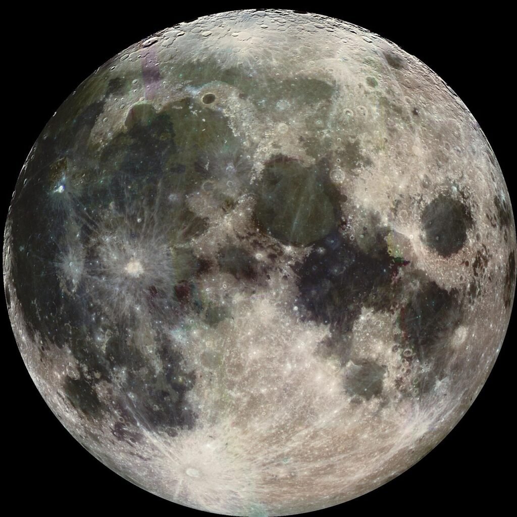
NASA’s guide to Moon phases explains that the Moon reflects sunlight and that our view of its illuminated half changes as it orbits Earth. That physical sequence gives a tattoo several distinct silhouettes. It does not establish that one phase must mean growth, completion, release or any other life event.
A crescent has an open side and two points. It can cradle a smaller sun, turn toward a face or leave a pocket of open skin between the motifs. A full moon is a complete disc, so it can match the sun’s central disc more directly. A quarter or gibbous moon creates unequal light and dark areas, which can make the composition feel less like two matching badges.
A phase row needs enough length for each shape to remain distinct. If it is meant to be astronomically ordered, label the phases instead of arranging crescents by appearance alone. NASA’s answers to common Moon questions explain that observers see the same phase from different angles in the northern and southern hemispheres. For a decorative design, orient the crescent to suit the composition without presenting that direction as a worldwide waxing or waning label.
Design the sun as more than a circle with spare rays
The Sun is a star rather than a flat disc with rigid spikes. NASA’s Sun facts distinguishes the visible photosphere from the outer atmosphere and describes the corona visible during a total solar eclipse. Tattoo rays are a graphic interpretation of light, heat or the corona, so their rhythm is a design decision.
Short, regular triangles produce a compact emblem. Alternating long and short rays make a more decorative ring. Curved or flame-like rays introduce rotation. An uneven corona creates an atmospheric edge but takes more room and can pull attention away from the moon. Decide whether the rays form a quiet frame or the widest, most active part of the tattoo.
Count and spacing matter because the rays determine the sun’s true footprint. A central disc that looks modest on paper can become much wider once long points surround it. Measure the whole silhouette when comparing sun tattoo placement with the moon, not only the two circular centres.
Compare three ways to arrange the pair
| Composition route | What the viewer reads first | Direction decision | Main planning risk |
|---|---|---|---|
| Facing pair | A meeting or exchange | Profiles, gaze and the space between them | Features crowding the central gap |
| Separate pair | Two related but independent symbols | How each reads from its own body view | The connection disappears or the scale feels mismatched |
| Shared composition | One combined celestial emblem | Which form sits in front and which leads | Too many rays, facial features and phase details in one circle |
When the faces should meet
Two profiles looking toward one another create a contained scene. The gap between noses, lips and crescent tips becomes part of the drawing, so it needs enough open skin to stay legible. Eye lines do not have to meet precisely, but they should look intentional. A sun set higher than the moon can feel like one figure is looking down; equal centres feel more formal.
Faces can look in the same direction for shared movement, or apart for independence or tension. These are compositional readings, not automatic celestial meanings.
When separation works better
Separation is useful when the pair belongs to two people, two limbs or two body planes. Each symbol can keep a clean silhouette and a different level of detail. The link can come from a repeated line weight, matching disc size, related ornament or a controlled colour palette rather than physical contact.
Exact mirroring is not always the goal. A radiant sun can outweigh a narrow crescent even when their discs match. A larger or darker moon can restore equilibrium without making the drawings identical.
When one emblem is stronger
An integrated design can place a crescent inside the sun’s ray field, divide one circle into solar and lunar halves, or use an eclipse-like overlap. Establish foreground and background before adding faces or ornament. A clean overlap needs one uninterrupted contour so the viewer can tell which form passes in front.
Avoid asking every feature to lead. If the sun has a face, a full ring of elaborate rays, a textured moon, stars, clouds and ornamental drops, the central relationship may vanish. Remove supporting details until the pair is still readable as a small thumbnail.
Visual balance does not require mirror symmetry
The Getty’s introduction to principles of design defines balance through the distribution of visual weight and distinguishes symmetrical from asymmetrical arrangements. That distinction is useful here because “balance” can describe how a composition looks without claiming that the tattoo carries one universal balance symbolism.
A symmetrical pair uses similar scale, height and detail on either side of an axis. It can suit paired shoulder blades, the upper chest or two corresponding limbs. An asymmetrical layout may use a large pale crescent against a smaller dark sun, or one detailed disc against a group of quieter phases. The result can still feel settled if contrast and empty space are distributed deliberately.
Check four sources of visual weight:
- The outside silhouette, including every ray and crescent point.
- Dark fill and dense texture inside each form.
- Faces, eyes and other features that attract attention quickly.
- Nearby empty skin, framing lines and supporting marks.
Do not solve every imbalance by adding stars. Small filler marks can blur the main boundary between the two subjects. Often the cleaner fix is to shorten rays, enlarge the crescent, reduce texture or move the centres farther apart.
Match the layout to a real body view
Moon tattoo placement and sun tattoo placement should be planned together even when the symbols sit apart. Photograph both proposed areas in one frame where possible. A pair that aligns in two cropped images may sit at different heights when the shoulders relax or the arms turn.
| Body format | Route it can support | What to check in the placement view |
|---|---|---|
| Paired shoulders or upper arms | Two independent symbols | Relative height, arm rotation and which side each face looks toward |
| Upper back or shoulder blades | A wide facing pair or a central shared design | Distance from the spine and how the pair changes as shoulders move |
| Centre chest or sternum area | Vertical pair, eclipse or compact emblem | Midline, available width and whether rays press into nearby contours |
| Forearm or calf | Stacked discs, a crescent cradling a sun, or a phase sequence | Main outward view and what wraps away on the curved surface |
| Thigh | Larger integrated illustration or offset pair | The view when standing and the space required by the ray field |
| Side torso | Vertical or arcing arrangement | Neutral posture, top and bottom boundaries, and the direction of the curve |
Choose a “front door” for the tattoo: the angle from which the pair should make sense first. On a forearm, that might be the outward view with the arm resting. On the back, it may be a straight view with shoulders neutral. Supporting texture can turn around a curved area, but the sun’s centre, the moon’s phase and any facial profiles should not all disappear around separate edges.
For a pair intended to sit inside a larger Asian composition, compare the scale and body flow shown in Yuyi Tattoo’s Japanese and Asian-inspired tattoo work. Use those examples to discuss hierarchy and background, not to borrow a culture-specific meaning for a generic sun or moon.
Test the concept before adding ornament
Start with two paper shapes or simple digital circles. Include the sun’s full ray width and cut the moon to the intended phase. Try them facing, separated and overlapping at roughly the proposed proportion. This quick comparison answers the structural question before flowers, clouds, jewellery, stars or faces make each option harder to judge.
Reduce the sketch to thumbnail size, place it over a normal photo of the body area, and mark what must remain visible if the design turns around a limb or torso. For a historical reference, record the museum, object title, culture and date. For an observed lunar phase, record the phase and viewing convention.
Prepare a focused custom enquiry
A useful brief does not need a finished drawing. It should answer the choices that only you can make:
- the personal idea, stated without a universal symbol claim;
- facing, separate or integrated composition;
- moon phase and whether astronomical ordering matters;
- sun ray type, facial treatment and preferred level of texture;
- direction of gaze or crescent opening;
- body side, main viewing angle and approximate boundaries;
- elements that must be included and elements you want excluded.
Add one body photo with the area marked and a small set of labelled visual references. The tattoo enquiry guide explains how to organise placement, size and reference information without sending an unfocused image folder. When the choices are ready, use the contact page to send Yuyi Tattoo the brief and ask how the composition can be adapted to the proposed area.
Sources and review date
- NASA Science: Moon Phases (reviewed 24 August 2026).
- NASA Science: Top Moon Questions (reviewed 24 August 2026).
- NASA Science: Sun Facts (reviewed 24 August 2026).
- J. Paul Getty Museum: Understanding Formal Analysis, Principles of Design (reviewed 24 August 2026).
- British Museum: Figure of Padmasambhava, museum number 1942,0416.1 (reviewed 24 August 2026).
- British Museum: Late Anglo-Saxon Crucifixion plaque, museum number 1980,1201.1 (reviewed 24 August 2026).
Frequently asked questions
What does a moon tattoo mean when it is paired with a sun?
It can express a personal idea such as contrast, companionship, rhythm or the coexistence of different qualities. The pair has no single meaning that applies across all cultures and wearers. State your intended relationship in plain language and use the drawing to support it.
Should the sun and moon face each other?
They should face each other when an exchange between two personified forms is central to the concept. They can look in the same direction for a shared movement, look apart for independence, or have no faces at all when phase, rays and geometry carry the design.
Which moon phase works best in a sun and moon tattoo?
A crescent creates an open directional shape that can cradle or face the sun. A full moon makes a second complete disc and supports a more formal pair. Quarter and gibbous forms create stronger asymmetry. Choose by silhouette first, then add any personal meaning you give the phase.
Does a left-facing crescent always mean waxing or waning?
No. The Moon’s apparent orientation changes with the observer’s viewpoint, including between hemispheres. If astronomical accuracy matters, specify the phase and viewing convention. If the crescent is decorative, orient it for the composition without labelling it as a universal waxing or waning sign.
What is the best placement for a sun and moon tattoo?
There is no single best placement. Separate symbols can suit paired shoulders, upper arms or limbs; a vertical pair can suit a forearm, calf or side torso; and a broad back, chest or thigh can support a wider shared composition. The useful choice is the one that preserves the silhouettes and main viewing angle on your body.


