
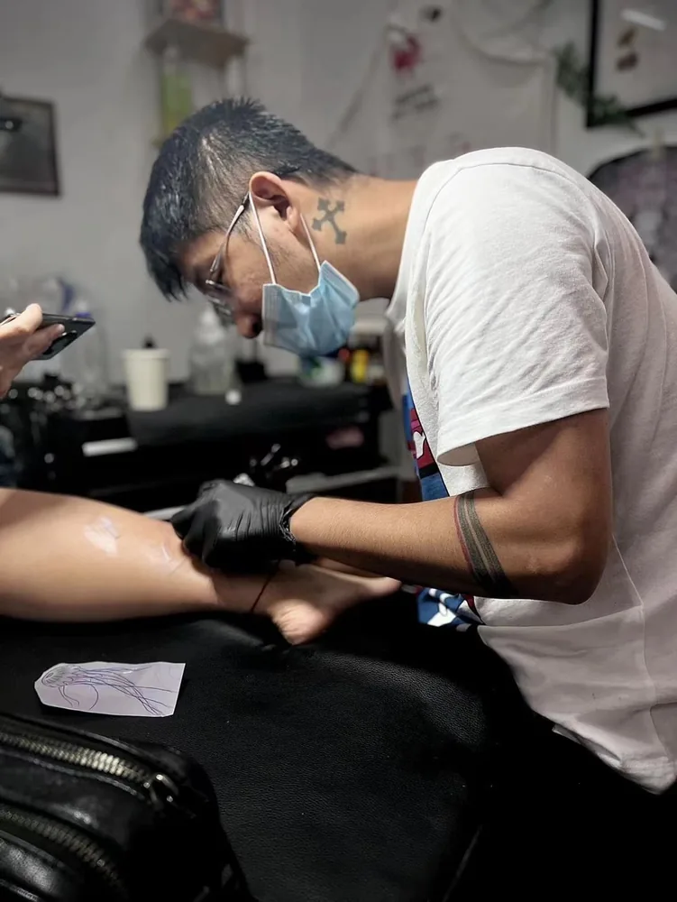
Choose matching tattoo ideas by asking one question first: if every tattoo is photographed separately, does each one still look intentional? A strong match has its own readable shape, subject or wording. The connection comes from a shared motif, visual rule or detail, rather than from two people having to stand together to complete the image.
Prepare one shared concept, then give each person a separate placement, size and visibility preference. That keeps the group decision clear without treating different bodies as interchangeable. It also lets the artist test each design alone before comparing the set.
Start with the standalone test
Put each proposed design on its own page and cover the others. Can you name what it is? Does it have a complete outline? If it contains text, can it be read without the other half? Does the composition look deliberately cropped rather than accidentally cut off?
This test quickly exposes a common weakness in split designs. A half-heart, unfinished sentence or object divided down the middle may make sense in a posed photograph, but one half may look like a fragment during ordinary life. That is not automatically wrong. It should be a conscious choice made by the person who will wear that fragment.
Standalone readability does not require identical tattoos. One person might wear a crescent moon and another a small tide line, linked by the same circular frame and dark-to-light treatment. Each image can be complete while the connection remains visible to the people involved.
Look at the design from phone distance and from several steps away. If its identity depends on a hairline gap, a tiny initial or the adjacent tattoo, simplify it or give it more room. The tattoo design readability guide explains how hierarchy, scale, contrast and open skin affect that decision.
Choose the type of match before choosing the motif
Many discussions get stuck on symbols too early. First decide how closely the tattoos should resemble one another. There are four useful structures.
| Structure | What connects the set | Standalone question |
|---|---|---|
| Exact repeat | The same finished design | Does the design suit every chosen body area and size? |
| Related variations | One visual family with individual changes | Is the shared rule still obvious after the changes? |
| Complementary pair | Two complete subjects with a known relationship | Does either subject look secondary or unfinished alone? |
| Split composition | One image or phrase divided across people | Is each fragment acceptable as a permanent solo view? |
Exact repeats can be clear, but they do not have to be placed in mirror positions. Related variations often give more room for different tastes. A shared flower species can use different angles; two animals can use the same frame; three friends can choose different stars drawn with the same number of points and line weight.
Complementary designs are useful when people want a connection without a duplicate. Wedding tattoo ideas might use two complete objects from the same setting rather than two halves of one icon. Anniversary tattoo ideas might share a date format or border while allowing different central subjects. These are design structures, not rules about a relationship.
The Design Council’s general design process recommends exploring several possibilities before narrowing and testing them. Applied here, that means sketching the four structures before committing to the first symbol everyone mentions.
Write one shared visual rule
A shared visual rule is more precise than “make them matching.” It names the features that must stay consistent. Try one sentence:
Each tattoo uses one complete botanical subject, a narrow oval frame, the same black-to-open-skin balance and one small date below, while the flower and placement can differ.
That sentence gives the artist a system. It says what can change and what cannot. Depending on the idea, the shared features might be subject family, silhouette, frame shape, line character, contrast, direction, repeated number, small accent or amount of negative space.
Do not lock every feature. If motif, crop, line weight, size, shading, direction and placement all have to match exactly, the design may fit one body better than another. Select two or three features that carry the connection, then let the remaining choices respond to the individual placement.
The Getty’s definitions of balance, emphasis and movement offer useful words for this comparison. Ask whether every tattoo has its own focal point, whether the visual weight feels settled, and where the eye moves first. Those questions are more actionable than asking whether the set has the same “vibe.”
Treat symmetry as a relationship, not a measurement
Matching placement can mean several things. It might mean the same named body area, the same level relative to a landmark, a mirrored direction, or simply equal visibility with ordinary clothing. Those options can produce different results.
Two inner wrists are not identical drawing surfaces. Neither are two ankles, shoulders or forearms. Proportions, existing tattoos, dominant-hand use and the way each person wants the tattoo seen can differ. A fixed five-centimetre design may look balanced on one area and cramped on another.
Each person should describe the placement from their own perspective:
- left or right side;
- inner, outer, front or back surface;
- upper and lower body landmarks;
- approximate height and widest width;
- which way the subject or text should face;
- whether equal visibility or mirrored positioning matters more.
Then compare the two placement plans. If symmetry is important, decide what the symmetry refers to. “Both centred two fingers above the inner ankle bone” is clearer than “same place.” For a group, identical placement may be less practical than one shared size range and one shared orientation rule.
Check initials, names, phrases and dates person by person
Text creates a second layer of matching. It has to connect the set and be correct on every individual tattoo. Type each final version on its own line. Check capitalisation, accents, punctuation, spacing, name order and which initials are included. Do not approve from a decorative font screenshot alone.
Personal names do not follow one universal first-name, middle-name and family-name pattern. The W3C documents differences in name order, multiple family names and the meaning of initials across cultures. For couple initials tattoo planning in Singapore, let each person state exactly how their own name should be represented. Do not derive initials from assumptions.
Non-English wording needs two checks. First, confirm the intended meaning and natural phrasing with a fluent native reader or qualified language professional. Second, confirm the exact written characters that will be drawn. Romanisation can help discussion, but it should not silently replace the chosen script.
Unicode’s work on visually confusable characters shows that different characters can look alike and that appearance can vary by font. That standard concerns digital text security, not tattoo design, but the practical lesson is sound: preserve the approved text as copyable characters, record the language, and compare it with the drawn version. A screenshot is supporting material, not the only source.
Dates deserve the same care. Numeric orders vary, so 03/04/2024 can be read in more than one way. ISO 8601 uses year-month-day to reduce ambiguity in data exchange, but a tattoo can use any deliberately chosen format. Write the date in words beside the decorative version during review, and have every person confirm it separately.
Leave room for individual choice and future flexibility
Future flexibility is a design property. It does not require predictions about the people involved. A complete solo image can remain visually coherent if it is seen without the others, moved into a different photo composition or later surrounded by unrelated work.
Ask three practical questions. Can the design stand without physical alignment? Can its boundary remain complete if no background is added? Would the wearer still accept its visible meaning if nobody knew it belonged to a set?
Expansion can be considered without promising it. A clear outer edge may allow other work to sit nearby later, while an open-ended line may invite continuation. Each person can choose differently. One may want a contained emblem; another may prefer space around it. The shared rule can survive both choices.
Prepare one shared brief plus individual placement notes
Keep the common decisions at the top, then add one short block for every participant. The tattoo enquiry guide can help organise the first message.
Use this format:
Shared concept: Three complete moth designs connected by the same oval frame, wing angle and small four-point star. Each moth may have a different internal pattern. The set should feel related in separate photos. No split wording.
Person A: left outer forearm, approximately 8 cm high, subject facing toward the hand, visible with short sleeves.
Person B: right shoulder blade, approximately 10 cm high, upright when standing, usually covered.
Person C: outer calf, size flexible after readability review, star placed below rather than above the moth.
Exact text or date: typed here, with language and spelling reviewer named if relevant.
Add one labelled reference for the main subject and one for the preferred composition. Do not send separate unlabelled folders and expect the artist to find the shared direction. If someone dislikes an element, record that before drawing begins rather than treating silence as group approval.
Groups should also state whether all tattoos must be completed under one arrangement. Availability for several people, a particular artist or a particular date requires direct confirmation. A design discussion does not promise same-day or group capacity.
Review every tattoo alone, then review the set
Run two approval rounds. In the solo round, each wearer checks their own subject, text, direction, placement, size and privacy preference. In the set round, compare shared features, visual weight and whether any design feels like the incomplete member of the group.
The design review checklist covers spelling, direction, scale, composition and what still needs confirmation. Use it for every design, not only for the group favourite.
When the shared rule and individual notes are ready, contact Yuyi Tattoo with the complete set in one message. Ask what can be assessed from the material and what needs an in-person placement check. Keep availability, timing and any booking terms as questions until the studio confirms them for the actual group.
Sources and review date
- Design Council — Framework for Innovation — reviewed 24 August 2026.
- Getty Education — Understanding Formal Analysis — reviewed 24 August 2026.
- W3C Internationalization — Personal names around the world — reviewed 24 August 2026.
- The Unicode Consortium — Unicode Technical Standard #39 — reviewed 24 August 2026.
- International Organization for Standardization — ISO 8601 date and time format — reviewed 24 August 2026.
Frequently asked questions
Do matching tattoos have to be identical?
No. They can share a motif, frame, line character, direction, date treatment or amount of contrast while using different central subjects. Write down which features create the match so individual changes do not erase the connection.
Are split matching tattoos a bad idea?
They are workable when every wearer knowingly accepts how their fragment looks alone. Review each half in a separate image. If one side appears accidental or unreadable, turn the concept into two complete complementary designs instead.
Where should a couple place matching tattoos?
There is no universal placement. Each person should choose a body area, side, size and visibility level, then decide whether “matching” means mirrored direction, equal height, equal visibility or simply the same design family.
How should we verify initials or non-English text?
Type the exact final text, preserve accents and punctuation, and let each person confirm their own name. For a language none of you reads fluently, use a native reader or qualified language professional, then compare the approved characters with the drawing.
What should a group send in the first enquiry?
Send one shared concept, the features that must match, labelled references and a separate placement note for every person. Include exact text and date formats. Ask about the next design and scheduling step without assuming several people can be accommodated together.

